11 Living Room Gallery Wall Ideas That Actually Look Curated
Gallery walls fail the same way every time. A random print goes up first, then a thrift frame next to it, then a vacation photo because the wall still looks empty, and four frames in the wall reads as a pile instead of a piece.
What separates a gallery wall that looks curated from one that looks chaotic is not the art itself. It is eleven specific composition decisions about color, layout, spacing, and rhythm — and most of them get made on the floor, in pencil, before a single nail goes in.
These eleven moves work for any framed-art wall, whether it is the first gallery you have ever hung or a refresh of one that never sat right. The broader logic of working with framed art and shelves shows up in our living room wall decor ideas pillar.
From locking a 60-30-10 color story before you buy a single frame to using removable hooks for the rental rules — these eleven moves are composition decisions, not inspiration. Jump to the question you need answered first.
- 1Pick one 60-30-10 color story before you buy a single frame
- 2Cut paper rectangles to each frame’s exact size and tape them up first
- 3Anchor the mass around eye-line (57 to 60 inches), not sofa-top
- 4Cap frame shapes at three and lock one finish
- 5Leave a consistent 2 to 3 inch gap between every frame
- 6Use one spine piece and let everything else orbit it
- 7Unify mismatched art sizes with same-width mat boards
- 8Add one non-frame element to break the paper rhythm
- 9Hang the bottom row first and build upward
- 10Pick one shared thread: subject, palette, or medium
- 11Use removable adhesive hooks for rentals under 8 pounds each
Pick One 60-30-10 Color Story Before You Buy a Single Frame
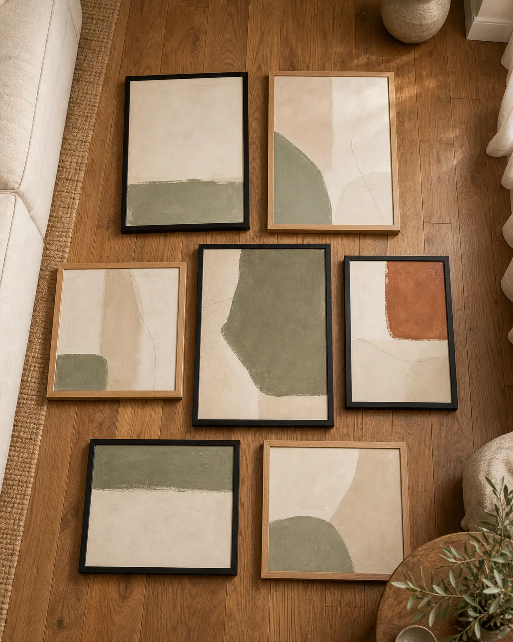
A gallery wall fails the moment the first frame goes up without a color plan. You buy the print you like, then the next one because it works with the first, then the third because it almost works, and four frames in the wall reads as a thrift haul.
A 60-30-10 color story locks the math before you spend a dollar. Sixty percent of the visual weight goes to a single neutral (the mat boards and frame finish), thirty percent to a repeating accent that ties the prints together, and ten percent to a single pop that punctuates one or two pieces. The wall reads as one composition because the math says so.
- Lay seven sample swatches on the floor before buying — confirm one neutral, one accent, one pop and nothing more
- Pick the 60% neutral from a tone already in the room — warm cream, dusty oak, soft sage
- Restrict the 30% accent to ONE family — terracotta or sage or muted gold, never all three
- Reserve the 10% pop for two frames maximum, placed asymmetrically across the gallery
- Save the palette card on your phone — you will be tempted to buy the gorgeous outlier next month and the card stops you
Cut Paper Rectangles to Each Frame’s Exact Size and Tape Them Up First
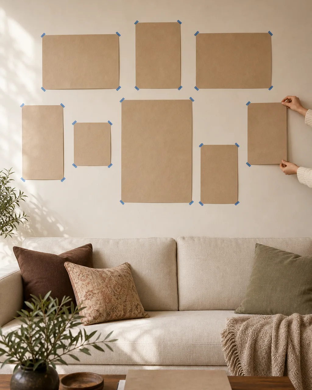
Most gallery walls get hung straight from the frames — a frame goes on the wall, a tape measure comes out, and a hole gets drilled. Three frames in, the math is off, the spacing looks wrong, and there are four extra holes that need spackle.
Cutting kraft paper to each frame’s exact size and taping the templates to the wall first moves the layout decision off your phone and onto the wall. You can stand back, adjust, sleep on it, and only commit to nail holes once the paper composition reads right.
- Use brown kraft paper or even newspaper — anything that holds painter’s tape and a pencil mark
- Trace each frame onto the paper with the frame face-down, then cut on the line — exact size, not estimated
- Mark the hanging-wire point on the paper template so you know where the nail goes when you commit
- Tape with painter’s blue, not masking — masking pulls paint chips off rental walls on removal
- Live with the paper composition for at least one evening before you drill; the layout that looks right at 2pm reads differently at 8pm
You will not need all eleven. Find the situation below that matches your wall today, and start with those two or three ideas.
Anchor the Mass Around Eye-Line (57 to 60 Inches), Not Sofa-Top
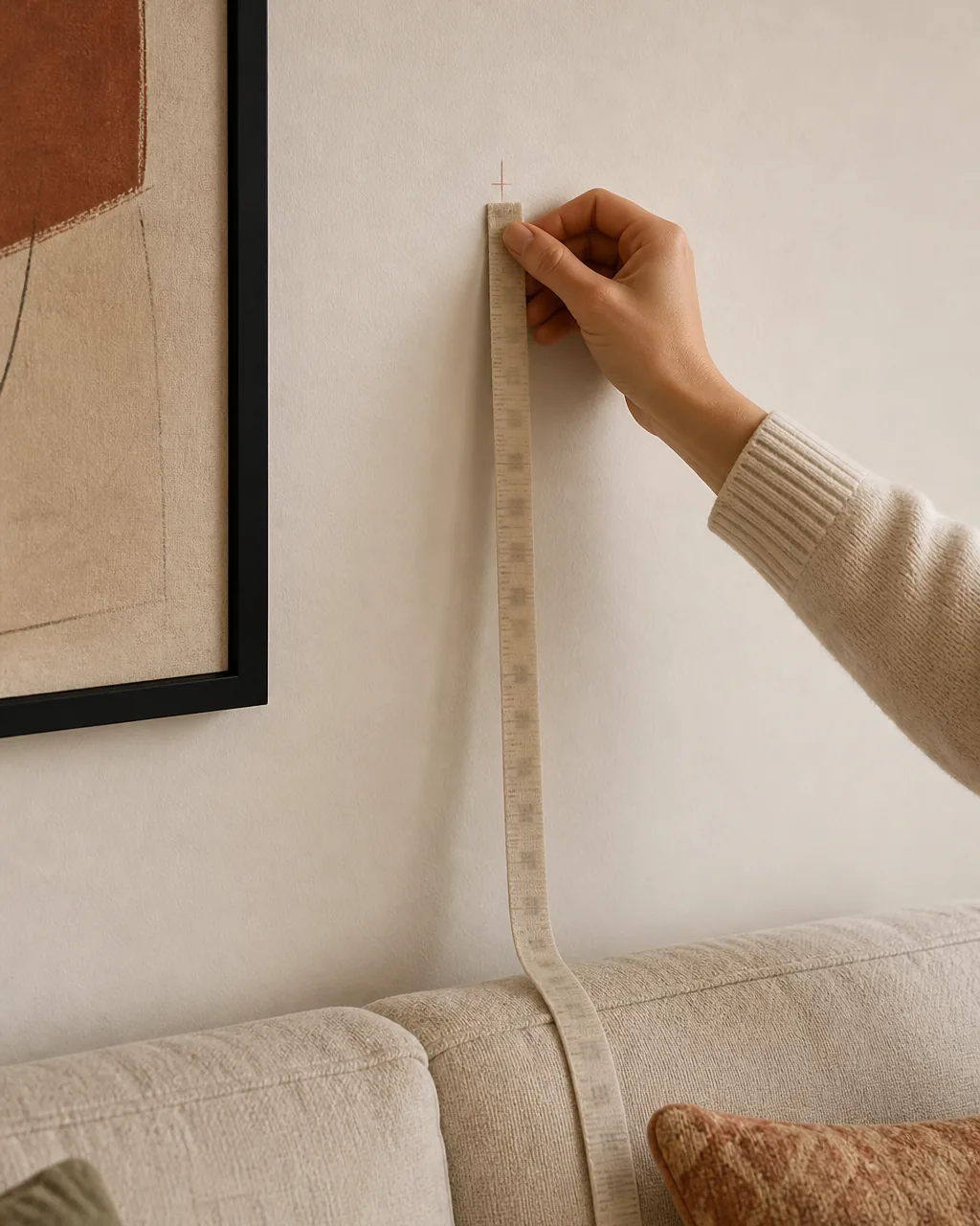
Most gallery walls float too high. People center the layout on the sofa back instead of the standing viewer, and the result is a wall of frames hovering at the ceiling with three feet of empty wall above the sofa.
Anchor the visual the visual center of the group at fifty-seven to sixty inches off the floor — the same height museums use because it lands at the average adult eye-line. The sofa-top is irrelevant; people stand and walk past the wall more than they sit and stare at it.
- Measure fifty-eight inches up from the floor and mark a faint pencil line — that line is your gallery’s vertical center
- Balance the visual mass equally above and below the line, not centered on the sofa-back rail
- If the sofa-back is unusually tall, leave a deliberate four-inch gap between sofa and lowest frame — anything tighter reads cramped
- Step back twelve feet to check; close-up the math works but far-away is what guests actually see
- Re-measure on a stool rather than a step ladder — a stool puts your eye where the layout lives
Cap Frame Shapes at Three and Lock One Finish
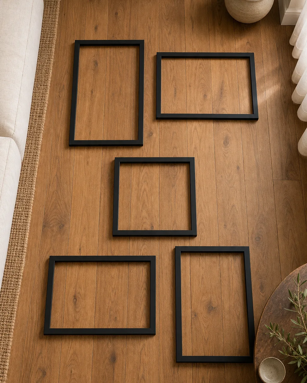
Mixing every shape and finish you own is what makes a gallery wall read as a thrift haul. Five shapes, four metals, two wood tones — the eye has no entry point and walks away.
Capping the variety inside three frame shapes (vertical rectangle, horizontal rectangle, square) and one finish (all matte black or all brushed brass or all oak) tells the eye the variety is intentional. The mix reads as curation because the constraints are visible.
- Pick three shapes — vertical rectangle, horizontal rectangle, square — and refuse the fourth even if it is gorgeous
- Choose ONE finish across every frame; matte black hides scratches, oak warms cool walls, brass adds glow
- Buy frames in a single brand line so the proportions match — frame depth and edge profile read at distance
- Repaint or spray mismatched thrift frames a single matte color before hanging if budget is tight
- Test the mix on the floor first — if the variety still reads chaotic, drop one shape to two
Leave a Consistent 2 to 3 Inch Gap Between Every Frame
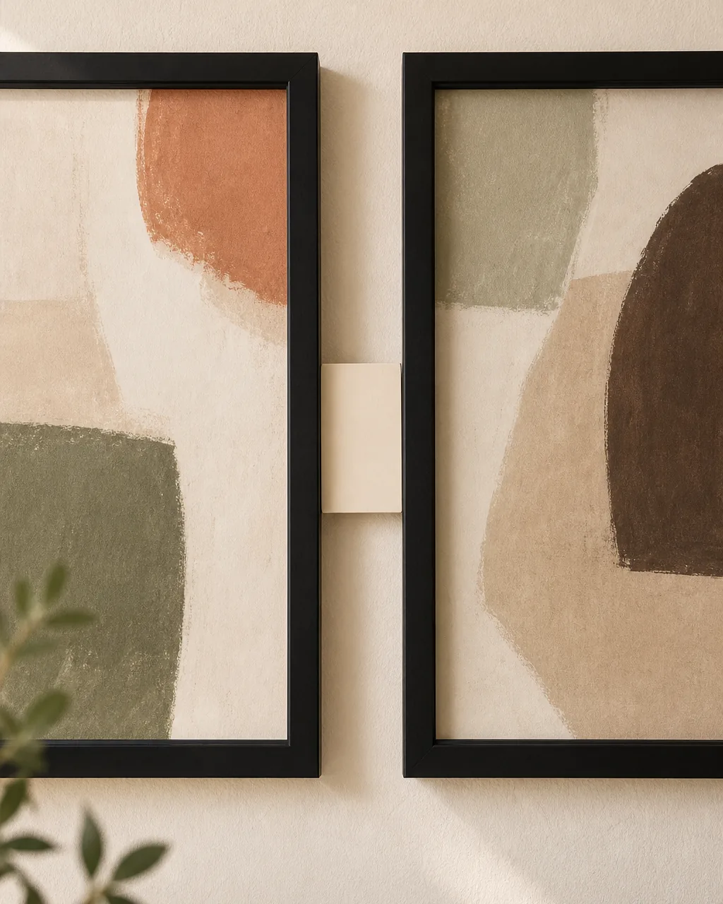
Inconsistent gaps are the silent killer of gallery walls. An inch here, four inches there, and the eye reads the wall as a pile instead of a piece. The frames look like they wandered in separately.
A consistent two to three inch gap between every frame in every direction makes the gallery read as one composition. Tighter than two inches and the frames merge into a block; wider than three and the frames orphan themselves.
- Cut a small cardboard spacer card the exact width of your chosen gap and use it between every frame
- Measure gap from frame edge to frame edge, not from artwork edge — the visible gap is what the eye reads
- Keep the gap identical horizontally and vertically; mixing two-inch horizontal with four-inch vertical breaks the rhythm
- Aim for 2.5 inches as the safe middle if the wall is over six feet wide; wider walls need slightly more breathing room
- Re-check the gap on every frame after the second drink at the housewarming — frames slide a quarter inch on bumps and the inconsistency shows
These four rules separate a gallery wall that holds together from one that just happens to have frames on it.
Use One Spine Piece and Let Everything Else Orbit It
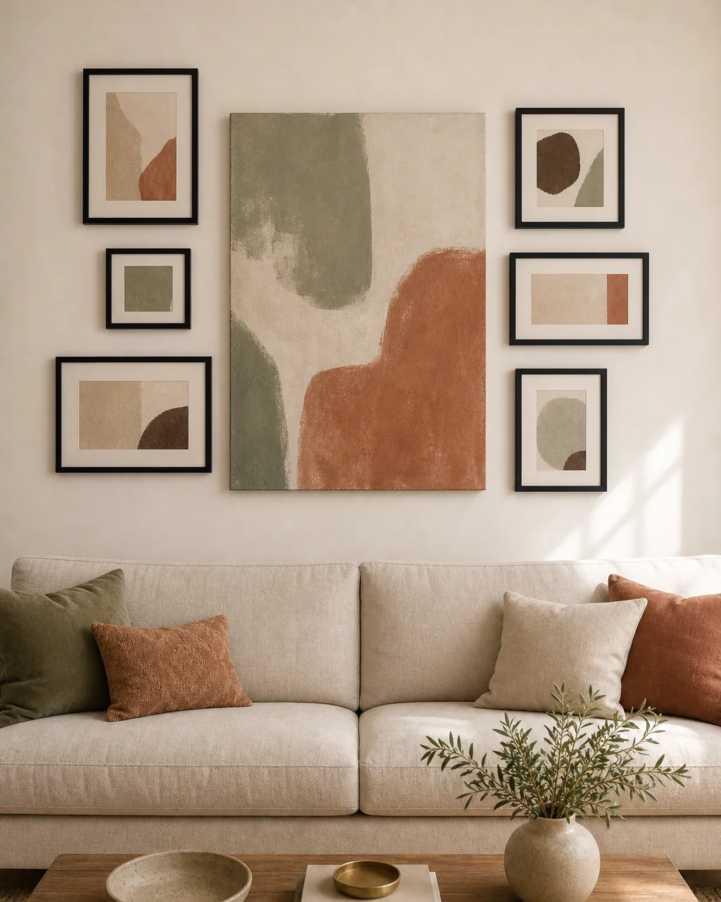
A gallery wall of equal-weight frames has no entry point. The eye bounces from frame to frame looking for somewhere to land and never settles, and the wall reads busy even when every individual piece is calm.
Picking one frame as a clear spine — usually the largest — and letting every other piece orbit it gives the eye a place to start. The spine sits slightly off-center, the rest balance around it, and the wall reads as one composition with a clear focal point.
- Choose the spine before you buy supporting pieces — the spine sets the scale for everything else
- Place the spine slightly off-center (around 40% from one edge) — dead-center reads stiff
- Keep supporting frames at most half the spine’s area; closer in size and the spine loses its job
- Balance the mass on the spine’s lighter side with one slightly heavier supporting frame to keep the visual weight even
- If the spine feels too dominant after hanging, swap it for a frame one size smaller rather than adding more orbit pieces
Unify Mismatched Art Sizes With Same-Width Mat Boards
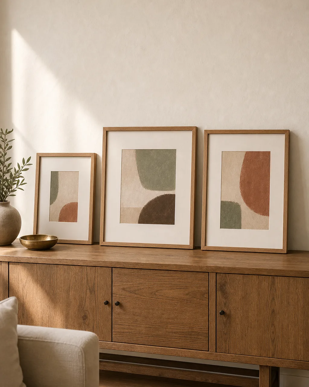
Most gallery-wall prints come in clashing sizes — a small thrift sketch, a medium print from a museum gift shop, an oversized photograph from a friend. Hung as-is they read random.
Wide cream museum mats unify the sizes by giving every print the same outer dimension. The small sketch lives inside a generous mat, the medium print inside a modest mat, the large photo with a narrow mat — every framed piece ends up the same size and the wall reads as a deliberate set.
- Order custom mats from a frame shop or DIY with foam-board kits — both work for under twenty dollars per frame
- Pick a single mat color across the whole gallery — warm cream reads neutral on most walls
- Aim for a 2.5 to 3.5 inch mat border on small prints; thinner reads cheap, thicker reads precious
- Use a four-ply mat thickness or thicker so the mat reads as a clear edge, not paper
- Cut the inside opening one-eighth inch smaller than the artwork on each side so nothing slips during hanging
Add One Non-Frame Element to Break the Paper Rhythm
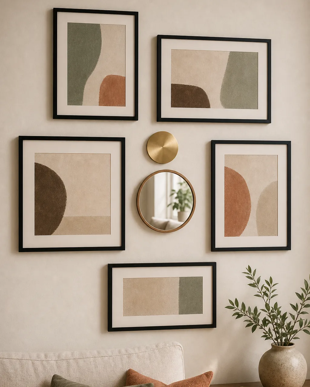
A wall of nothing but framed paper reads flat. Same finish, same rectangular shape, same flush-to-wall depth — the gallery looks like a hotel hallway.
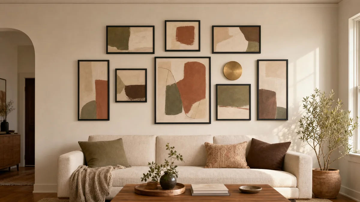
Slipping ONE non-frame element into the composition breaks the rhythm just enough to make the wall feel collected. A small round mirror catches light, a brushed brass disc adds metal, a woven seagrass tray adds texture. One is curation; three is clutter.
- Pick one accent only — the second one breaks the trick and the third turns the wall into a hodgepodge
- Match the accent’s color family to your existing palette; a metallic accent should echo something elsewhere in the room
- Hang the accent off-center but never in a corner — corner placement reads like an afterthought
- Choose an accent under twelve inches in diameter so it does not compete with the spine piece
- Avoid 3D objects deeper than two inches; shadow lines longer than the frames break the visual plane
11 living room gallery wall moves, one system that reads as a curated composition
- 1Pick one 60-30-10 color story before you buy a single frameA 60% neutral base, 30% repeating accent, and 10% pop locked in writing before shopping keeps the finished wall reading as one composition instead of a pile of unrelated prints.
- 2Cut paper rectangles to each frame’s exact size and tape them up firstTrace each frame onto kraft paper, cut to actual size, and arrange the paper templates on the wall with painter’s tape before drilling a single hole.
- 3Anchor the mass around eye-line (57 to 60 inches), not sofa-topVisual center of the gallery lands 57 to 60 inches from the floor so a standing viewer sees the layout balanced, never floating above an empty sofa back.
- 4Cap frame shapes at three and lock one finishUse only vertical rectangles, horizontal rectangles, and squares — and pick one finish (all matte black or all oak or all brass) so the variety reads as a deliberate set.
- 5Leave a consistent 2 to 3 inch gap between every frameA single consistent gap of two to three inches between every frame in every direction makes nine separate prints read as one piece of art on the wall.
- 6Use one spine piece and let everything else orbit itPick the largest frame as a spine, place it slightly off-center, and arrange every other piece in orbit around it so the eye always has a place to land first.
- 7Unify mismatched art sizes with same-width mat boardsDrop differently sized prints into identical wide cream mats inside identical frames and the wall reads as a curated set even when the artwork sizes vary by inches.
- 8Add one non-frame element to break the paper rhythmMix in one small round mirror, one brushed brass disc, or one woven basket — exactly one, never three — so the all-paper rhythm breaks just enough to feel collected.
- 9Hang the bottom row first and build upwardSet the lowest row first along a level line, then build the gallery up from there so the layout reads gravity-anchored instead of floating untethered.
- 10Pick one shared thread: subject, palette, or mediumChoose one shared thread — all same subject, or all same palette, or all same medium — and stop there; one connecting idea reads curated, three reads corporate.
- 11Use removable adhesive hooks for rentals under 8 pounds eachCommand-strip style picture hangers rated for four to eight pounds hold most small framed prints with zero nails and zero spackle on move-out day.
styledhomenotes.com
Hang the Bottom Row First and Build Upward
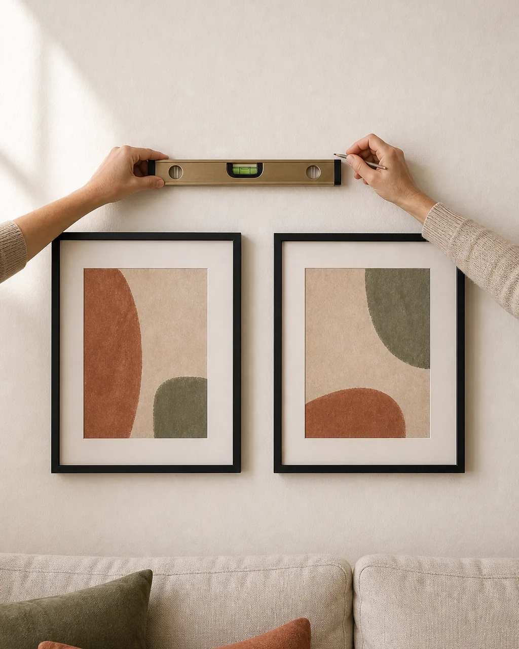
Hanging top-down is how galleries float and feel untethered. You start with the spine at eye-line, work outward, and end up with three frames floating in the upper corners that ran out of layout.
Hanging the bottom row first along a level line gives the layout gravity. The base anchors the eye, every row above stacks deliberately, and there is never an orphan frame floating where you ran out of plan.
- Mark a level pencil line where the bottoms of the lowest row will sit, not where the tops will land
- Hang the largest bottom-row frame first as a base anchor, then space outward in both directions
- Build upward in rows of one to three frames, checking the cardboard spacer card on every gap
- Step back after each row to confirm the visual mass is still anchored low; floating high is the failure mode
- Save the lightest, smallest frames for the top row where weight matters least and your arms get tired
Pick One Shared Thread: Subject, Palette, or Medium
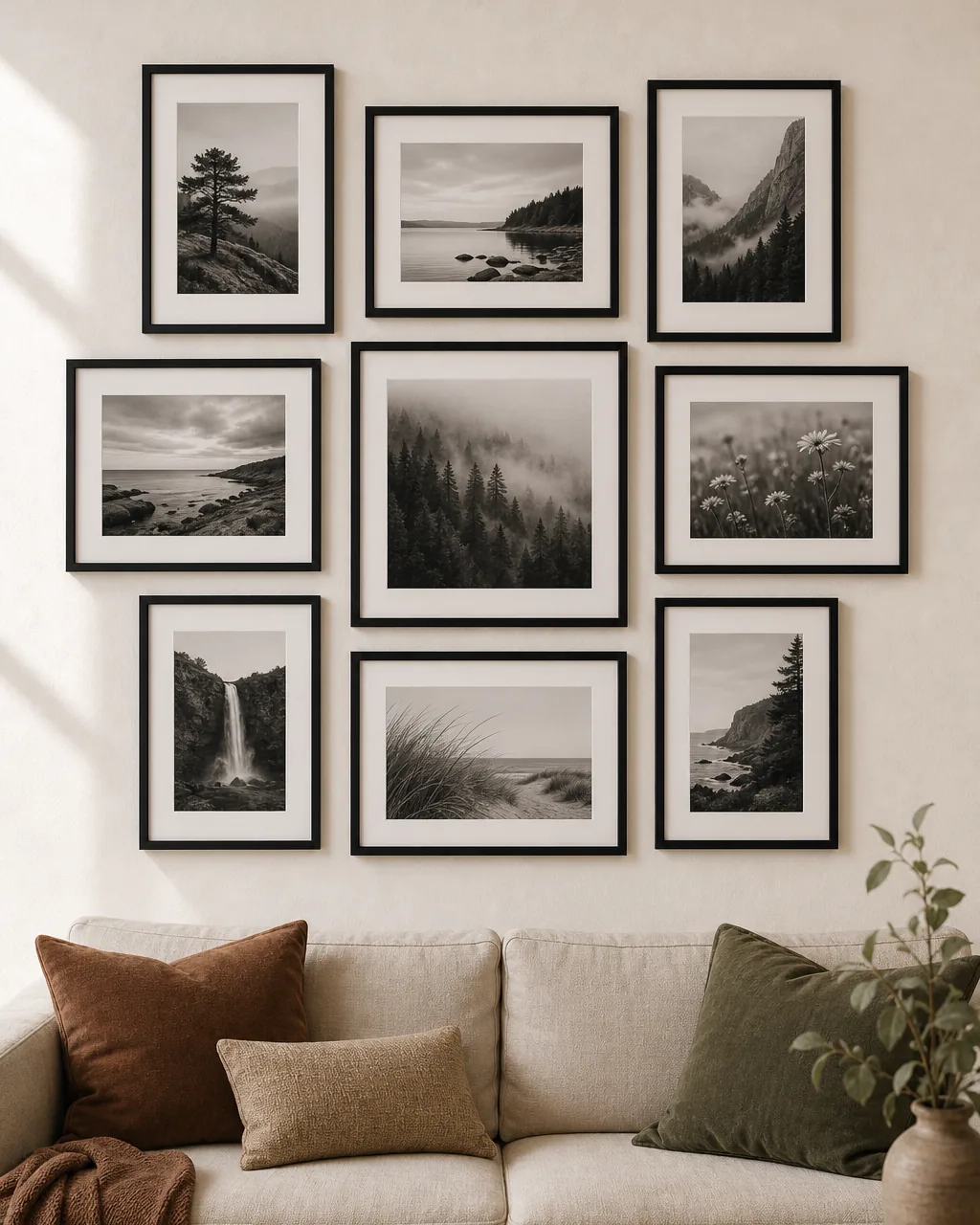
Wedding photos, abstract prints, vintage postcards, and a watercolor of the dog hung together share nothing — the wall reads as a yard sale even with perfect framing and spacing.
Picking ONE shared thread — same subject, or same palette, or same medium — and stopping there makes the gallery read curated. Zero threads reads random; three threads reads like a corporate hotel lobby trying too hard. One is the right number.
- Choose the thread first: all black-and-white photography, OR all watercolor, OR all the same subject (florals, architecture, portraits)
- Resist adding a second thread later — the wall will read as overcomplicated once you do
- Keep one outlier as a deliberate accent if you cannot let go — but only one, treated like the non-frame element above
- Photograph the wall and check it reads as a set; if every print looks unrelated at thumbnail size, the thread is too weak
- Re-edit the gallery every six months — pull the print that no longer fits the thread and rotate in one that does
Use Removable Adhesive Hooks for Rentals Under 8 Pounds Each
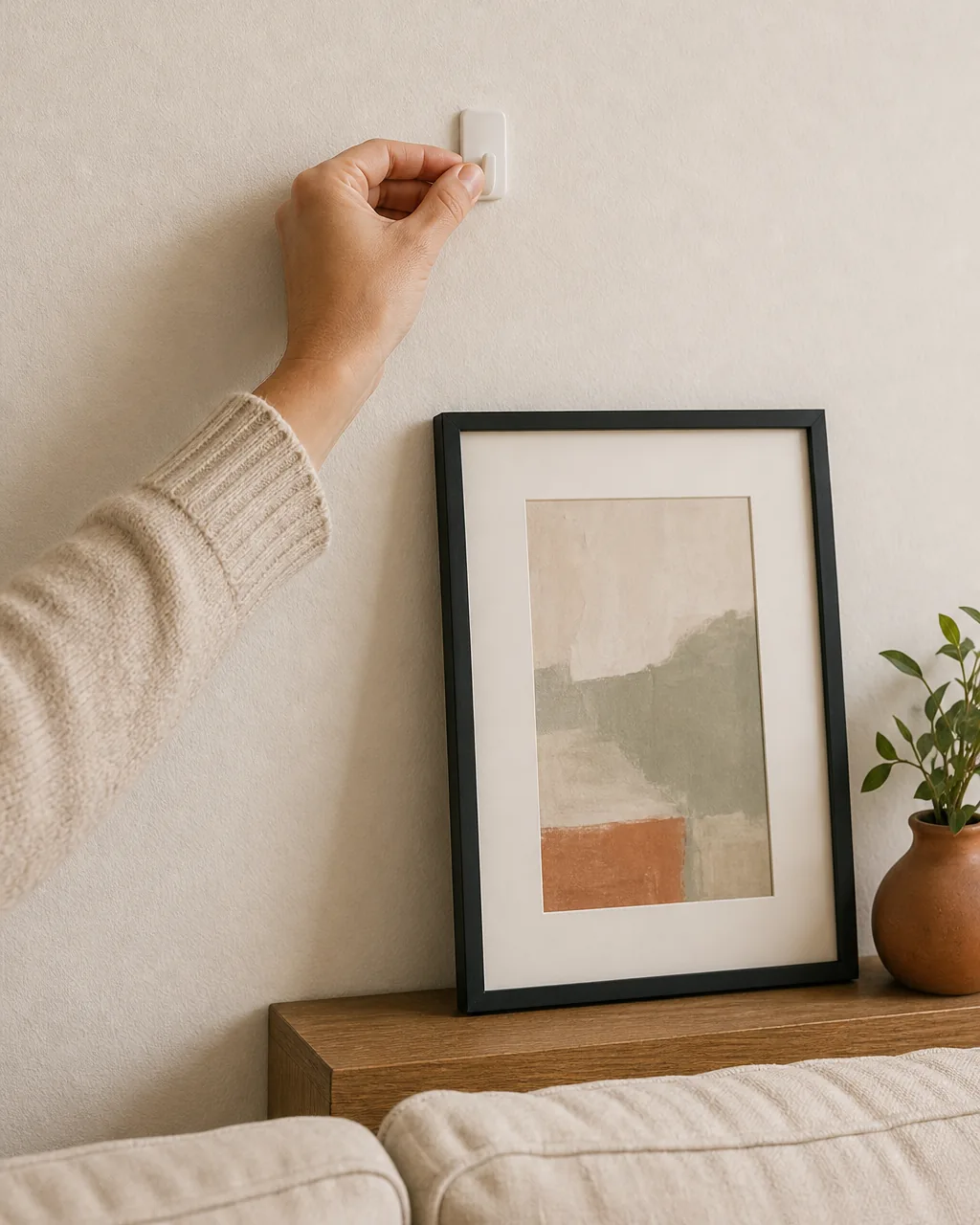
Most renters skip gallery walls entirely because they read the lease too literally. Drywall hooks need spackle, plaster anchors leave scars, and move-out fees add up quickly.
Removable adhesive picture hangers — Command-style strips — hold lightweight frames cleanly and pull off without damage on move-out day. They are not for every gallery wall, but for prints under eight pounds in standard frames they work beautifully and leave the lease intact.
- Check the weight rating on the package; most adhesive picture hangers are rated for four, six, or eight pounds
- Weigh each framed piece on a kitchen scale before hanging — guessing under-rates roughly half the time
- Press the hook against the wall for thirty seconds at install per the package instructions; rushed install is why hangers fall
- Use TWO hangers per frame on anything over three pounds, even if the rating says one is enough — peace of mind
- On move-out day pull straight down on the release tab, slowly; pulling forward at an angle is what tears paint

Nora writes about small, livable systems for real apartments. The gallery wall above her sofa is nine framed prints in one finish, three shapes, a 60-30-10 cream-sage-clay palette, and a single brushed brass disc tucked between the frames — which is why every move in this guide gets pressure-tested against a real wall, an honest budget, and a layout that has to survive a fresh pair of eyes a month later before it shows up here.
Nora Ellis edits Styled Home Notes. Visit the Nora Ellis author page. More from Nora: small living room ideas, living room wall decor ideas, living room shelf decor ideas.