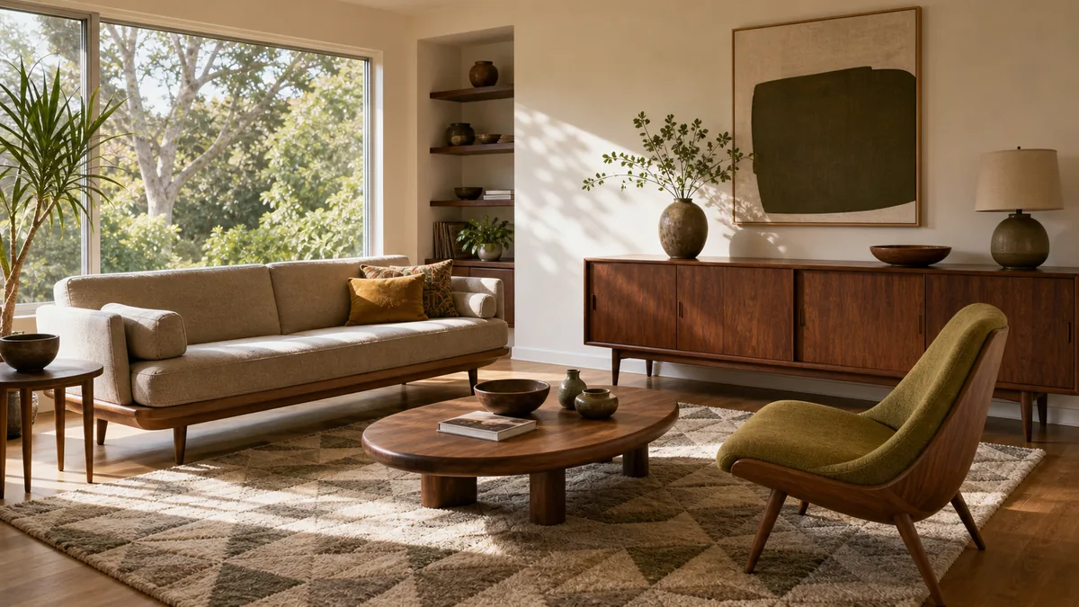
12 Mid-Century Modern Living Room Ideas That Nail the Era Without Feeling Like a Set
Mid-century modern gets copied more than almost any living room style — and misread more than almost any of them too. A tapered leg here, a mustard pillow there, and it still doesn’t quite land.
What separates a real mid-century room from a vague nod to it isn’t mood or lighting. It’s specific decisions: leg shape, wood tone, how many patterns you allow, what your picture frames are made of.
These 12 ideas are single decisions, not a checklist to run through all at once. Pick the ones your room is missing. For the wider style comparison, see this modern living room ideas guide.
Not a mood board — specific leg shapes, wood tones, and pattern rules. Find the decision your room is missing and start there.
- 1Choose Furniture With Exposed Tapered Legs, Not Skirted Bases
- 2Anchor the Room in Warm Walnut Tone Wood, Not Gray or White Oak
- 3Add One Graphic Geometric-Print Textile, Not a Matching Pair
- 4Hang Art in Thin Black Metal Frames at a Strict Eye-Line
- 5Give the Room One Sculptural Accent Chair as a Standalone Object
- 6Pick One Saturated Accent Color for Color-Blocking, Not a Muted Earth Tone
- 7Float Furniture on Slim Legs to Let the Floor Read as Part of the Room
- 8Keep the Sofa Silhouette Low and Straight-Backed
- 9Use Brass or Black Metal Lighting as the Room’s Single Sculptural Accent
- 10Let a Wall-Length Credenza Divide Storage From Living Space
- 11Choose an Organic-Shaped Coffee Table Over a Rectangular One
- 12Balance an Open Floor With One Graphic Rug
Choose Furniture With Exposed Tapered Legs, Not Skirted Bases
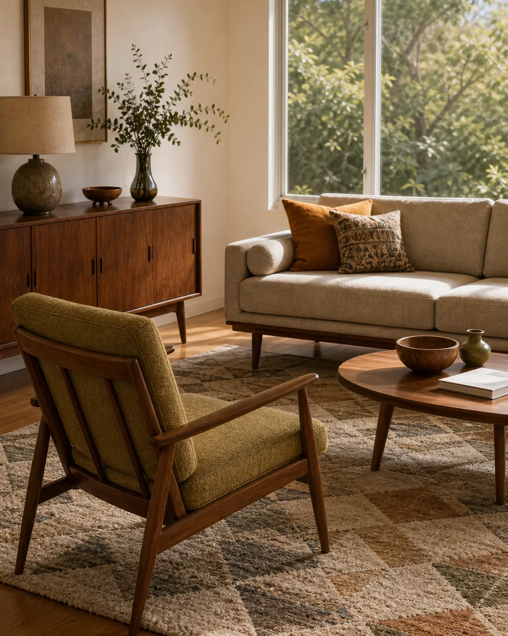
The single most reliable mid-century signature isn’t a color or a fabric — it’s the leg. Skirted sofas and boxy upholstered bases read as generic-contemporary the moment you see them; thin, angled, exposed wood legs read as mid-century on sight, because they let light and floor show underneath instead of hiding it behind fabric.
- Check every seating piece in the room for a visible gap between the frame and the floor — if the fabric runs straight to the ground, the leg signal is already lost
- Look for legs that angle outward slightly rather than dropping straight down, the detail that separates true mid-century from generic wood-leg furniture
- Match leg finish across pieces (all walnut-tone or all black) so the room reads as one decision, not several unrelated purchases
- Prioritize this swap on the sofa and the main chair first — smaller pieces like side tables matter less for the overall silhouette read
- Skip slipcovers on tapered-leg furniture entirely, since a loose cover erases the exact leg line the whole look depends on
Anchor the Room in Warm Walnut Tone Wood, Not Gray or White Oak
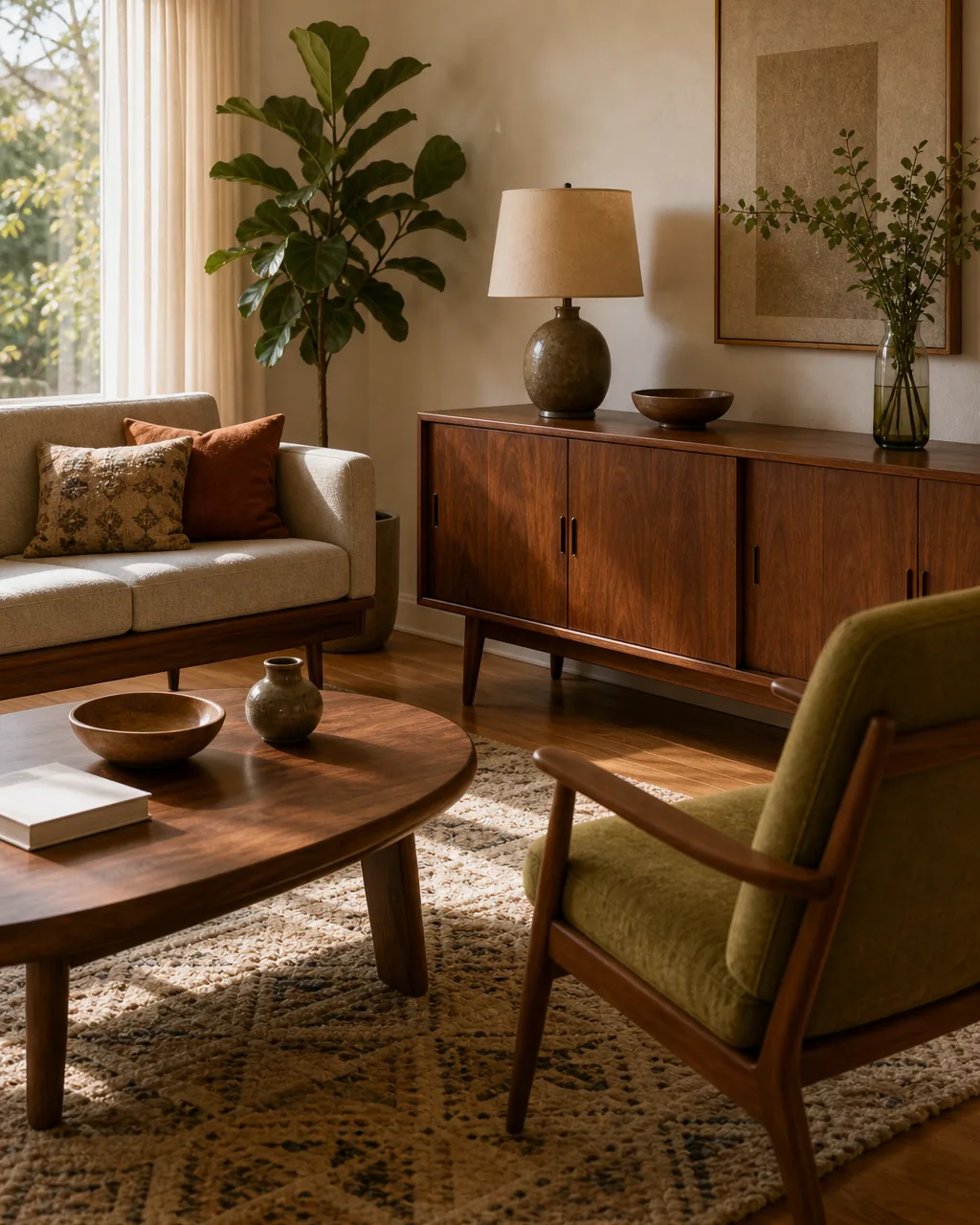
Mid-century interiors ran on one specific wood cast: warm reddish-brown walnut, not the pale gray-washed oak that dominates farmhouse and Scandinavian rooms right now. Pick one anchor piece in true walnut tone and let every other wood surface in the room follow its lead.
- Hold a paint chip or fabric swatch of true walnut brown against your current furniture to spot pieces that are actually gray-toned despite looking “wood”
- Start with the largest wood surface in the room — a credenza or coffee table — since it sets the tone every other piece gets compared against
- Avoid mixing warm walnut with cool gray-oak in the same sightline; pick one wood family and stay in it for this room
- Use a walnut picture-frame ledge or side table as a low-cost way to introduce the tone if a full furniture swap isn’t in budget yet
- Let brass or black metal hardware bridge between walnut pieces bought at different times, so the tone reads intentional even if the pieces don’t match exactly
Add One Graphic Geometric-Print Textile, Not a Matching Pair
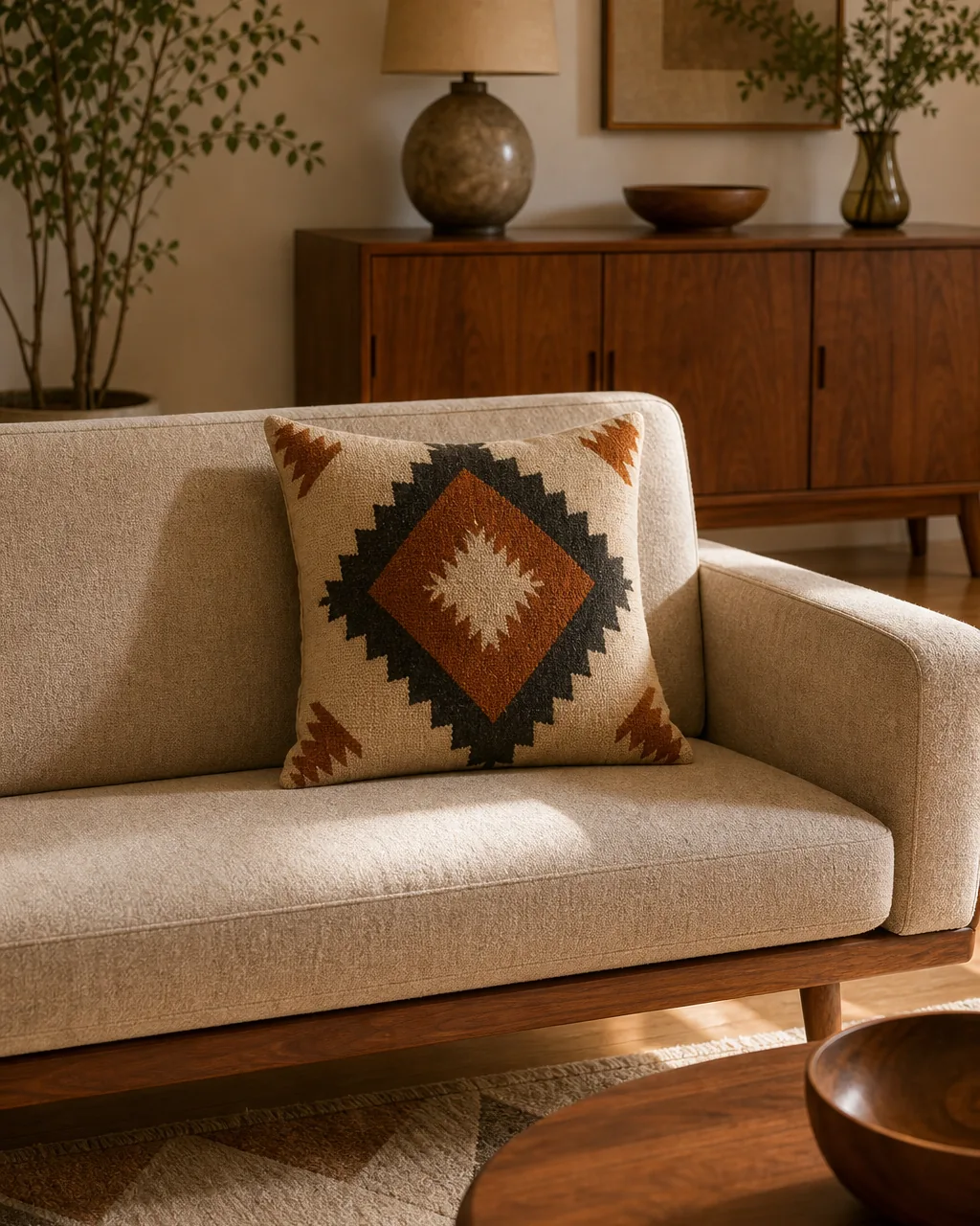
A single boldly patterned throw pillow or upholstered chair in a period-accurate geometric print does more work than a matched set. Mid-century rooms used pattern as one accent, not a repeated motif spread across three surfaces.
- Choose one geometric print — diamonds, sunbursts, or angular abstract shapes — and place it on exactly one surface in the room
- Keep every other textile in the same sightline solid or subtly textured, so the one pattern has nothing competing with it
- Pick a pattern with at least one color pulled from your walnut or accent-color palette, so it reads as coordinated rather than random
- Resist buying the matching pair the pillow comes packaged with — a single accent is the actual mid-century move, not a duplicated one
- Rotate the patterned piece seasonally if you want variety, but keep the “one only” rule fixed regardless of which print you’re using
The right first move depends on what’s reading as generic-contemporary right now, not personal taste. Find the situation below that matches your room today.
Hang Art in Thin Black Metal Frames at a Strict Eye-Line
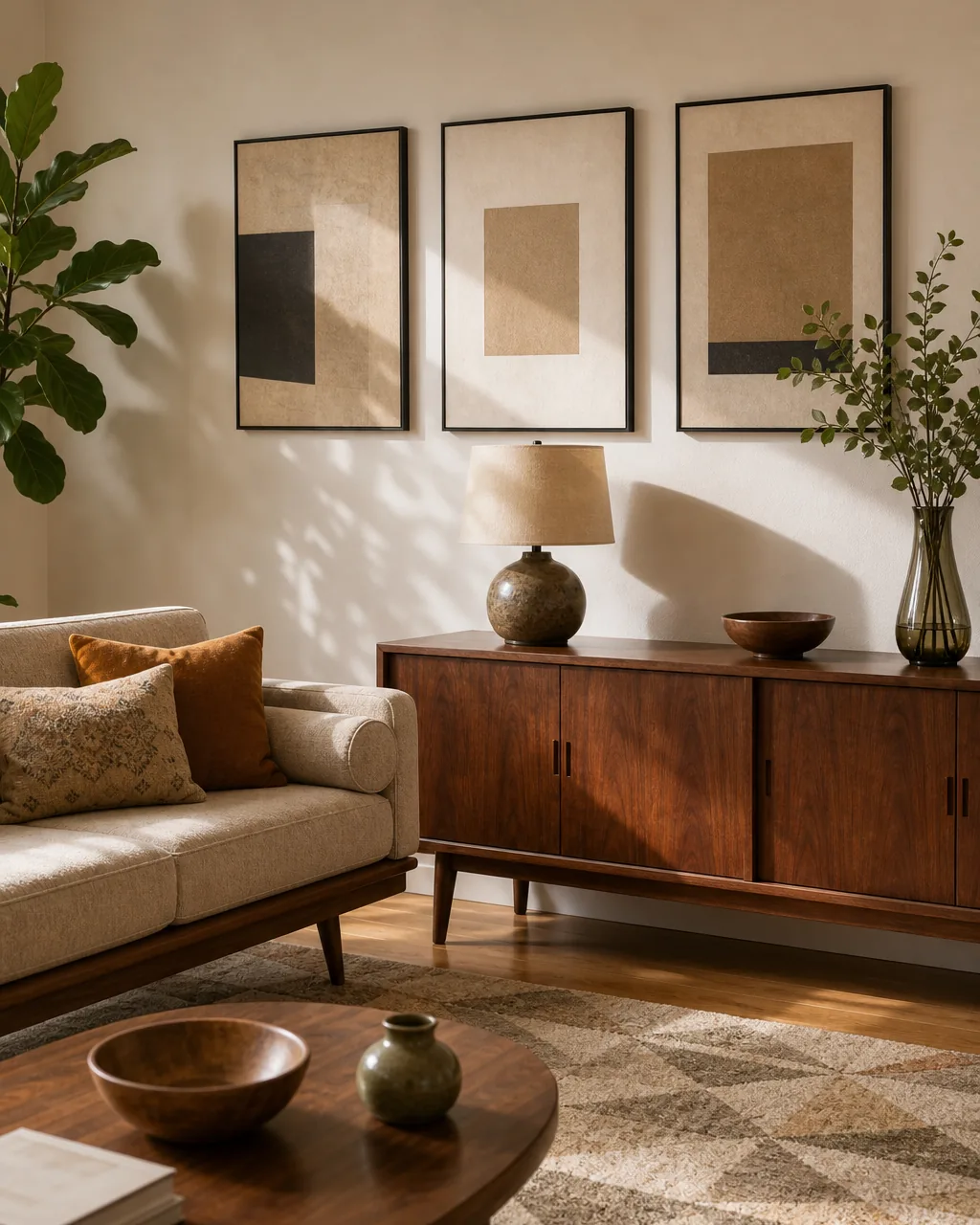
Frame material carries as much period signal as the art inside it. Thin black or brass metal frames, hung at one consistent eye-line height, read as mid-century; thick wood or white mat frames read as farmhouse or contemporary gallery-wall instead.
- Measure center height once — roughly 57 to 60 inches from the floor — and hang every frame in the grouping to that exact same line
- Choose metal frames no wider than about half an inch, since a thick frame profile shifts the whole look toward a different era
- Keep frame finish consistent across the grouping (all black or all brass, not mixed) so the wall reads as one styling decision
- Let the art inside stay simple — abstract shapes or botanical line work — so the frame material stays the visual focus, not competing artwork
- Space multiple frames with equal gaps rather than a scattered gallery-wall layout, which pulls the eye away from the strict eye-line rule
Give the Room One Sculptural Accent Chair as a Standalone Object
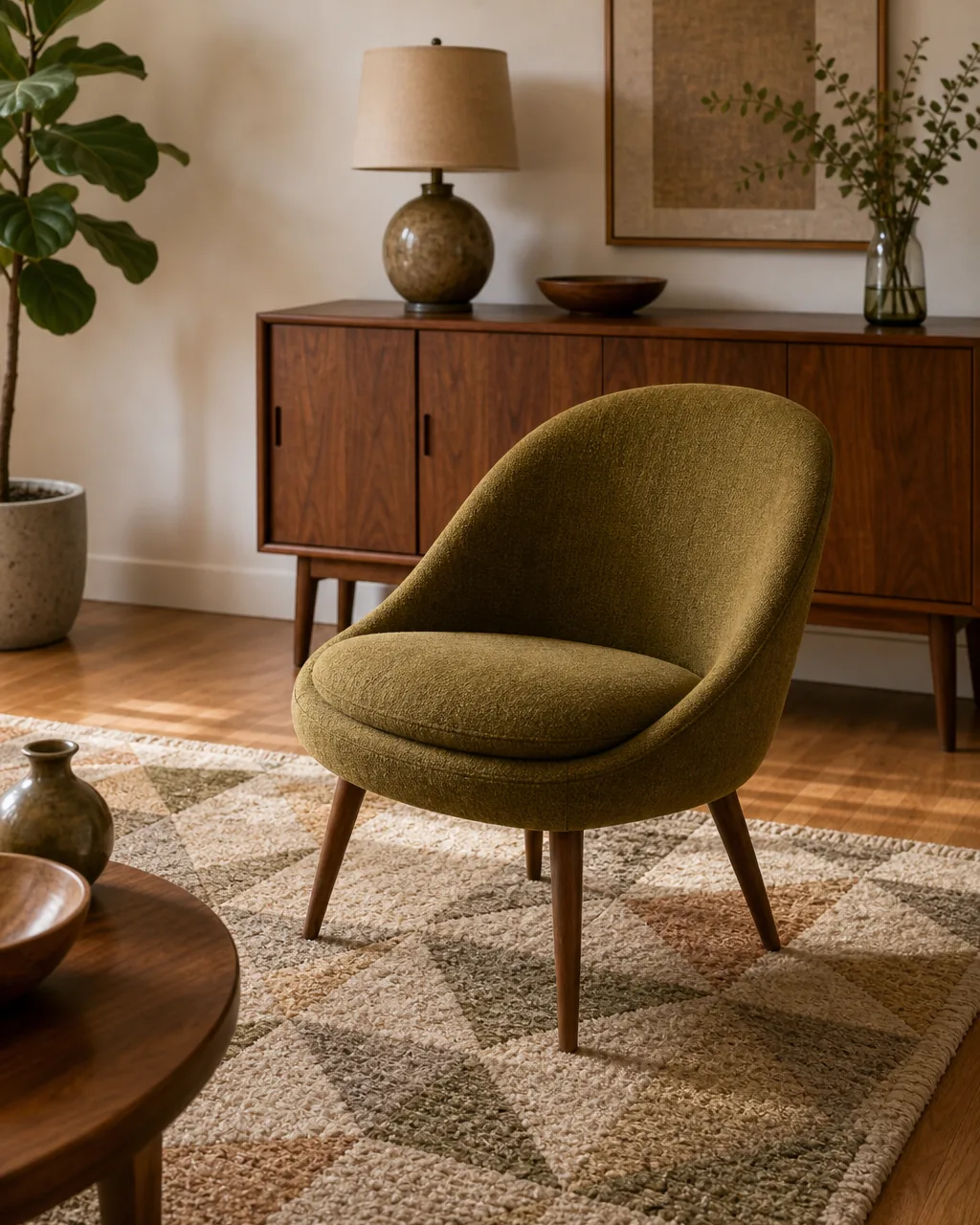
A single chair with a distinct sculptural silhouette — a curved shell back, an angled swivel base — placed slightly apart from the main seating group functions as a piece the room is arranged around, not just another seat filling a corner.
- Position the accent chair at a slight angle to the main seating group instead of squaring it up, which reinforces its “standalone object” role
- Leave a few inches of breathing room around the chair rather than pushing it flush against a wall or table, so its full silhouette stays visible
- Choose a chair whose shape reads as sculptural from every angle in the room, since this piece gets seen from more directions than a sofa does
- Skip adding a matching ottoman or side table directly beside it — pairing it down reinforces the “art object” read over “extra seating” read
- Reserve this move for one chair only; a second sculptural piece competes with the first instead of reinforcing the room’s single focal point
Pick One Saturated Accent Color for Color-Blocking, Not a Muted Earth Tone
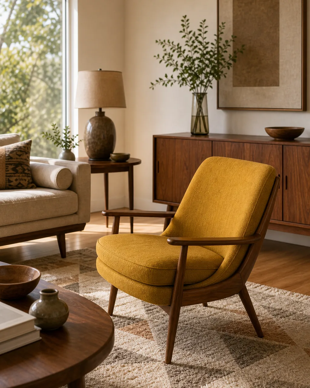
Mid-century palettes leaned into single saturated hits — mustard, burnt orange, olive — used as a color block against a warm neutral base, distinct from the softer muted earth-tone accents common in warm-modern rooms right now.
- Choose one saturated color and commit it to a single large surface, like a chair or a wall panel, rather than spreading it across several small accents
- Keep the rest of the room in warm neutrals so the one saturated color reads as a deliberate block, not just another accent among many
- Test the color against your walnut wood tone before committing — mustard and olive both pair cleanly, but not every saturated hue does
- Avoid pairing two saturated colors in the same sightline; mid-century color-blocking is a solo move, not a duo
- Repeat the exact same hue in a smaller accessory elsewhere in the room (a vase, a single book cover) to tie the color block back without adding a second block
These four rules separate a true mid-century room from one that just borrowed a few surface details.
Float Furniture on Slim Legs to Let the Floor Read as Part of the Room
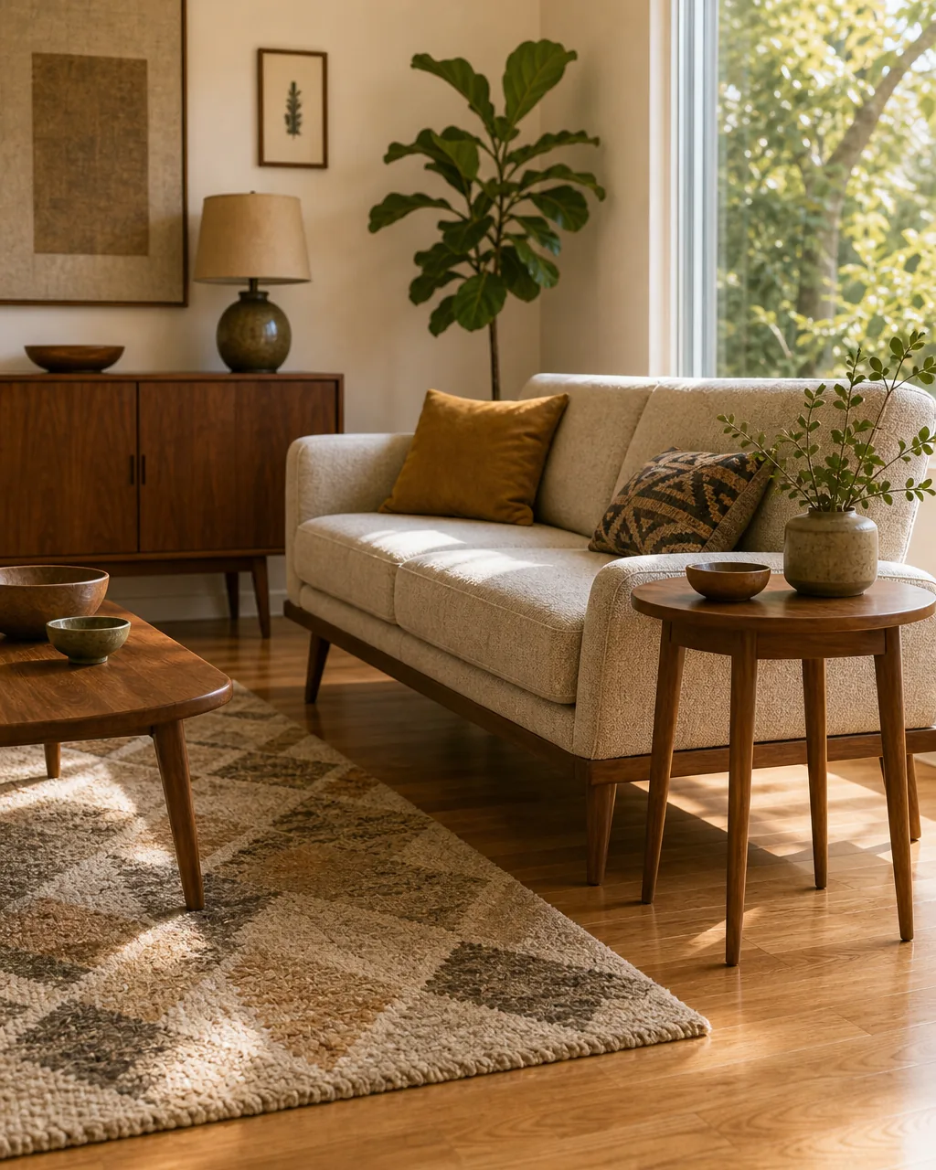
Keeping every seating piece raised on visible slim legs, rather than resting flush to the floor, keeps sightlines open across the room and makes even a small living room read larger without removing a single piece of furniture.
- Audit the room from the doorway and note where the floor disappears behind furniture bases — those are the pieces worth swapping first
- Choose legs slim enough that floor is visible on at least three sides of each piece, not just the front
- Pair this with a rug sized to sit clearly under the furniture group rather than wall-to-wall carpet, which cancels the floating-leg effect visually
- Keep floor lighting low-profile near floated furniture so the open sightline created by the legs isn’t blocked by a bulky lamp base
- Apply this rule room-wide rather than to one piece alone — a single floated sofa next to boxy end tables breaks the effect
Keep the Sofa Silhouette Low and Straight-Backed
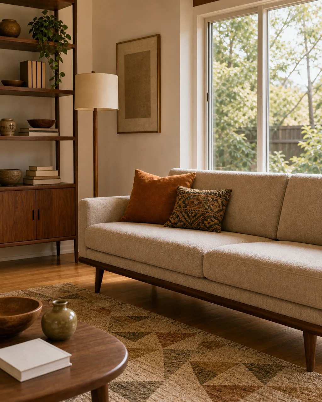
A low, straight-backed sofa profile — not an overstuffed or tall-backed contemporary shape — keeps the room’s horizon line low and lets taller pieces like a floor lamp or bookshelf read as intentional punctuation rather than clutter.
- Measure your current sofa’s back height against a nearby lamp or shelf; if the sofa competes with them in height, the horizon line is already too busy
- Choose a straight back over a rolled or tufted high back, since the flat line is what reads as mid-century rather than traditional or transitional
- Let one taller piece (a floor lamp, a tall plant, a bookshelf) stand clearly above the sofa’s low line, rather than several competing tall pieces
- Avoid stacking oversized throw pillows that visually raise the sofa’s back height back up above the intended low line
- Keep the coffee table low as well, so the whole seating group reads as one consistent low horizon rather than the sofa alone
Use Brass or Black Metal Lighting as the Room’s Single Sculptural Accent
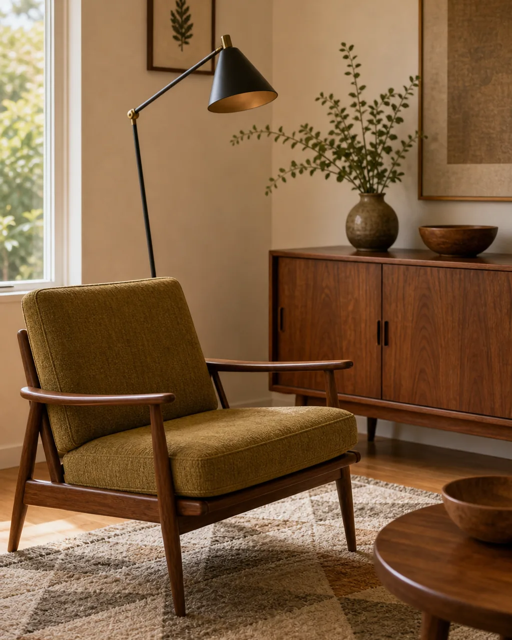
One slim-armed floor lamp in brass or matte black functions as a sculptural focal point rather than just another light source, standing in for the kind of fixture mid-century rooms treated as furniture in its own right.
- Choose a lamp with a visible angled or articulated arm rather than a plain straight pole, since the joint detail is what reads as sculptural
- Position the lamp beside the sculptural accent chair from idea five, letting the two pieces reinforce each other as the room’s focal pairing
- Match metal finish to your picture-frame hardware from idea four, so black or brass reads as one consistent metal choice through the room
- Keep every other light source in the room simple and recessed or hidden, so this one fixture stays the clear metal accent
- Skip a matching table lamp in the same finish nearby — one sculptural metal fixture per sightline is the rule, same as the accent chair and accent color
12 material and silhouette decisions, one real mid-century modern room
- 1Choose Furniture With Exposed Tapered Legs, Not Skirted BasesThe single most reliable silhouette signal — skirted bases read as generic-contemporary on sight.
- 2Anchor the Room in Warm Walnut Tone Wood, Not Gray or White OakTrue walnut sets the room apart from farmhouse and Scandinavian’s pale wood casts.
- 3Add One Graphic Geometric-Print Textile, Not a Matching PairA single bold pattern does more than a matched set spread across the room.
- 4Hang Art in Thin Black Metal Frames at a Strict Eye-LineFrame material and consistent height carry as much period signal as the art itself.
- 5Give the Room One Sculptural Accent Chair as a Standalone ObjectOne chair placed apart from the seating group reads as art, not just extra seating.
- 6Pick One Saturated Accent Color for Color-Blocking, Not a Muted Earth ToneMustard, burnt orange, or olive used as one solid block, never a muted earth tone.
- 7Float Furniture on Slim Legs to Let the Floor Read as Part of the RoomVisible floor beneath every piece keeps even a small room feeling open.
- 8Keep the Sofa Silhouette Low and Straight-BackedA low, flat back keeps the room’s horizon line low and taller pieces intentional.
- 9Use Brass or Black Metal Lighting as the Room’s Single Sculptural AccentOne articulated floor lamp functions as furniture, not just a light source.
- 10Let a Wall-Length Credenza Divide Storage From Living SpaceA long low credenza separates zones without adding a divider or curtain.
- 11Choose an Organic-Shaped Coffee Table Over a Rectangular OneA kidney or free-form shape breaks up the room’s rectangular furniture grid.
- 12Balance an Open Floor With One Graphic RugOne patterned rug anchors floated furniture and adds the room’s one floor-level accent.
styledhomenotes.com
Let a Wall-Length Credenza Divide Storage From Living Space
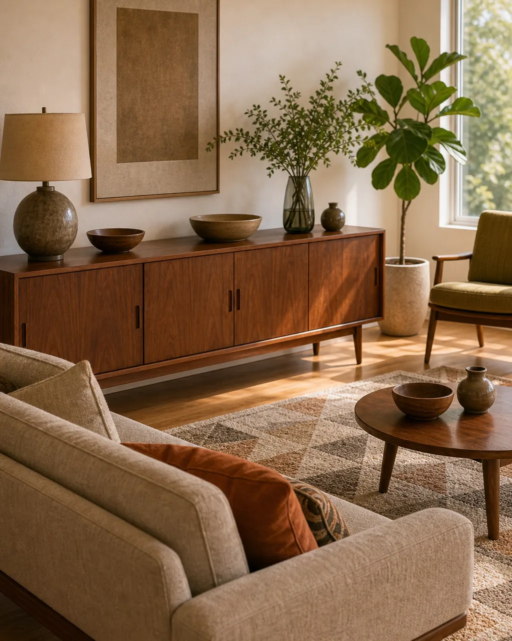
A long, low walnut credenza along one wall does double duty: closed storage plus a visual boundary that separates a media or bar zone from the seating group, without adding a room divider or curtain to the room.
- Position the credenza along the wall the seating group backs up against, so it reads as a natural boundary rather than an extra piece of furniture
- Use one end of the credenza for media or bar storage and the other end for display objects, so the division between “function” and “display” is visible
- Keep the credenza’s top surface at or below sofa-back height so it doesn’t block sightlines across the room
- Choose a credenza length that spans at least the width of the seating group behind it, so the visual boundary reads as intentional rather than partial
- Skip stacking decor too high on top of the credenza — a low, clean surface keeps the piece reading as a boundary rather than a display shelf
Choose an Organic-Shaped Coffee Table Over a Rectangular One
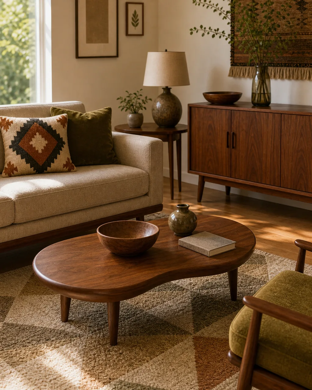
A kidney, boomerang, or free-form coffee table shape breaks up the grid of rectangular furniture already in the room and signals the era as clearly as the leg style does, without needing any additional styling to make the point.
- Measure the space in front of your sofa first — organic shapes often need a few extra inches of clearance since their widest point isn’t centered like a rectangle’s
- Choose a shape with at least one clearly curved or asymmetric edge, rather than a rounded rectangle that reads as just a soft-cornered version of the same shape
- Let the table stand with minimal styling on top — one bowl, one small object — so its silhouette stays the visible focal point rather than being hidden under decor
- Pair the organic shape with the room’s straight-lined sofa and rectangular rug for contrast, rather than matching it to another curved piece
- Keep the wood tone matched to your walnut anchor piece from idea two, so the shape reads as a deliberate choice rather than a mismatched addition
Balance an Open Floor With One Graphic Rug
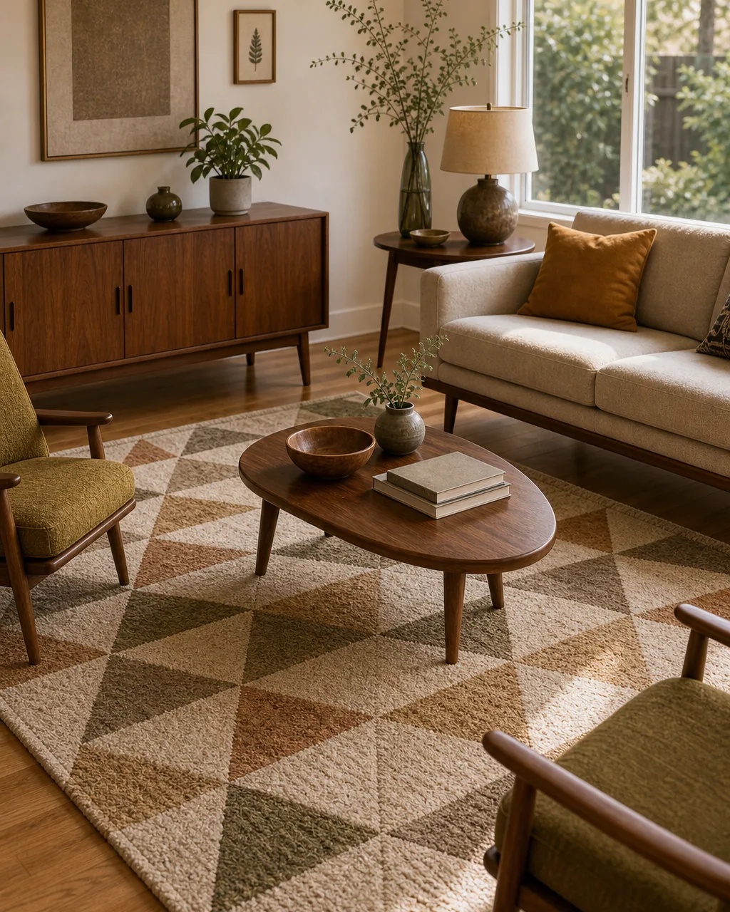
A single rug in a bold geometric pattern anchors the low-profile furniture group and adds the room’s one permitted burst of pattern at floor level, balancing the negative space the raised furniture legs create underneath every piece.
- Size the rug so all four legs of the main seating pieces sit on it, rather than just the front legs, which keeps the floating-leg effect from reading as awkward
- Choose a geometric pattern that shares at least one color with your saturated accent from idea six, so the floor and the furniture read as one palette
- Keep this rug as the room’s only patterned textile if you’ve already used the one-textile-accent rule from idea three, rather than doubling up on pattern
- Let the rug’s pattern scale be large enough to read from across the room — small tight repeats disappear under furniture and lose the graphic effect
- Vacuum-line or brush the rug’s pile in one direction after placing furniture, since a crushed, uneven pile reads as neglected rather than intentionally lived-in
None of these decisions require a full furniture swap to matter. A leg shape, a wood tone, a single saturated color — each one moves a room closer to the real era instead of a vague reference to it.
Once the material choices are set, see how a cozy living room uses a warmer, softer version of the same idea, or carry the same edited-down thinking into how you style open shelving nearby.

Nora writes about small, livable rooms for real apartments. Her first mid-century find was a walnut credenza pulled from a curb, and she spent a year learning which details actually read as the era and which just looked dated. Every move here is tested against real furniture, not a showroom vignette.
Nora Ellis edits Styled Home Notes. Visit the Nora Ellis author page. More from Nora: cozy living room ideas, living room shelf decor ideas.