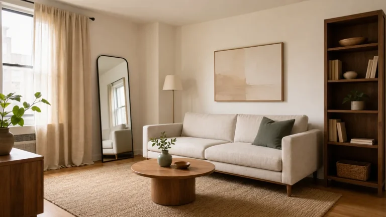
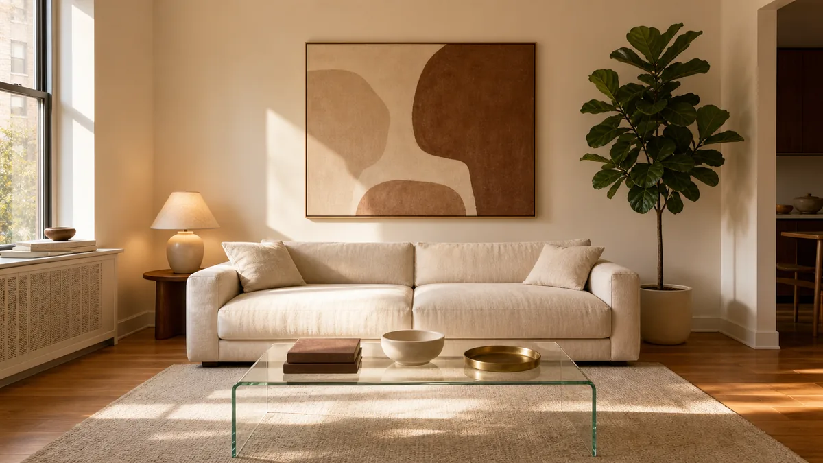
11 Minimalist Living Room Ideas That Feel Calm Without Looking Empty
A minimalist living room fails the same quiet way every time. Too many objects on too many surfaces, three competing color palettes, a gallery wall fighting with the sofa, a tangle of cords beneath the TV. The room reads as either visually noisy or, over-corrected, like a cold staging shot.
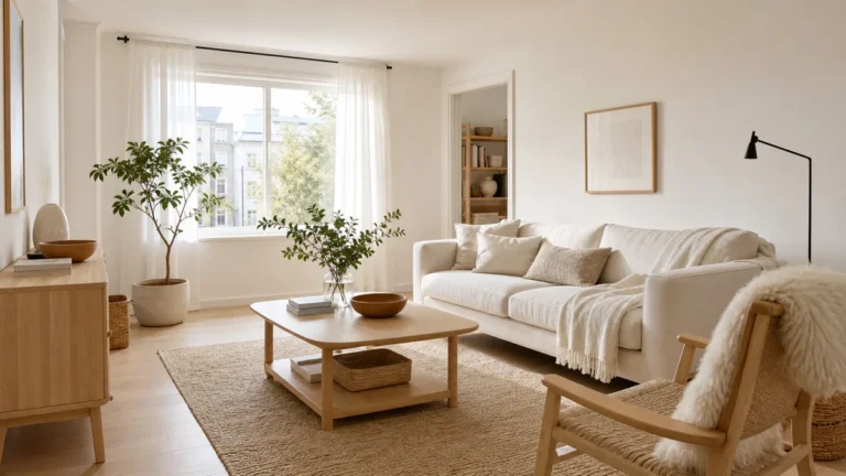
What separates a minimalist room that feels calm from one that feels cold is not the size or the budget. It is eleven editing decisions — anchors, palettes, breathing room, focal points, surface rules, and a recurring audit — most take an afternoon and run themselves for months.
These eleven moves work for any apartment living room. The same logic of editing-not-emptying shows up across the apartment in our minimalist small space ideas sister piece.
From a single anchor piece and a tight two-tone palette to a six-week remove-three edit — these eleven moves are editing decisions, not styling tricks. Jump to the question your living room is failing at right now.
- 1Pick one anchor piece and build the rest of the room around it
- 2Choose a two-tone palette and hold it for every object in the room
- 3Pull the sofa three feet from the wall and float the coffee table in front
- 4Hang one large piece of art at eye level instead of a gallery wall
- 5Limit every surface to three objects of varying heights, never four
- 6Conceal every cord and cable so every plane reads clean
- 7Pick one soft-good texture and repeat it across cushions, throw, and rug
- 8Use one large statement plant instead of five small ones
- 9Build a closed-storage rule — anything not beautiful lives behind a door
- 10Keep the coffee table at 50 percent empty, always
- 11Edit the room every six weeks with a remove-three audit
Pick One Anchor Piece and Build the Rest of the Room Around It
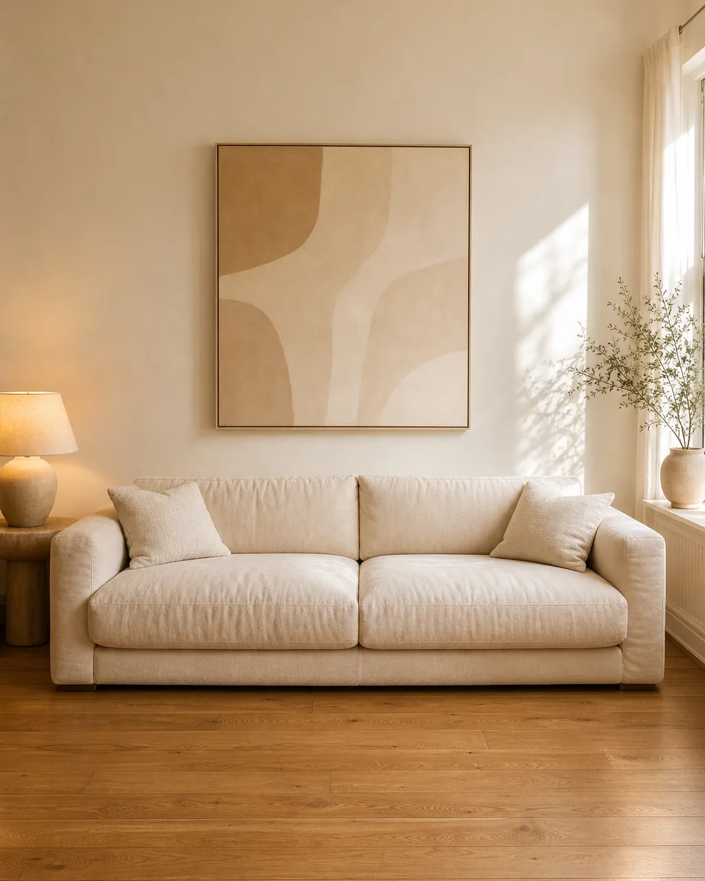
A minimalist living room without an anchor piece reads as five separate objects negotiating for attention. Every chair, side table, and lamp competes for visual weight, the eye has nowhere to land, and the room feels both half-finished and somehow too full at the same time.
Picking one anchor piece up front — usually the sofa, sometimes a single large piece of art or one statement floor lamp — and then editing every other object until it visibly supports the anchor is the move that turns a furnished room into a designed one. The anchor decides scale, color temperature, and where the eye starts; everything else earns its place by reinforcing those three answers.
- Pick the anchor before you buy anything else — usually the largest piece you spend most time touching, almost always the sofa
- Match anchor scale to the room, not to a showroom — a deep low-slung sofa in a small room is the anchor, not five small chairs
- Let the anchor decide the palette — every other piece pulls one color from the anchor and stays in that lane
- Reject any object that competes with the anchor for attention — second-most-interesting must read as quietly supporting, not co-starring
- Re-test the anchor whenever you add a piece — if the new object pulls the eye off the anchor, it is the wrong piece
Choose a Two-Tone Palette and Hold It for Every Object in the Room
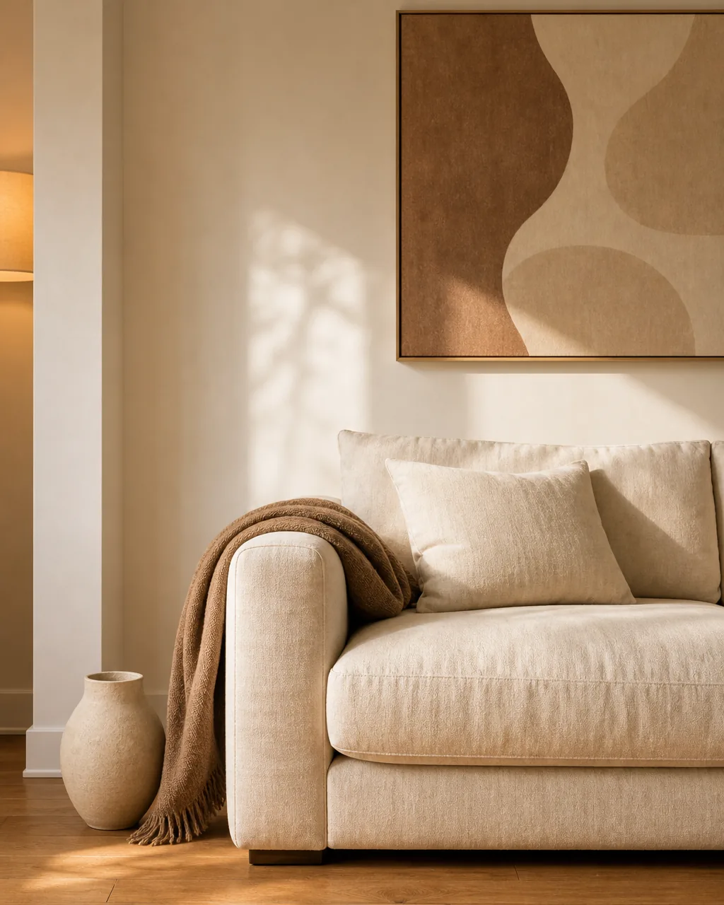
Most rooms that read as cluttered are not actually full of too many things — they are full of too many colors. A grey sofa, a navy lamp, a terracotta vase, and an emerald throw mean the eye has nowhere to rest because four palettes are arguing for floor space.
A two-tone palette — usually warm white plus warm oak, occasionally warm white plus muted sage — held tightly across every object in the room is the editing move that does the most work for the smallest effort. The room reads calm because the eye sees only two color decisions instead of seven, and adding a third primary anywhere — even one — immediately re-introduces the busy feeling.
- Write the two colors down before shopping — warm white plus warm oak is the most forgiving default for a minimalist room
- Audit every existing object against the palette — anything in a third primary color gets removed, recovered, or relocated to another room
- Allow neutrals (cream, oatmeal, cocoa) inside the palette — neutrals share temperature with the anchors and do not break the two-tone read
- Use the related modern living room ideas palette logic if your anchor leans modern — same two-color discipline, slightly cooler woods
- Re-audit the palette quarterly — small accent purchases (a pillow, a candle) drift the palette open without you noticing
You will not need all eleven at once. Find the situation below that matches your room today, and start with those two or three ideas.
Pull the Sofa Three Feet From the Wall and Float the Coffee Table in Front
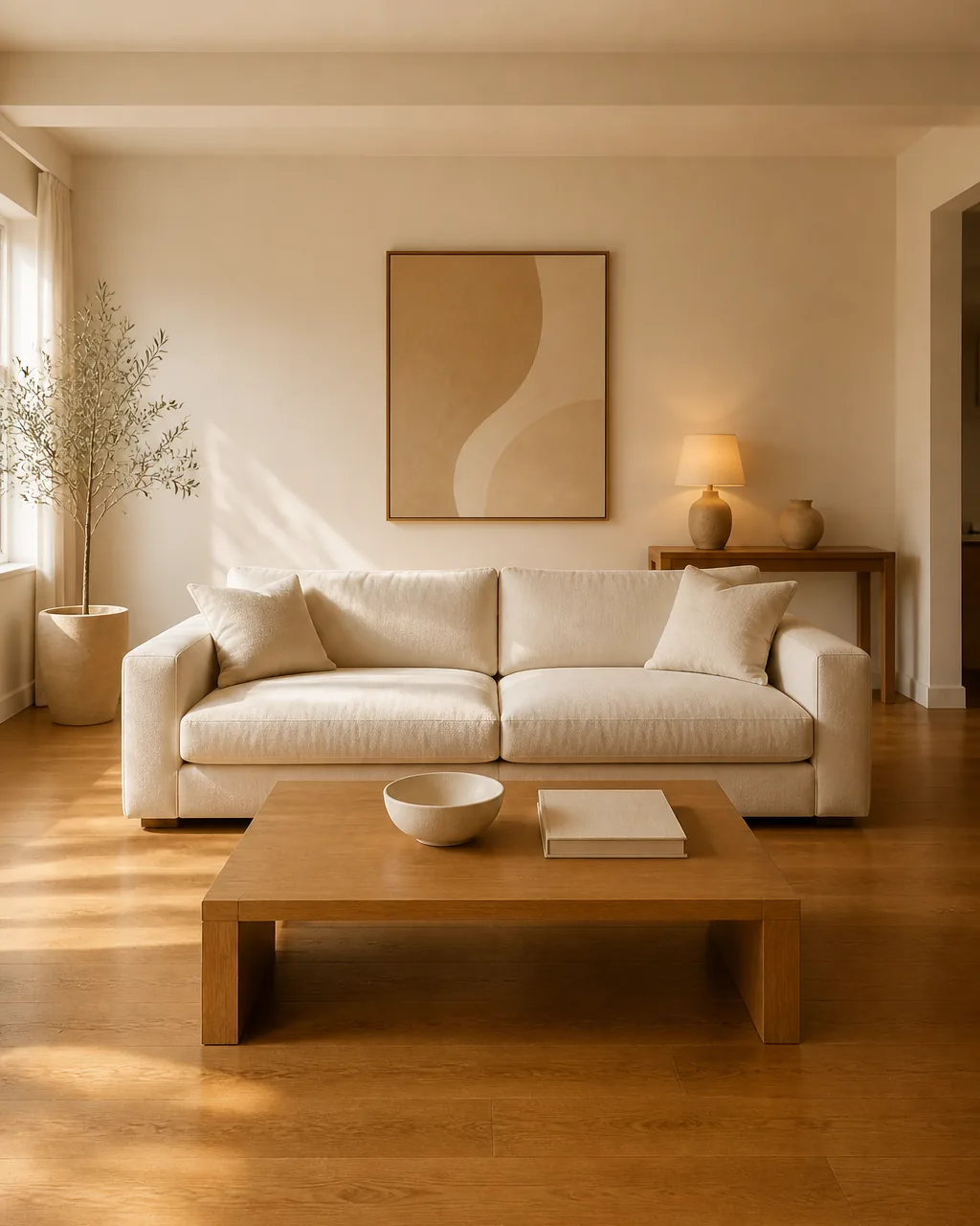
Pushing every piece of furniture against the perimeter walls makes a minimalist living room read as waiting-room empty in the middle and visually crowded around the edge. The floor in the center feels exposed, the walls feel weighted down, and the room reads as bigger but worse.
Pulling the sofa about three feet off the back wall and floating the coffee table in front gives every piece breathing room. The eye sees the room in layers instead of a single perimeter line, and people can walk behind the sofa instead of squeezing past the front.
Three feet is the rule of thumb. It leaves enough room to stand a side table or floor lamp behind the sofa without crowding.
- Measure three feet from the wall to the back of the sofa — less than two feet and the float does not register, more than five and the seating zone breaks apart
- Float the coffee table 14 to 18 inches from the front of the sofa — close enough to set a cup down without leaning forward
- Use the floated wall space behind the sofa for a single large piece of art or one floor lamp — leave nothing else against the wall
- Anchor the seating zone with a rug that runs at least under the front legs of the sofa and the full coffee table — floating without a rug feels unmoored
- Test the float by walking the room — you should be able to walk behind the sofa without turning sideways
Hang One Large Piece of Art at Eye Level Instead of a Gallery Wall
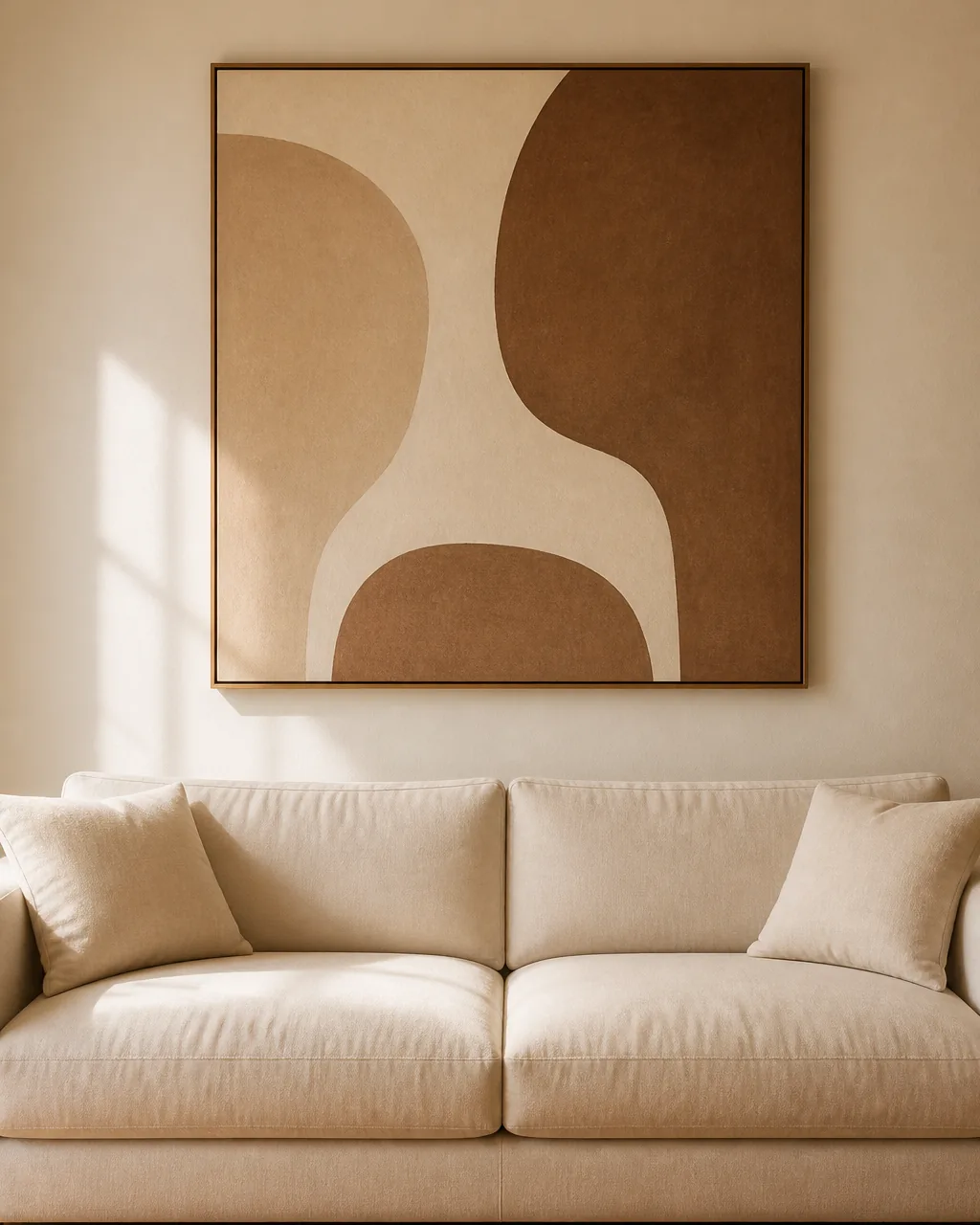
A gallery wall is the opposite of a minimalist move. Eight to twelve smaller frames create eight to twelve focal points, the eye jumps between them looking for the main subject, and the wall reads as decorated rather than designed.
One large piece of art hung centered at eye level above the sofa — roughly 57 inches from the floor to the middle of the piece — replaces the gallery cluster with a single quiet focal point. The wall reads as composed, the sofa beneath gets visually anchored to the wall above it, and the rest of the room is allowed to breathe because the eye has exactly one place to land first.
- Size the art to about two-thirds the width of the sofa — smaller and the wall reads as under-decorated, larger and it competes with the sofa anchor
- Hang the center of the art 57 inches from the floor — eye level for most adults, regardless of sofa height
- Pick abstract or quiet representational work over busy detail — minimalist walls reward calm imagery and punish high-detail prints
- Choose one frame style (or no frame) and stop — a single bare canvas, one warm-oak frame, or one slim black frame, never a mix
- Resist adding small pieces beside it later — if you need more art, swap the large piece for a different large piece, do not start a cluster
Limit Every Surface to Three Objects of Varying Heights, Never Four
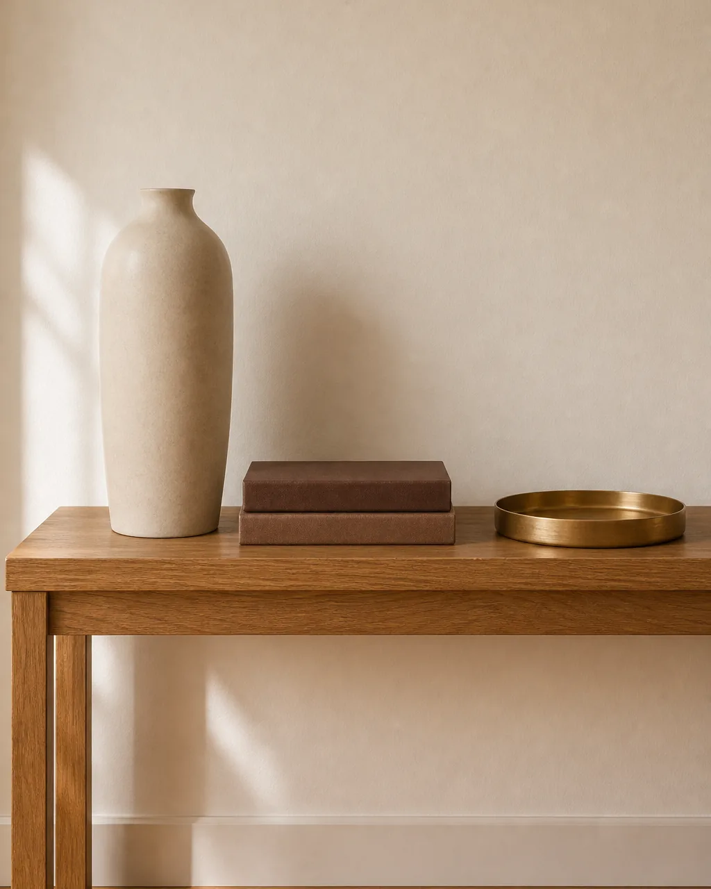
The single fastest way a minimalist living room slides back toward clutter is the surface drift — one weekend the console has three objects on it, the next weekend someone sets down a candle and a small framed photo, and a month later there are seven objects in a row reading as collection rather than composition.
Capping every flat surface — console, side table, coffee table, mantel, credenza — at exactly three objects of varying heights is the rule that holds calm against drift. Three reads as composed because the eye sees a triangle; four reads as collection because the eye reads a row. Varying heights one tall, one mid, one low keeps the trio from looking like soldiers lined up at attention.
- Set the rule out loud — “three objects per surface, varying heights” — so anyone in the household knows when an addition breaks it
- Use one tall (vase, lamp), one mid (book stack, small sculpture), one low (tray, small bowl) as the height formula
- Remove anything you cannot defend in one sentence — if the object does not have a reason to be on that surface, it does not stay
- Audit each surface weekly during normal cleaning — surface clutter accumulates fastest at the coffee table and the entry console
- Use a small basket nearby for objects you mean to put somewhere else — homeless objects are how surfaces grow to four and five
These four rules separate a minimalist living room that feels warm and lived-in from one that feels like an empty showroom — or sneaks back to clutter inside a month.
Conceal Every Cord and Cable So Every Plane Reads Clean
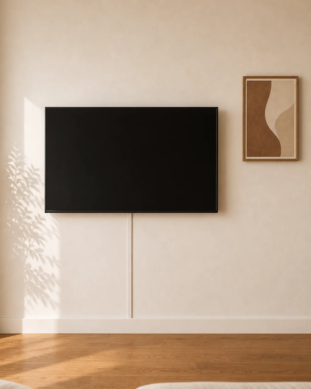
The leftover visual noise in a well-edited minimalist living room is almost always cords. The TV wall reads cluttered because of three dangling cables beneath the screen. The lamp on the console reads styled but the cord runs visibly down the wall and across the floor. The eye notices, even if no one consciously identifies why the room still feels busy.
A slim cord channel painted to match the wall under the TV, an in-wall cable pass-through for the lamp cord, and routing every other cable behind furniture so nothing reads visibly across a flat surface is the editing move that earns the most calm for the smallest hardware spend. The TV wall, the console, and the lamp wall all suddenly read as planes again instead of objects with strings attached.
- Buy a slim adhesive cord channel and paint it the wall color before installing — pre-painted channels read seamless after install
- Route TV cables down inside the channel into the credenza below — never let cables dangle visibly below the TV
- Use an in-wall pass-through (two small holes wired together) for lamps and console electronics — surface-mounted cords always read as clutter
- Coil excess cord with a small velcro tie and tape it to the back of the furniture — loose cord pools read as visual noise on the floor
- Audit cord visibility from every seat in the room — what reads clean from one angle often reveals a stray cable from another
Pick One Soft-Good Texture and Repeat It Across Cushions, Throw, and Rug
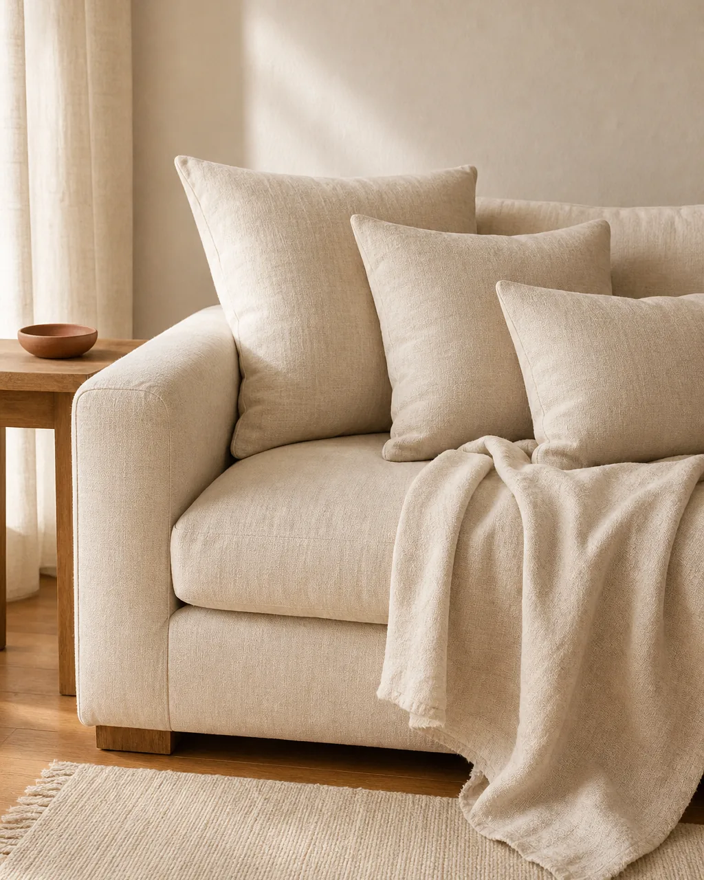
Mixed soft-good textures — a velvet cushion next to a boucle cushion next to a chunky knit throw on a flat-weave rug — read as collected rather than designed. The eye has to interpret four separate fabric languages in one seating zone, and the minimalist calm leaks out through the texture mismatch even when the color palette is held tight.
Picking one soft-good texture and repeating it across every cushion, throw, and rug makes the fabric story read as one decision instead of four. Warm linen is the most forgiving choice for a minimalist room.
Linen shares temperature with warm oak, it ages well, and it never reads precious. The room still has texture; it just stops shouting in four different fabric voices.
- Pick the texture before buying any soft goods — linen, wool, or boucle are the three minimalist-safe defaults
- Match within a slight tone range — three slightly different cream linens still read as one decision; one cream linen plus one terracotta velvet does not
- Mix knit weights within the chosen texture (chunky linen rug, mid linen throw, fine linen cushion) — texture variation lives inside the chosen family
- Avoid synthetic blends that visibly read as polyester sheen — synthetic shine breaks the matte minimalist register more than any color choice
- Refresh once a year by replacing one tired piece in the same texture — never re-mix to a new texture family
Use One Large Statement Plant Instead of Five Small Ones
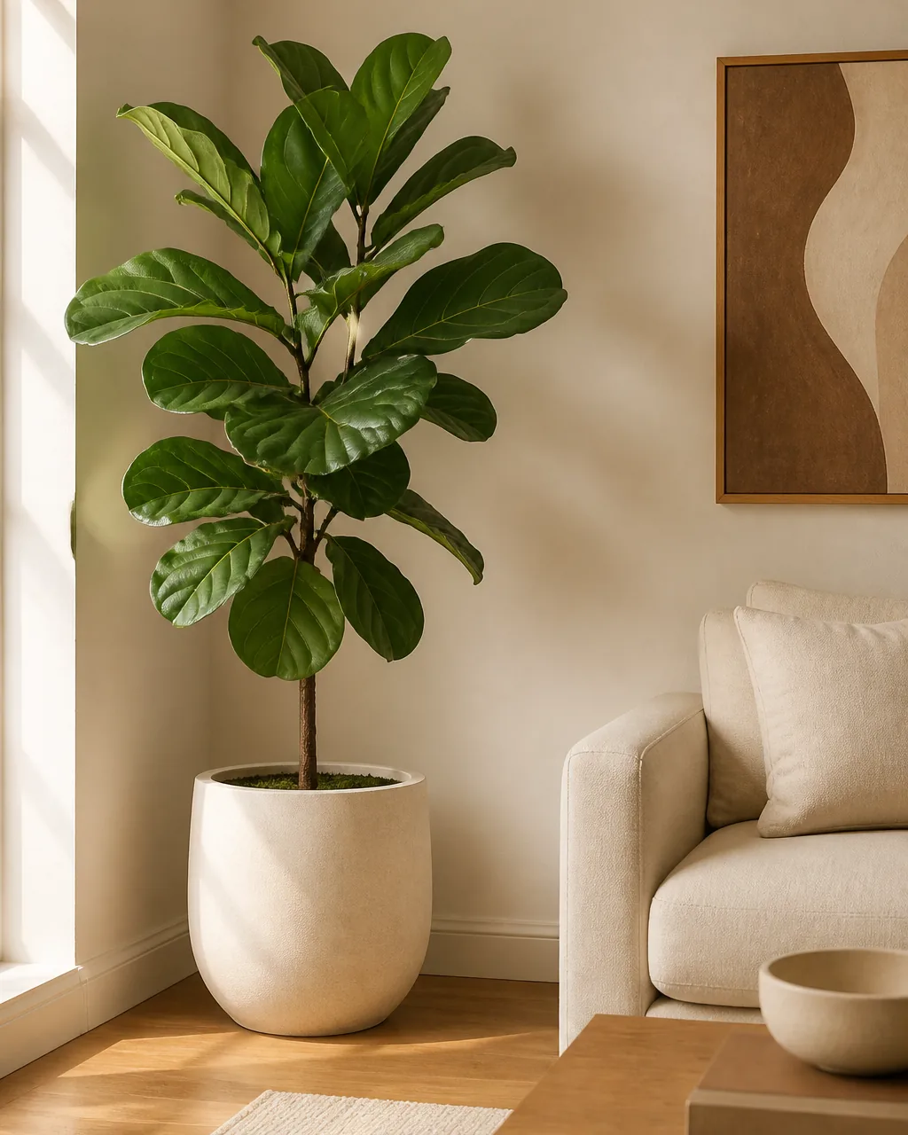
Five small plants scattered across a minimalist living room read as a plant collection, not as architecture. Each small pot demands a surface, each cluster of leaves adds visual noise to a different corner, and the room ends up feeling like a low-grade plant store instead of a designed space.
One large statement plant — a fiddle leaf fig, an olive tree, or a tall snake plant — in a single warm-cream ceramic pot anchored in one corner of the room replaces the collection with one piece of green architecture. The minimalism is maintained, the room gets the life that plants bring, and only one surface (the floor in one corner) is occupied instead of five.
- Pick a plant tall enough to read as architecture, not decoration — minimum four feet for a fiddle leaf or olive tree
- Anchor the plant in one corner the eye already travels to — never the dead center of a wall and never in front of the window
- Pick a pot that matches the warm palette — warm cream, cocoa kraft, or warm oak, never a high-contrast black
- Resist adding a second plant — the rule is one per room until the first one outgrows the space
- Treat the plant as committed furniture, not seasonal decor — moving it weekly breaks the visual anchor
11 minimalist living-room editing moves, one system that stays calm without going cold
- 1Pick one anchor piece and build the rest of the room around itOne foundation piece — usually a low-slung sofa — defines the whole room, and every other object earns its place by supporting that anchor instead of competing with it.
- 2Choose a two-tone palette and hold it for every object in the roomWarm white plus warm oak is the most forgiving minimalist pair, and refusing to introduce a third primary color anywhere is what keeps the room reading calm instead of busy.
- 3Pull the sofa three feet from the wall and float the coffee table in frontPulling the sofa off the back wall and floating the coffee table gives every piece breathing room and stops the perimeter-furniture feeling that makes a room read as waiting-room empty.
- 4Hang one large piece of art at eye level instead of a gallery wallA single large art piece centered at eye level above the sofa replaces what could have been a gallery cluster and gives the eye one quiet focal point instead of competing rectangles.
- 5Limit every surface to three objects of varying heights, never fourThree objects read as composed, four read as collection — and varying the heights one tall, one mid, one low keeps the surface from looking like a row of soldiers.
- 6Conceal every cord and cable so every plane reads cleanMost leftover visual noise in a minimalist room is cords — a slim cord channel painted to match the wall hides every cable and lets the TV wall, console, and lamps read as clean planes.
- 7Pick one soft-good texture and repeat it across cushions, throw, and rugA linen-only or wool-only soft-good palette across every cushion, throw, and rug keeps the fabric language consistent so the eye does not jump between competing weaves.
- 8Use one large statement plant instead of five small onesA single large fiddle leaf fig or olive tree in a warm-cream pot anchors a corner and replaces what could have been five smaller plants drifting across every surface.
- 9Build a closed-storage rule — anything not beautiful lives behind a doorA long low credenza with closed cabinet doors hides electronics, cables, mail, and remotes — the most reliable shortcut to a calm room is hiding everything that is not actively earning its visible spot.
- 10Keep the coffee table at 50 percent empty, alwaysHalf the table surface clear is the active ingredient — three objects placed on one side and intentional empty wood on the other reads as restful instead of styled-for-photos.
- 11Edit the room every six weeks with a remove-three auditSix weeks is when minimalist rooms quietly drift back toward clutter — a calendar reminder to remove exactly three objects, no replacements, keeps the system honest without needing a full reset.
styledhomenotes.com
Build a Closed-Storage Rule — Anything Not Beautiful Lives Behind a Door
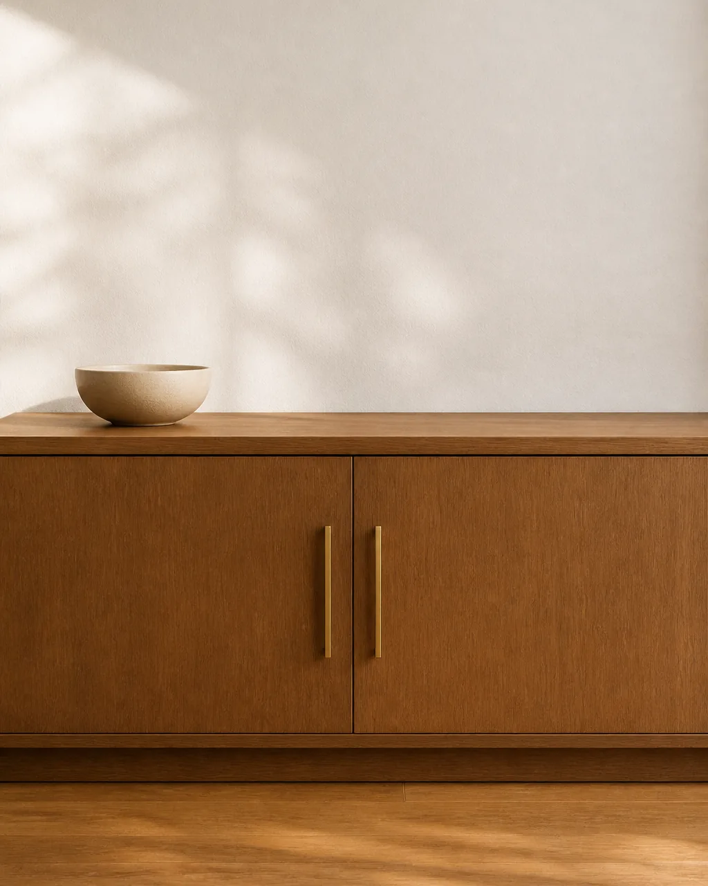
Open shelving in a minimalist living room becomes a daily styling problem. Remotes, mail, charging cables, headphones, paperwork, and the random not-quite-decor that real households accumulate end up on the open shelves because there is nowhere else to put them, and the calm of the room is gone inside a week.
Building a closed-storage rule — anything not actively beautiful lives behind a cabinet door — is the system that holds minimalism against the friction of everyday life.
A long low credenza with closed cabinet doors below the TV wall absorbs all the not-pretty essentials. Only the few intentional objects on top stay visible. The room reads minimalist because the household’s actual stuff has been edited from view, not removed.
- Buy storage with doors, not open shelves, for any piece that will hold daily-use objects — remotes, mail, charging stations, paperwork
- Reserve open shelves only for genuinely styled displays — books, ceramics, a small art object — never for utility
- Cap the credenza top at the rule-of-three — three objects of varying heights, never four, no matter how much surface is available
- Use small bins or trays inside the closed storage to keep the inside organized — closed doors hide chaos, they do not solve it
- Apply the same rule to entry and side tables — if the surface tends to attract clutter, swap it for a piece with a closed drawer or door
Keep the Coffee Table at 50 Percent Empty, Always
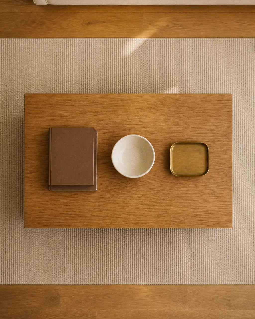
A coffee table is the surface most likely to drift back to clutter in any minimalist living room. People set down keys, mail, mugs, magazines, remotes, and snacks every day, and unless the surface starts the day visibly half empty, by evening it looks indistinguishable from the maximalist table next door.
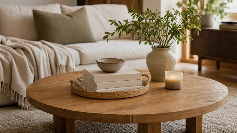
Keeping the coffee table at 50 percent visibly empty as the baseline — three intentional objects on one side, deliberate empty wood on the other — is what makes the minimalism survive normal use. Empty space is the active ingredient, not the absence of decor.
A coffee table with three objects on the left side and clear wood on the right looks restful. The same three objects spread across the whole surface looks styled-for-photos, and crumbles the first time someone sets a mug down.
- Place styling on one side only — the left third or the right third, never spread across all three thirds
- Use a low brushed-brass tray to contain everyday items (remote, candle, coaster) — the tray makes the clutter look intentional and removable
- Clear the table at the end of every day — five seconds of cleanup is the rule that keeps the 50-percent baseline from drifting to 80
- Do not add a fourth object even when the surface looks bare — the empty space is the design choice, not a missing object
- When guests come, hide the everyday tray altogether — pure empty wood reads as more generous than even three styled objects
Edit the Room Every Six Weeks With a Remove-Three Audit
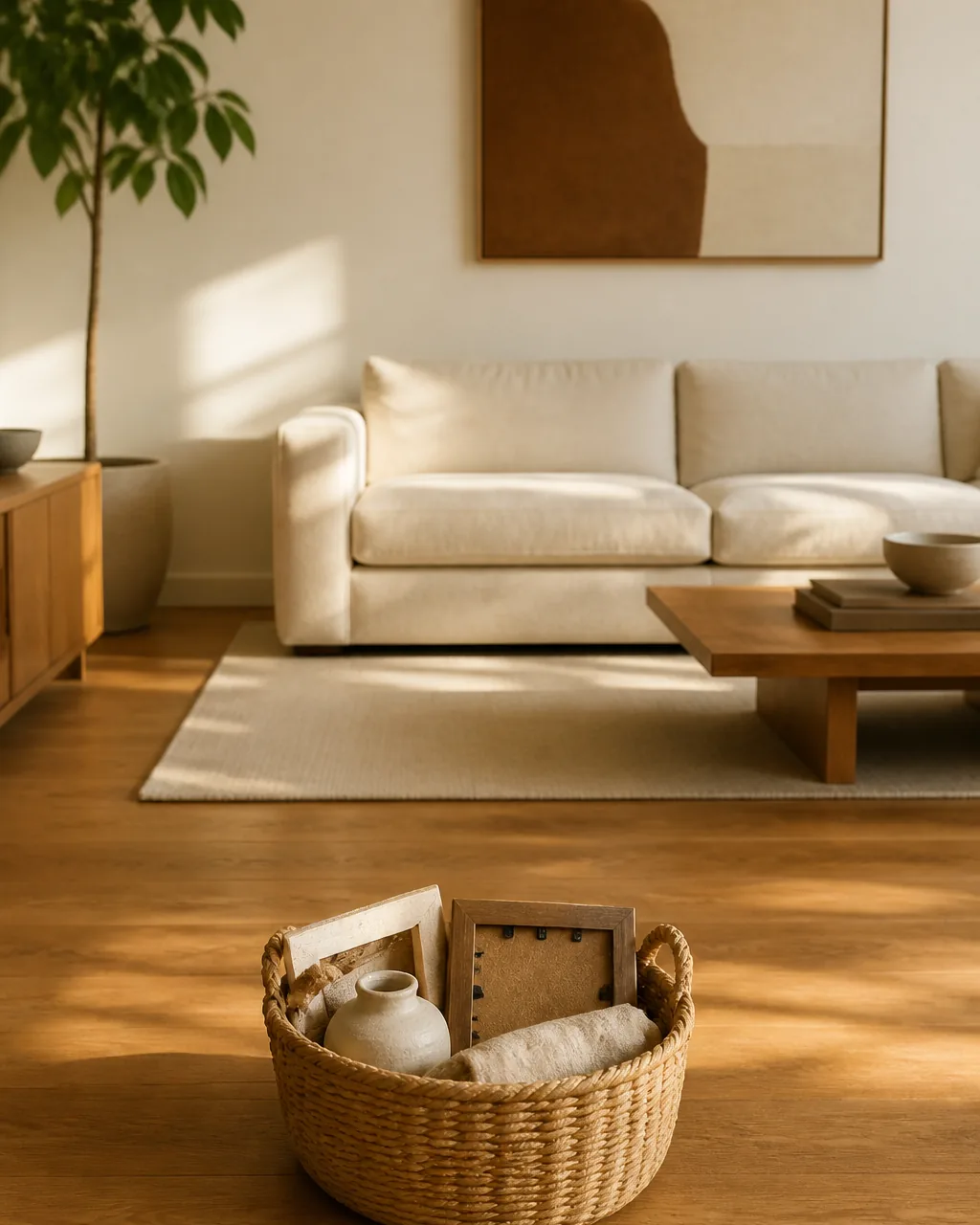
The cleverest minimalist living room in the world drifts after six weeks. New small things arrive — a candle from a friend, a magazine, a basket bought on sale, a pillow that seemed like a good idea — and the room slowly fills back up by one object at a time until the original calm is gone and no single addition is the obvious culprit.
A scheduled six-week remove-three edit — walk the room, identify exactly three objects to remove, take them out, no replacements — is the maintenance rhythm that holds the system over months. The labor is small (ten minutes), the rule is unambiguous (exactly three, no more), and the result is that the room never quietly drifts back to the cluttered baseline it started from.
- Put the edit on the calendar every six weeks — the first Saturday morning of every other month is a low-friction default
- Walk the room counter-clockwise from the door — a fixed walking path forces every surface to get reviewed
- Remove exactly three objects, no more — capping the number forces real choices and prevents the editing session from becoming a frustration purge
- Box the removed objects for thirty days before deciding their fate — if you do not miss them in a month, they were drift
- Skip the remove-three only if you actively removed three objects in the previous two weeks — the rule is rhythm, not arithmetic
The same editing discipline shows up in different rooms across the apartment in the cozy living room ideas (for warmth-led rooms) and the modern living room ideas (for shape-led rooms).

Nora writes about small, livable systems for real apartments. Her own living room runs one cream linen sofa as the anchor, a two-tone warm-white-and-warm-oak palette held across every object, exactly three things on the coffee table at any time, and a six-week remove-three edit on the first Saturday of every other month — which is why every move in this guide gets pressure-tested against a real apartment, real daylight, and a household that actually has to live with whatever the room asks of it on a Tuesday night.
Nora Ellis edits Styled Home Notes. Visit the Nora Ellis author page. More from Nora: minimalist small-space ideas, modern living room ideas, cozy living room ideas.