13 Studio Apartment Layout Ideas That Make One Room Feel Like Several
A studio apartment’s biggest problem isn’t the missing walls. It’s furniture that never got told where to stand.
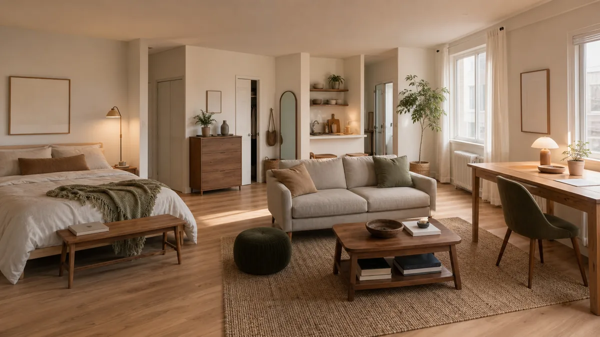
The bed, the sofa, the desk — they default to whatever corner was closest on moving day. That’s what makes one room feel like four things fighting for the same floor. What solves it is furniture geometry: which corner holds the bed, which way the sofa floats, how wide the path stays.
These 13 ideas are placement and orientation only — nothing to buy, just where you put what you own. For the fuller toolbox with dividers and rugs, start with this studio apartment ideas guide.
No dividers, no curtains — just where the bed, sofa, and table actually sit. Find the move that matches your floor plan and start there.
- 1Anchor the Bed in the Corner Farthest From the Front Door
- 2Float the Sofa Perpendicular to the Wall to Fake a Second Wall
- 3Keep a Straight, Furniture-Free Path From the Door to the Window
- 4Let the Window Anchor the Living Zone, Not the Entry Door
- 5Angle the Bed 45 Degrees Only When the Corner Is Too Tight for Square
- 6Push the Fold-Down Table Flat Against the Wall Until Meal Time
- 7Rest One Rug Under Just the Living Furniture’s Footprint
- 8Put All the Open Shelving on One Wall, Leave the Facing Wall Bare
- 9Use the Kitchen Counter’s Edge as the Line Between Cooking and Living
- 10Keep Furniture Low Near the Bed, Let It Rise Near the Living Zone
- 11Check the Door and Closet Swing Arcs Before Placing Anything
- 12Match the Rug’s Long Edge to the Room’s Longest Wall
- 13Give the Desk a Window View Instead of a Wall View When Space Allows
Anchor the Bed in the Corner Farthest From the Front Door
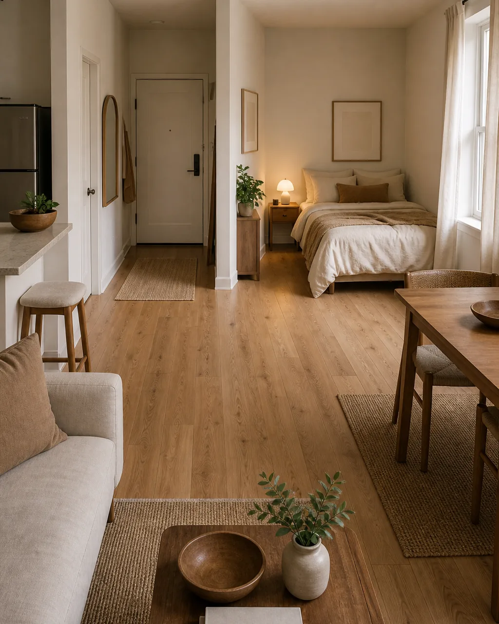
The bed is the one piece of furniture that defines whether a studio reads as private or exposed the second someone walks in. Anchoring it in the farthest corner from the door means anyone entering sees the living zone first, not an unmade bed.
- Measure the diagonal from the door to every corner before deciding — the farthest corner isn’t always the one that looks obvious at a glance
- Face the headboard away from the direct sightline of the door, even if that means it isn’t flush against the true corner wall
- Leave at least two feet of clearance on the accessible side of the bed so it doesn’t feel wedged into the corner
- Use the corner’s two walls to your advantage — flank the bed with a nightstand on the open side, not squeezed against both walls
- Keep the corner assignment fixed once set; moving the bed later to “try” a different spot usually disrupts every other zone that adjusted around it
Float the Sofa Perpendicular to the Wall to Fake a Second Wall
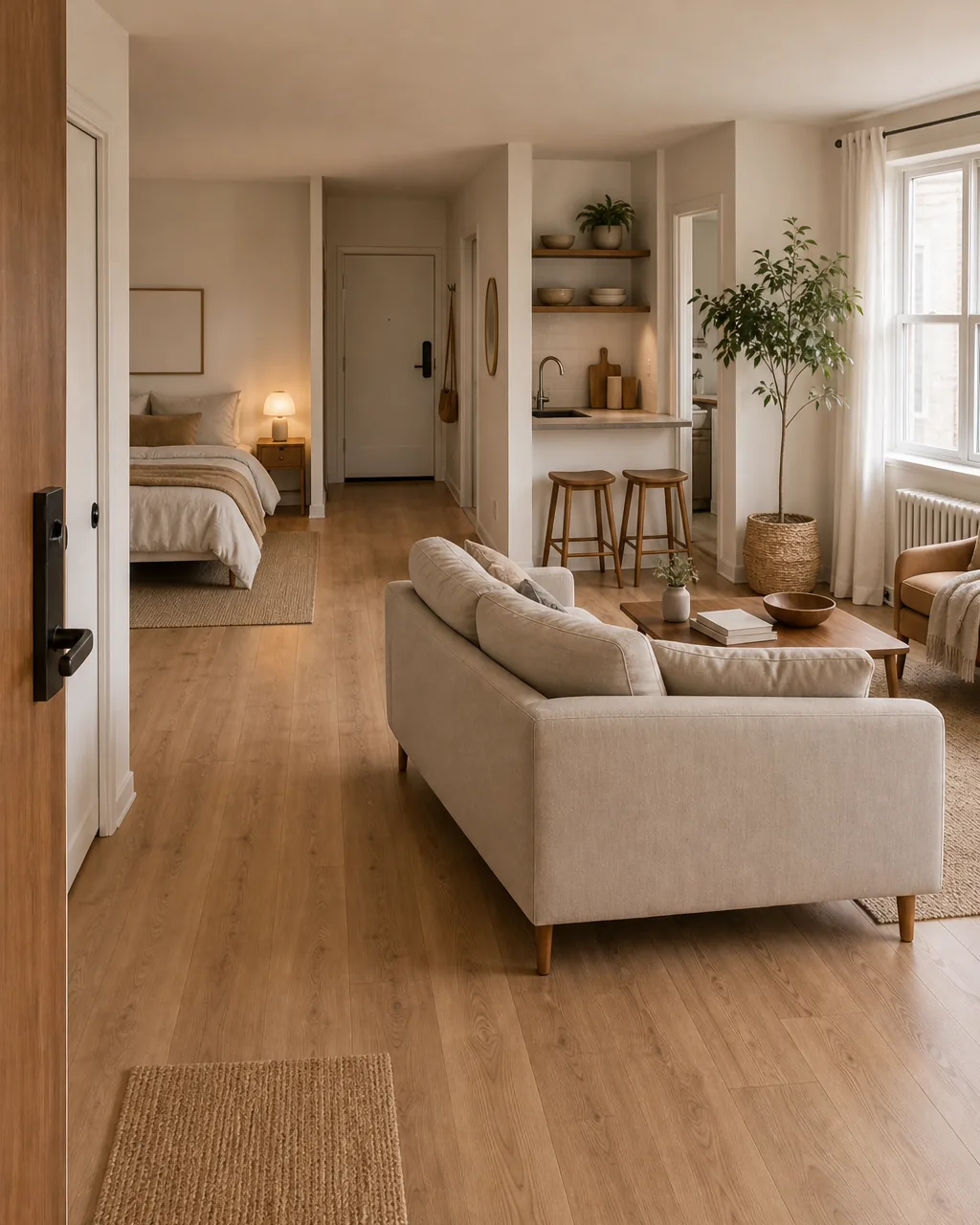
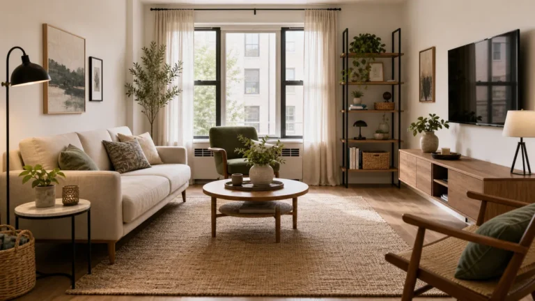
A sofa pushed flush against a wall reads as one more piece of furniture in an open room. The same sofa floated perpendicular — its back facing into the room instead of a wall — acts like a low wall of its own, without adding a single divider.
- Leave at least 30 inches behind the floated sofa back for walking clearance, or the “wall” effect collapses into a squeeze
- Position the perpendicular sofa so its back faces the zone you want to visually separate from, not the zone you want to highlight
- Add a slim console or side table at the sofa’s open end to reinforce the boundary line without blocking the walkway
- Anchor the floated end with a rug that stops where the sofa’s silhouette stops, so the boundary reads consistently from floor to furniture
- Skip this move in very narrow studios — floating a sofa needs enough width on both sides, or it just creates two cramped halves
Keep a Straight, Furniture-Free Path From the Door to the Window
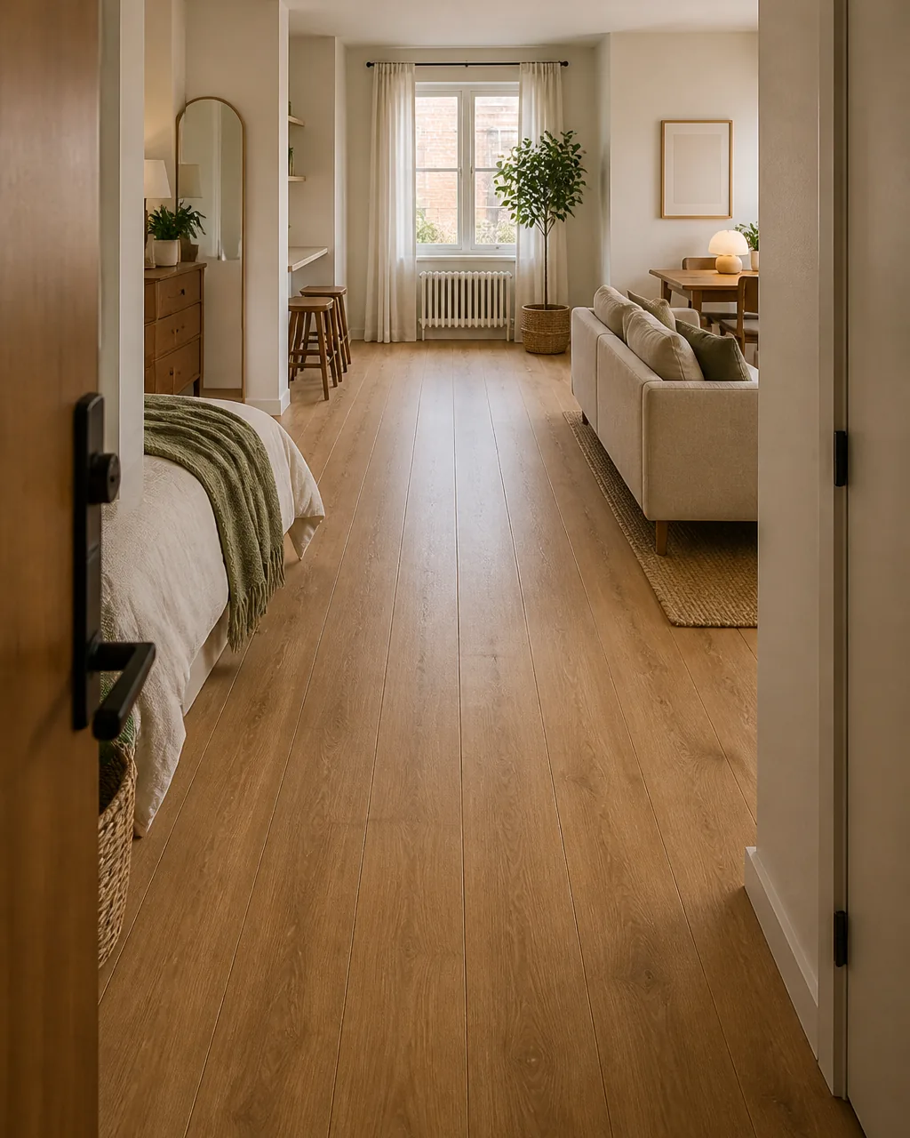
Every studio has one line that gets walked more than any other: door to window, day after day. When furniture drifts into that line, the whole room feels tighter than its actual square footage. Keeping that specific path clear does more for how spacious a studio feels than any single piece of furniture removed.
- Identify the door-to-window line first, before placing anything else — every other furniture decision should work around this line, not through it
- Aim for at least 30 inches of clear width along the path, the minimum for comfortable two-way walking
- Push furniture legs and corners to the outer edge of the path rather than just “mostly” clear — a chair leg six inches into the line still catches a foot
- Use the path as the room’s spine when arranging everything else; furniture on the left and right can differ, but the center stays open
- Re-check the path after adding any new furniture piece, since a single new side table is often what quietly narrows it
The right first move depends on where your door and window sit, not personal taste. Find the situation below that matches your room today.
Let the Window Anchor the Living Zone, Not the Entry Door
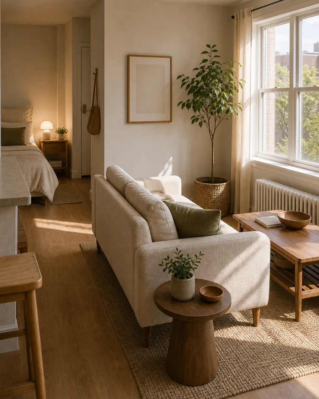
Most studios default to arranging the living zone around wherever the door happens to be, since that’s the first thing anyone notices on move-in day. Anchoring the living zone to the window instead — the best natural light source in the room — gives the space a real focal point that has nothing to do with traffic flow.
- Face the sofa toward the window rather than toward the door, even if the door is the more “obvious” orientation
- Center the coffee table on the window’s midpoint, not on the room’s overall midpoint, so the whole grouping reads as intentional
- Let daylight do double duty as the zone’s natural light source, saving a floor lamp for evening use only
- Keep tall furniture out of the direct window-to-seating sightline, even along the side walls
- Revisit this anchor point seasonally — a window that gets harsh afternoon sun in summer may need a sheer panel, without moving the furniture
Angle the Bed 45 Degrees Only When the Corner Is Too Tight for Square
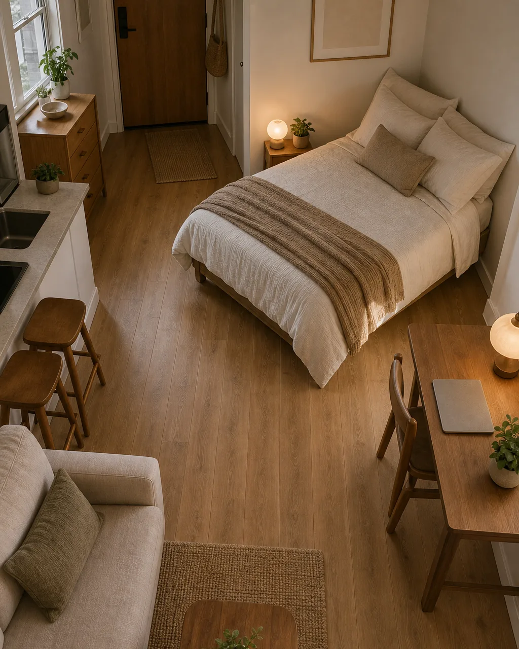
A square, flush-to-the-wall bed placement is almost always the better default — it wastes the least floor space and keeps sightlines simple. But in a corner too narrow for the bed’s full width to sit flush, angling it 45 degrees can open up walking space on both sides that a square fit would have blocked entirely.
- Try the square placement first and only switch to an angle if the bed genuinely doesn’t fit without blocking a door or window
- Measure the triangular gap the angle creates behind the headboard — that dead space needs a plan, or it becomes a dust trap
- Keep the angle consistent with the room’s dominant sightline, not fighting against the door-to-window path
- Use the angled position to create two usable side gaps rather than one wide one and one unusable sliver
- Reconsider the whole furniture plan if angling the bed still doesn’t solve the space problem — the issue may not be the bed at all
Push the Fold-Down Table Flat Against the Wall Until Meal Time
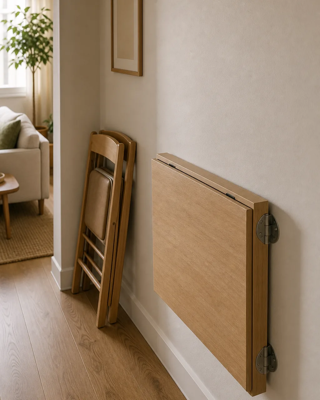
A dining table that stands open all day claims floor space whether anyone’s eating or not. A fold-down table flat against the wall gives that same square footage back to the rest of the room for the other 22 hours of the day, and only defines a dining zone when it’s actually needed.
- Mount the fold-down bracket into a stud, not just drywall anchors — a wall-mounted table takes real downward force when open and loaded
- Choose a wall with at least the table’s full open depth clear in front of it, so unfolding doesn’t collide with other furniture
- Pick a tabletop finish that matches the room’s existing wood tones, since it stays visible as a flat panel even when folded
- Keep chairs stored nearby but out of the main walking path — stacked or hung, not left standing in the clear zone
- Fold the table back down right after each meal rather than “later,” or it quietly becomes a permanent open table again
These four rules separate a studio that reads as multiple rooms from one that just has furniture scattered around.
Rest One Rug Under Just the Living Furniture’s Footprint
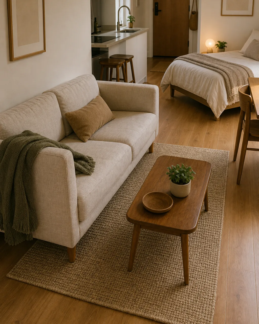
A rug that’s too small floats disconnected under a coffee table; a rug that’s too big blurs into the rest of the room and stops doing any zoning work. Sizing one rug to exactly the living furniture’s footprint — sofa front legs in, coffee table fully on — turns the rug itself into the zone’s boundary line, no curtain required.
- Measure the sofa and coffee table’s actual footprint before shopping, not the “room size” rug charts most retailers show
- Let the rug’s front edge sit just past the sofa’s front legs, not centered under the whole seating arrangement
- Stop the rug boundary clearly short of the dining or bed zones, so its edge reads as an intentional line, not a mistake
- Choose a low pile in a studio this size — rugs with more texture read as louder zoning statements than the room may need
- Vacuum along the rug’s exact edge weekly; a fraying or curling boundary edge undercuts the entire visual effect
Put All the Open Shelving on One Wall, Leave the Facing Wall Bare
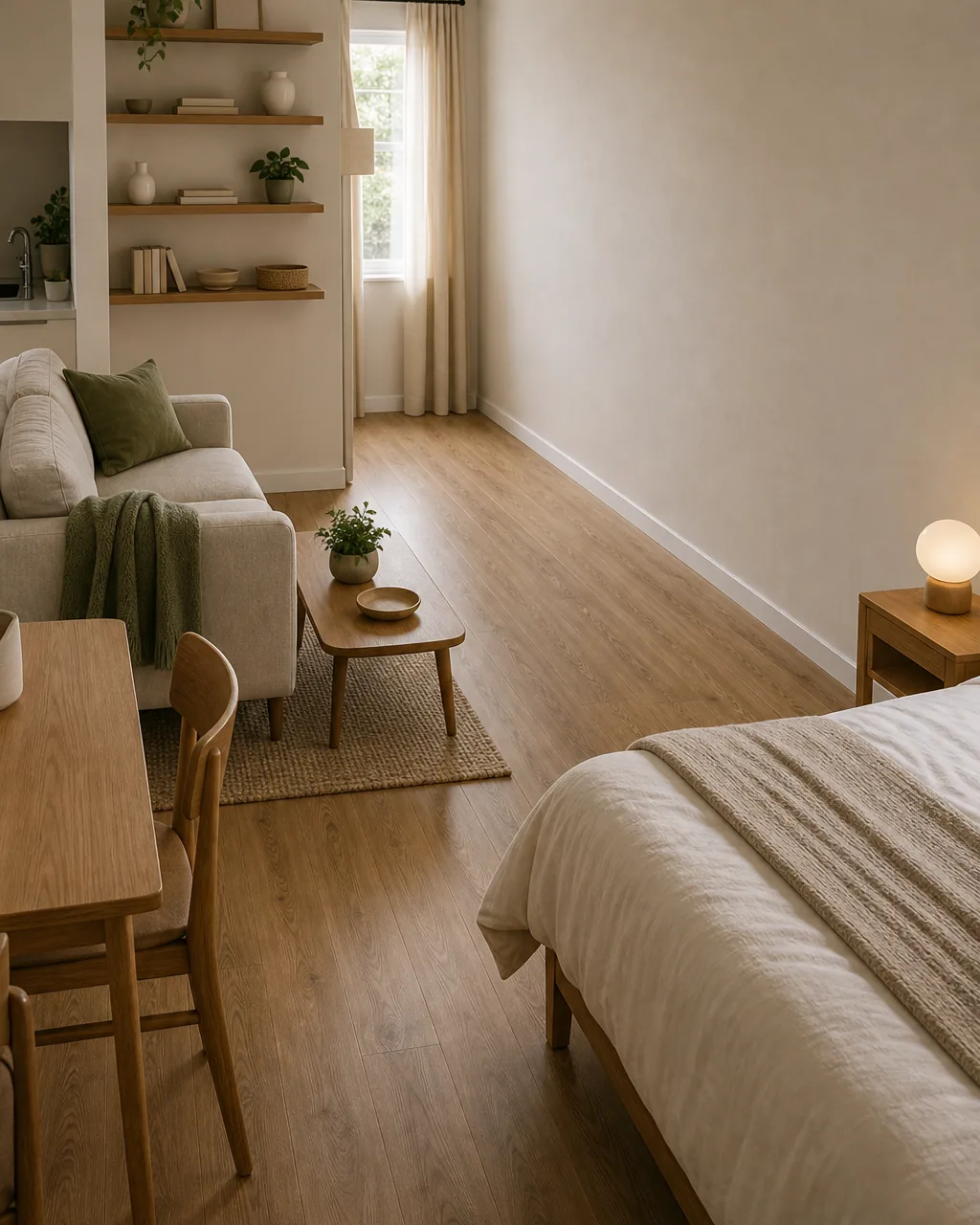
Open shelving spread across every available wall makes a studio feel visually noisy from every angle at once. Concentrating all of it on a single wall and leaving the facing wall bare gives the eye one clear place to land and one place to rest, instead of clutter in every sightline.
- Choose the wall with the least window and door interruption for shelving, so the run reads as one continuous system
- Leave real negative space between shelf groupings rather than filling every inch — a packed shelf wall reads as storage, not styling
- Keep the facing wall genuinely bare, resisting the urge to add “just one” piece of art once the shelving is styled
- Anchor floating shelves into studs, since a corner or narrow wall run still carries real weight from books and objects
- Reassess the shelf wall’s density every few months — items tend to accumulate there specifically because it’s the “shelf wall”
Use the Kitchen Counter’s Edge as the Line Between Cooking and Living

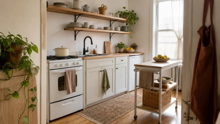
A kitchen counter already has a hard physical edge — most studios just don’t use it as the zoning line it already is. Letting the counter’s edge mark exactly where “cooking” ends and “living” begins means nothing else needs to define that boundary; the existing architecture does the work.
- Keep all cooking-related items strictly behind the counter’s edge, resisting the drift of mail or shoes onto the living side
- Position the nearest living-zone furniture to align with, not overlap, the counter’s front edge line
- Use a runner rug or mat only on the kitchen side of the edge, reinforcing rather than blurring the boundary
- Skip adding a visual divider on top of the counter edge — a curtain or shelf here usually competes with a boundary that already works
- Keep counter-edge clutter to a minimum on the living-room-facing side specifically, since that’s the side most visible from the seating
13 layout moves, one studio that reads as several rooms
- 1Anchor the Bed in the Corner Farthest From the Front DoorPuts the most private piece of furniture out of the sightline the moment the door opens.
- 2Float the Sofa Perpendicular to the Wall to Fake a Second WallA sofa turned into the room reads as a boundary line the eye respects, with no divider needed.
- 3Keep a Straight, Furniture-Free Path From the Door to the WindowOne clear line through the room keeps the whole studio feeling walkable instead of cramped.
- 4Let the Window Anchor the Living Zone, Not the Entry DoorOrienting seating toward daylight instead of the door makes the living zone feel chosen, not leftover.
- 5Angle the Bed 45 Degrees Only When the Corner Is Too Tight for SquareA diagonal placement only earns its keep when a square one genuinely won’t clear the walking path.
- 6Push the Fold-Down Table Flat Against the Wall Until Meal TimeGives the room a real table without permanently spending floor space on it.
- 7Rest One Rug Under Just the Living Furniture’s FootprintThe rug’s edge alone tells the eye where one zone ends, no curtain required.
- 8Put All the Open Shelving on One Wall, Leave the Facing Wall BareConcentrating storage on one wall gives the eye a resting wall on the other.
- 9Use the Kitchen Counter’s Edge as the Line Between Cooking and LivingThe counter itself is already the boundary — nothing extra needs to be added.
- 10Keep Furniture Low Near the Bed, Let It Rise Near the Living ZoneA height gradient across the room signals a shift in zone without a single wall.
- 11Check the Door and Closet Swing Arcs Before Placing AnythingFurniture inside a swing arc is what makes a studio feel cramped and awkward to move through.
- 12Match the Rug’s Long Edge to the Room’s Longest WallAligning the rug to the room’s true shape reads as one cohesive space instead of a patchwork.
- 13Give the Desk a Window View Instead of a Wall View When Space AllowsA desk facing daylight instead of drywall makes the work zone feel like a choice, not a compromise.
styledhomenotes.com
Keep Furniture Low Near the Bed, Let It Rise Near the Living Zone
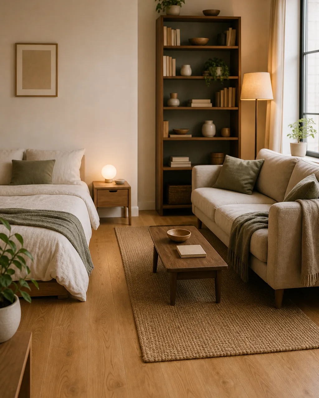
A flat furniture height across the whole studio makes every zone blend into the next with no visual cue. Letting furniture height rise gradually from the low bed and nightstand toward taller pieces like a bookshelf or floor lamp near the living zone gives the eye a gradient to read — low means rest, tall means activity.
- Start with the bed and nightstand as your lowest points and work outward, rather than placing the tallest piece first
- Place the tallest furniture piece, like a bookshelf, at the transition point between zones rather than deep inside either one
- Keep the height increase gradual across two or three pieces rather than one abrupt jump from low bed to tall shelf
- Match wood tones across the height gradient so the eye reads it as one intentional arrangement, not mismatched furniture
- Avoid placing the tallest piece directly in the door-to-window sightline, even if it’s the natural transition point
Check the Door and Closet Swing Arcs Before Placing Anything
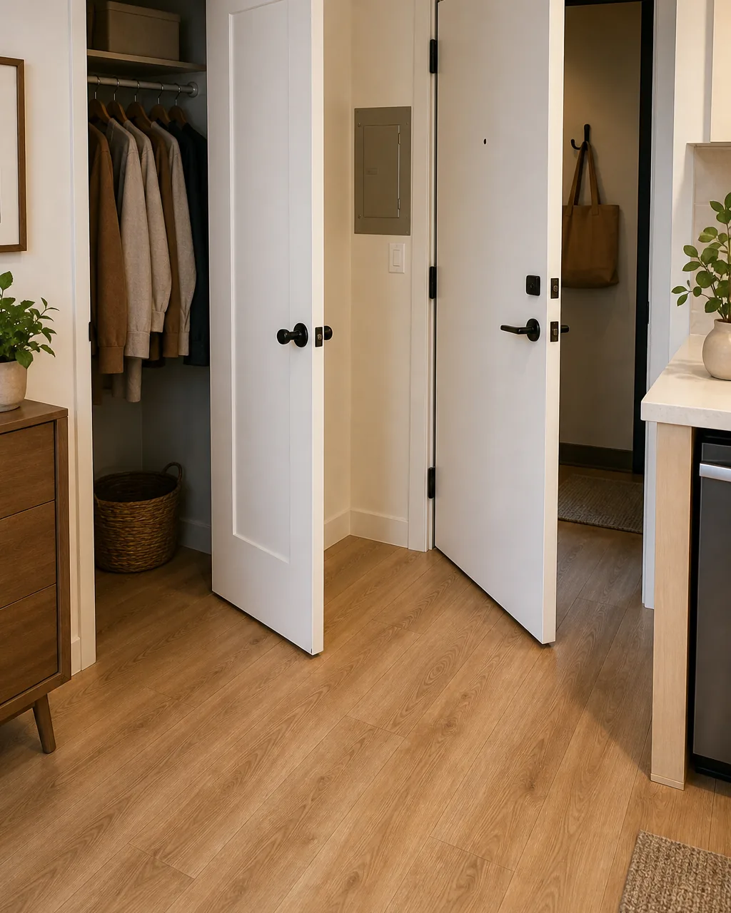
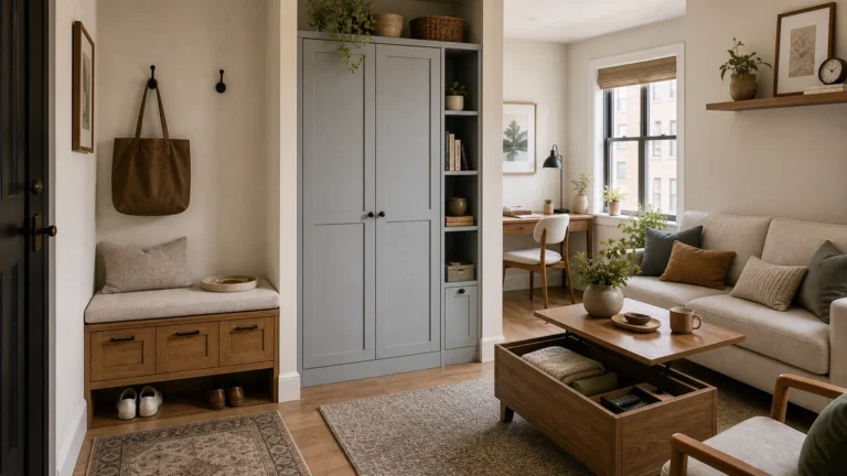
Furniture placed before checking a door’s full swing arc is one of the most common studio layout mistakes — a dresser that seemed fine at rest suddenly blocks a closet door from opening past 45 degrees. Mapping every door and closet swing arc before placing anything permanent avoids relocating furniture twice.
- Open every door and closet in the room fully, then mark the floor space the swing actually covers before placing furniture
- Treat swing arcs as permanently off-limits floor space, not “usually clear” space that a low ottoman might sneak into
- Check swing arcs against furniture at its actual depth, not just its footprint against the wall it will sit near
- Reconfirm swing clearance after any furniture rearrangement, since a piece moved for one reason can quietly block a door for another
- Prioritize the swing arc of daily-use doors, like a closet, over rarely opened ones when floor space is genuinely tight
Match the Rug’s Long Edge to the Room’s Longest Wall
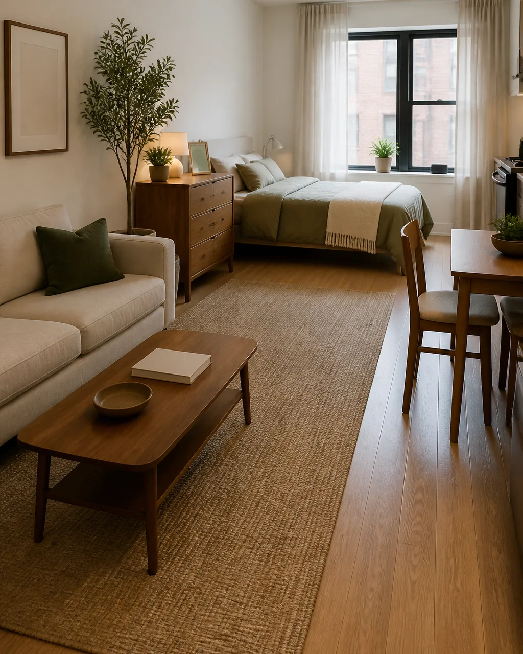
A rug placed at an angle to the room’s dominant wall makes a studio look slightly off, even when nothing else is wrong. Matching the rug’s long edge to run parallel with the room’s longest wall ties every zone the rug touches into one visual line instead of a scattered layout.
- Measure the room’s longest uninterrupted wall first, then choose a rug length that runs parallel to it, not the shortest wall
- Let the rug’s parallel line connect multiple zones it passes through, rather than stopping arbitrarily at the first piece of furniture
- Keep rug width proportional to the walking path it borders, so it defines the edge without narrowing the path itself
- Choose a low-profile rug for a runner this long, since a raised pile can create a subtle trip line the full length of the room
- Center the rug’s width along the wall it parallels, rather than shifting it toward whichever zone feels more finished
Give the Desk a Window View Instead of a Wall View When Space Allows
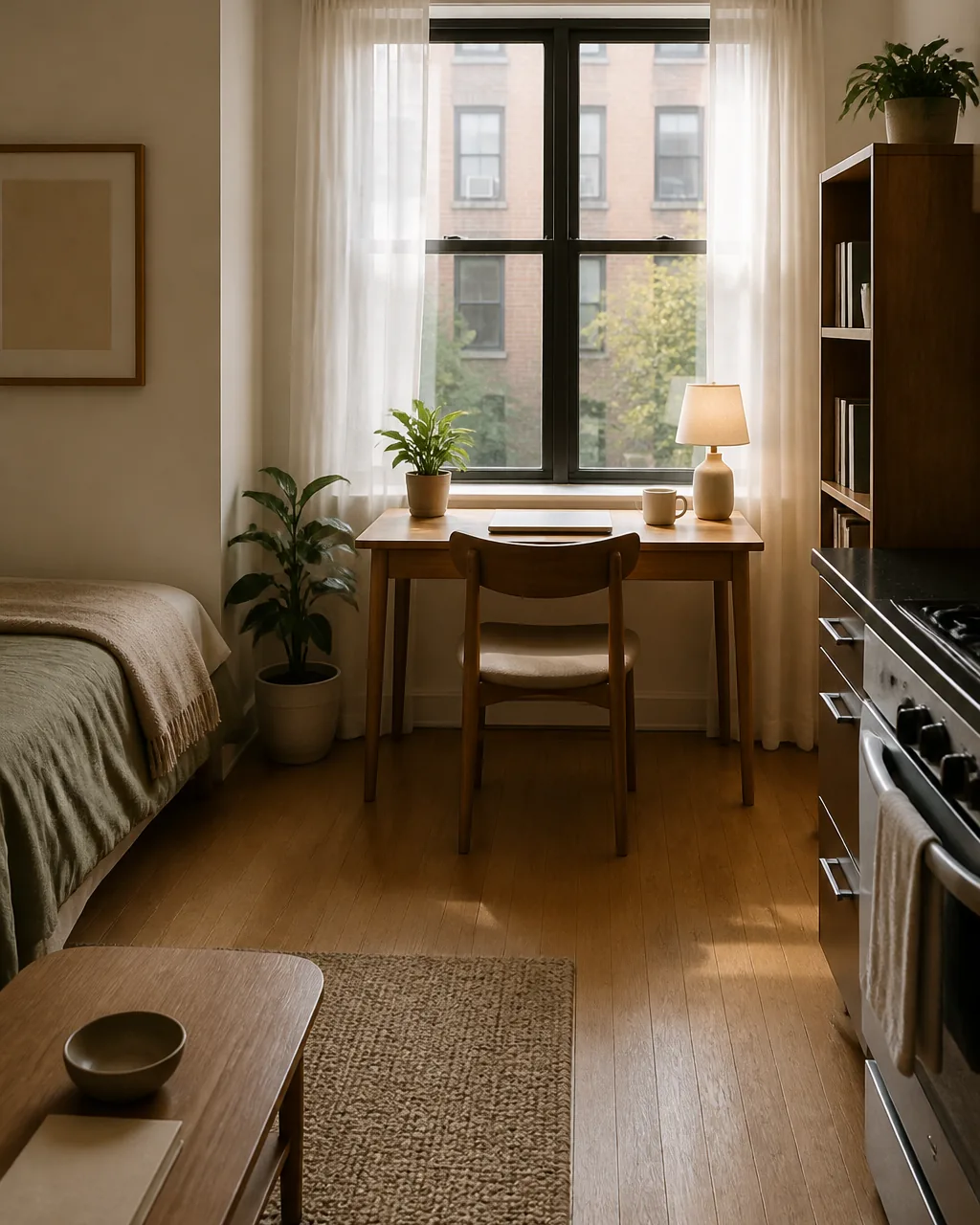
A desk pushed against the nearest blank wall is the default in almost every studio, mostly because it’s the first flat surface available. When the room allows it, turning the desk to face the window instead makes the same square footage of workspace feel like a chosen spot rather than a leftover corner.
- Prioritize the window orientation only if it doesn’t block the door-to-window walking path established earlier
- Position the desk chair so getting up doesn’t require squeezing past the desk itself, especially in a tighter window nook
- Add a small task lamp for evening hours, since window-facing desks lose their light advantage after dark
- Keep the desk surface shallow enough that it doesn’t eat into the window sill’s usability for plants or storage
- Skip this move entirely if the only available window looks directly into a neighboring building at close range — privacy outranks the view
A studio apartment doesn’t need a single wall added to feel like more than one room. What it needs is furniture that’s been told, deliberately, where to stand — which corner, which direction, how much space to leave clear around it.
Once the geometry is set, the same logic extends outward — see how a one-bedroom apartment divides public and private space at a larger scale, or bring the same furniture-choice thinking into just the living room corner of a small apartment.

Nora writes about small, livable rooms for real apartments. Her first place after moving into a smaller apartment was a 340-square-foot studio, and she spent the first three months rearranging furniture before she figured out that geometry, not dividers, was what made it feel like more than one room. Every move here is tested against a real floor plan, not a showroom mockup.
Nora Ellis edits Styled Home Notes. Visit the Nora Ellis author page. More from Nora: studio apartment ideas, one bedroom apartment ideas.