14 Kitchen Aesthetic Ideas That Make the Whole Room Feel Designed
A kitchen earns its look the same way a living room does. Not through a renovation, but through a handful of deliberate choices that repeat across surfaces, hardware, and light.
Most kitchens default to "put things where they fit." Clear the kitchen countertop clutter first, then treat visible surfaces as a composition. The whole space shifts from functional to designed.
These fourteen ideas target the visual layer. Hardware finish, shelf editing, lighting temperature, and material repetition. None require a contractor.
- 1Dominant Hardware Finish
- 2Two-Color Open Shelf
- 3Uniform Jar Family
- 4Under-Cabinet Warm Glow
- 5Art Above the Sink
- 6Tea Towel Color Accent
- 7Curated Cooking Tray
- 8Statement Pendant Light
- 9Three-Zone Countertop
- 10Standing Cutting Board
- 11Hardware Backplate Swap
- 12Triple Material Echo
- 13Above-Cabinet Scale
- 14Feature Backsplash
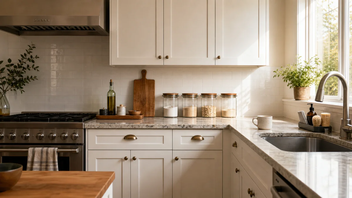
1. Choose One Dominant Finish for All Hardware
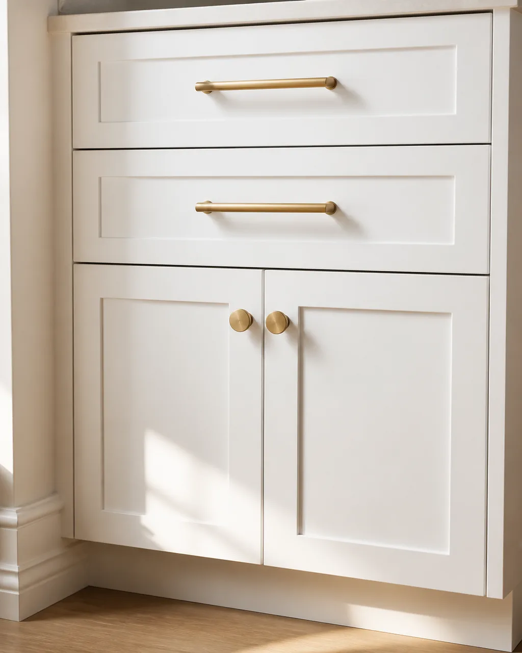
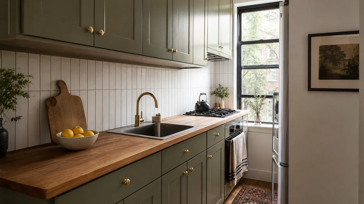
Brass, matte black, or brushed nickel on every knob, pull, and faucet creates a thread that ties cabinets, drawers, and fixtures into one story. Mixed finishes make a kitchen look like it was assembled from different eras, because it usually was. Matching hardware is the cheapest renovation with the biggest visual payoff.
- Count every visible piece of hardware in the kitchen including the faucet and light switch plates
- Order the same finish and style for the entire room in one batch
- Bar pulls on drawers and round knobs on doors is a classic pairing within one finish family
- Budget around four to eight dollars per piece at hardware stores for solid options
- Swap everything in one afternoon so the change registers as a whole-room shift
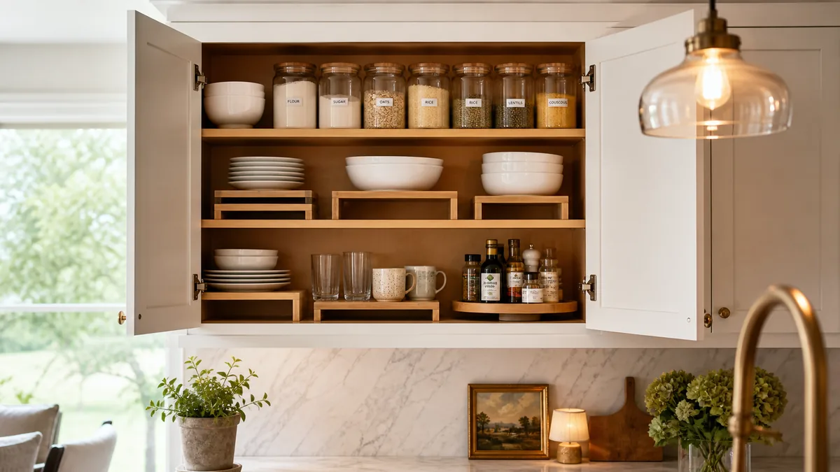
2. Edit Your Open Shelving Down to a Two-Color Palette
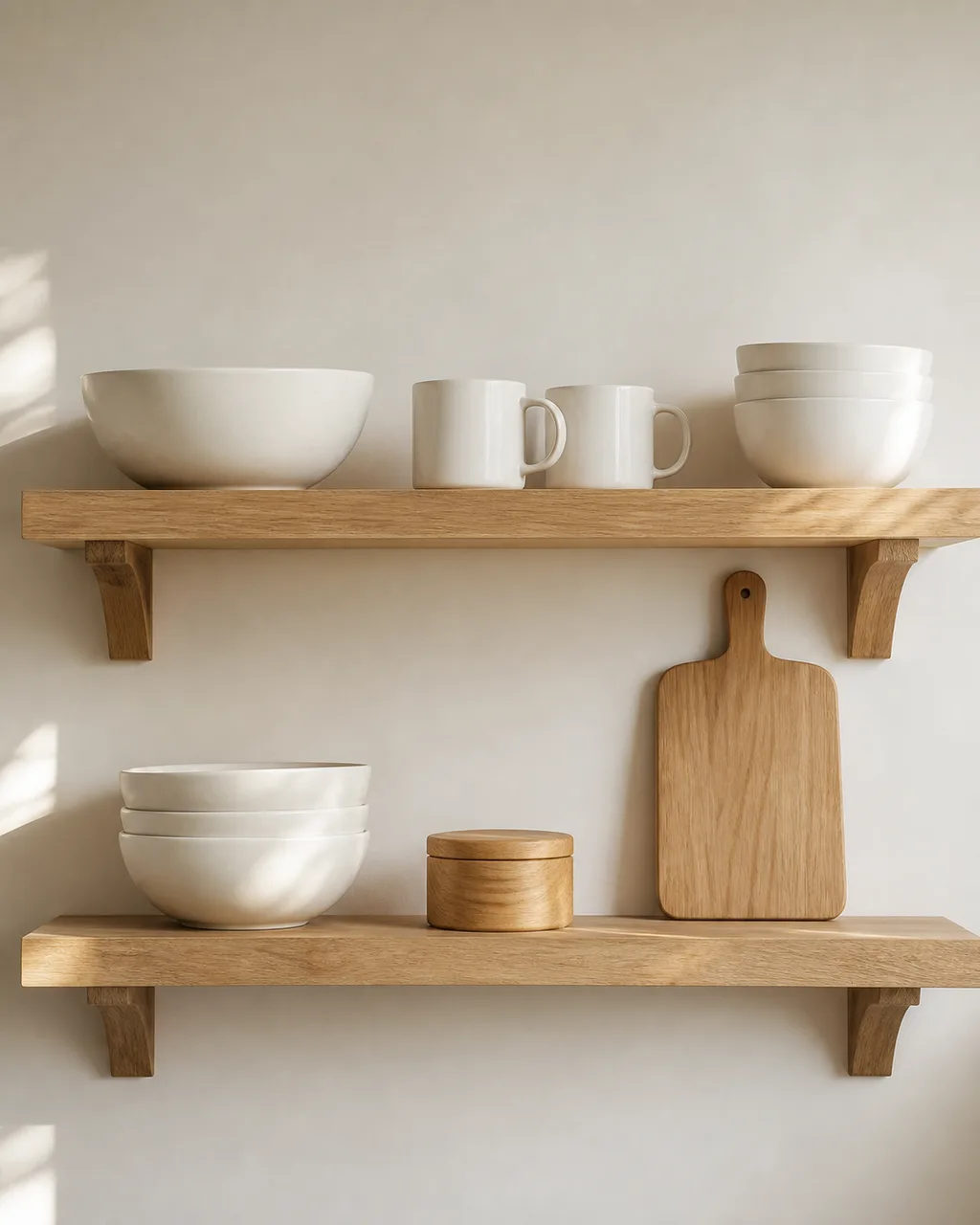
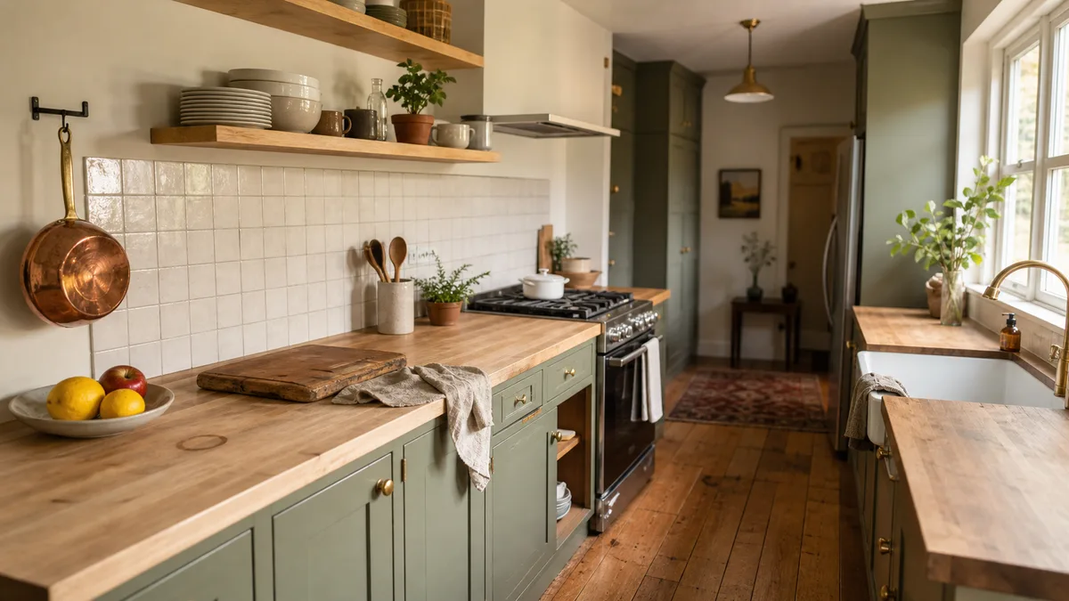
Remove anything that breaks the palette. What stays on display should pass the "would I photograph this shelf?" test, and two colors keep it calm. Open shelves reward restraint. The moment a red mug or a patterned plate breaks the color rule, the eye goes straight to the outlier and the whole shelf reads as cluttered.
- White plus natural wood is the safest starting pair for warm kitchens
- Black plus white works in modern or Scandinavian-leaning spaces
- Move anything outside the two-color rule into closed cabinets, not the trash
- Stack plates and bowls of the same color in neat columns rather than scattered singles
- Photograph the shelf after editing to see how it reads on screen, which is roughly how guests see it
3. Replace Mismatched Containers With One Family of Jars
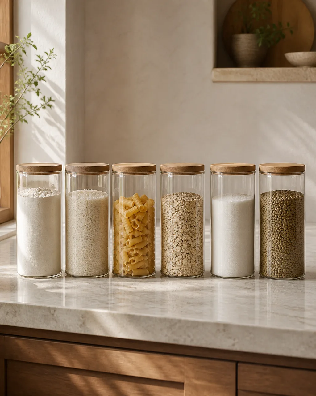
A uniform row of glass or ceramic canisters along the counter transforms pantry staples into a visual accent instead of packaging noise. Flour in its paper bag, rice in a plastic pouch, pasta in a box. Each product screams a different brand identity. One jar family erases all that noise into a single quiet line.
- Glass with wooden lids is the most photogenic and lets you see fill levels at a glance
- Choose jars tall enough to hold a full bag of flour or pasta standing upright
- Label with a single style of adhesive tag or skip labels entirely if you know your staples by sight
- Buy two extra jars beyond what you need now so the row can grow without mismatching
- Place the row against the backsplash where it catches side light and reads as a display
4. Install Under-Cabinet Lighting in Warm White
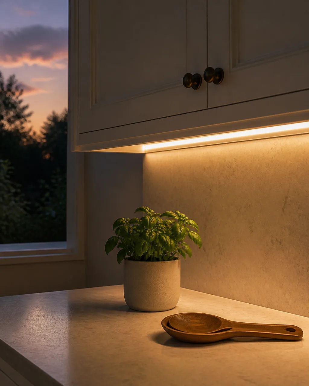
A 2700K LED strip hidden beneath upper cabinets creates an amber glow that makes the countertop feel intentional and photographs warmer than overhead fluorescent. Cool white or daylight strips make food look clinical and skin look grey. Warm white flatters everything on the counter and turns meal prep into a mood.
- Adhesive-backed LED strip tape is the easiest install: peel, stick, plug in
- Position the strip behind the front lip of the cabinet so the source stays hidden
- Connect to a dimmer switch or smart plug so the glow adjusts for cooking versus evening
- Run the strip across the full length of your counter run, not just one section
- Leave it on in the evening and turn off the overhead: the kitchen glows like a restaurant
5. Add One Piece of Art or a Floating Shelf Above the Sink
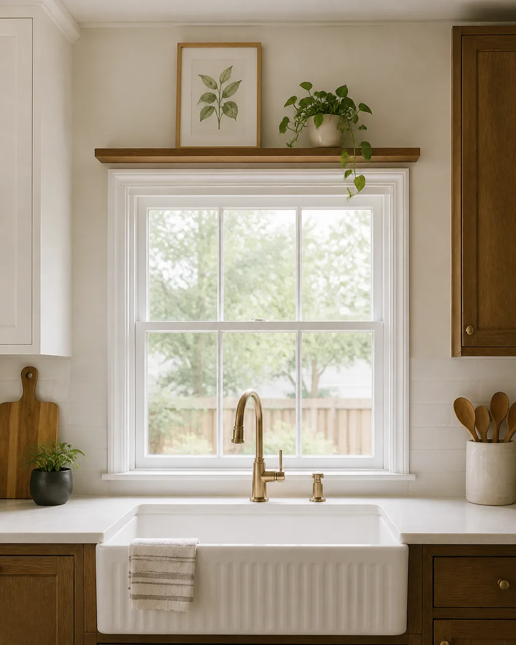
The wall above the sink is dead space in most kitchens. A small framed print or a narrow shelf with a trailing plant gives the eye a landing spot. You stand at the sink more than any other spot in the kitchen. Staring at a bare wall or a builder-spec backsplash tile wastes the room's most inhabited view.
- Choose art with a frame that tolerates humidity: metal or sealed wood, never raw paper
- A narrow shelf holds one print plus one trailing plant and nothing else
- Mount it high enough that splashing water from the faucet cannot reach it
- Botanical prints, line drawings, or abstract watercolors in neutral tones work in any kitchen style
- A single trailing pothos on the shelf softens the hard tile lines without needing floor space
6. Use Linen or Cotton Tea Towels as a Color Accent
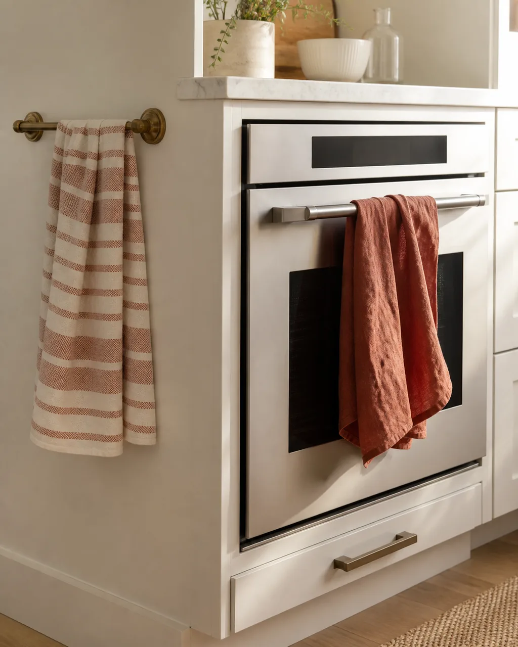
Drape one earthy-toned towel over the oven handle or hang two on a brass rail. Textiles break up the hard-surface monotony of tile, stone, and stainless without adding clutter. Kitchens are the hardest room in the house: metal, glass, ceramic, stone. A linen towel introduces the only soft surface in the room and the eye notices immediately.
- Choose a color that exists nowhere else in the kitchen so the towel pops as an accent
- Rust, sage, charcoal, or ochre read as intentional; bright red reads as a cleaning rag
- Swap towels seasonally for the cheapest possible room refresh
- Hang on a visible rail or oven handle, not wadded on the counter
- Iron or steam-press once so the linen drapes flat and reads as decor, not laundry
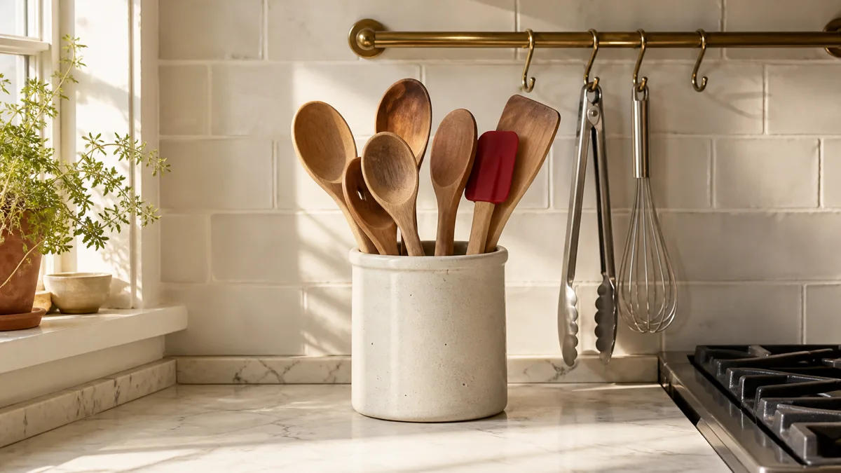
7. Group Everyday Oils and Tools on a Single Tray
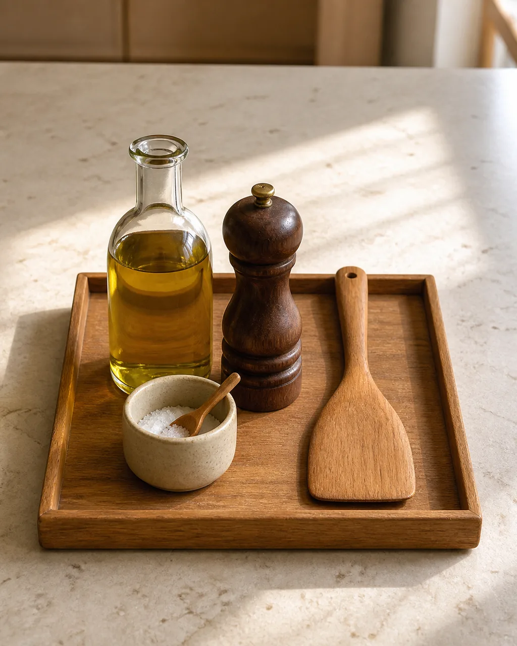
Olive oil, salt cellar, pepper mill, and a wooden spoon on one rectangular tray reads as a curated still life instead of a scattered collection of bottles. Without a tray, the same objects look abandoned on the counter. With a tray, they look placed. The tray draws a border that says "this group is intentional."
- Use a wooden or matte ceramic tray, not woven or fabric, which absorbs oil drips
- Keep the group to four or five items maximum so the tray stays composed
- Wipe the tray base weekly to prevent oil rings from building up
- Position the tray near the stove where the items are actually used
- Replace plastic squeeze bottles with glass cruets: the tray only works if every item looks good
8. Swap Overhead Lighting for a Pendant With Personality
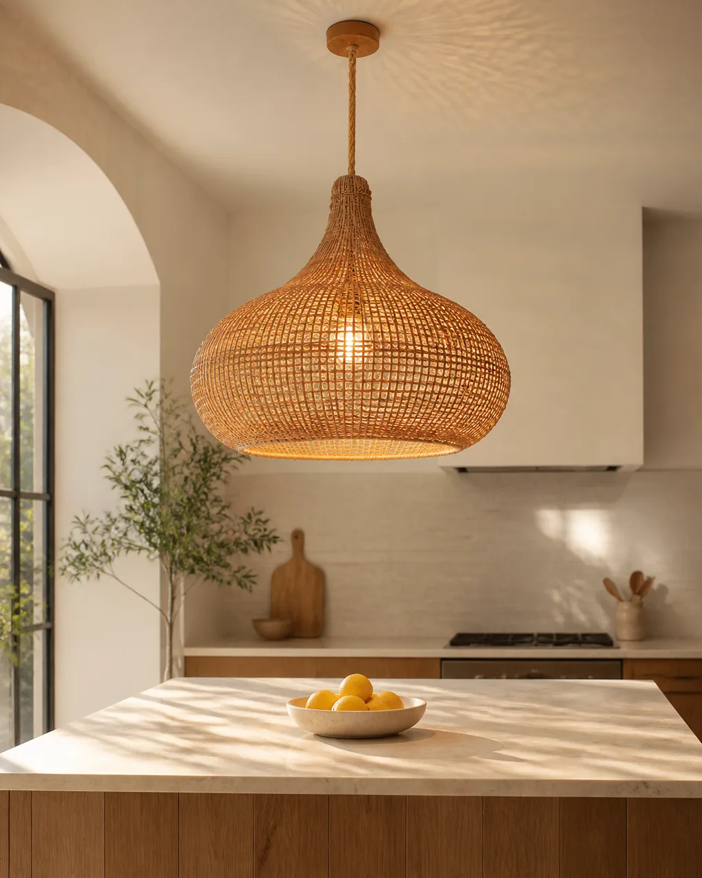
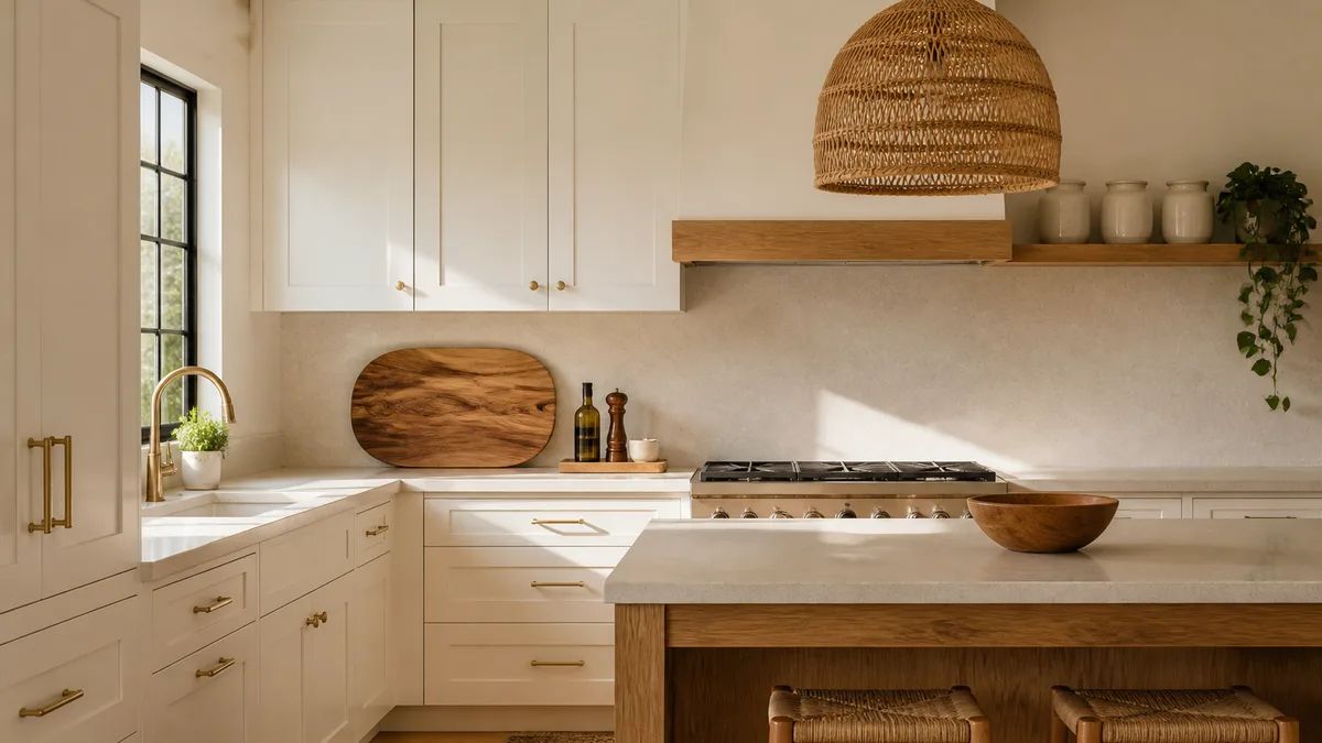
One statement pendant above an island or sink changes the room's character more than any paint color. The overhead flush-mount light that came with the kitchen is the default ceiling. Swapping it for a rattan dome, a ribbed glass globe, or an aged brass shade gives the room a focal point it never had.
- Measure the ceiling height: pendants need at least seven feet of clearance above the counter
- A single large pendant reads bolder than two or three small ones clustered together
- Rattan and woven pendants cast patterned shadows that make the ceiling interesting
- Choose a pendant whose style matches nothing else in the kitchen so it reads as the hero
- Hire an electrician for a hardwired swap or use a plug-in pendant kit with a ceiling hook for a rental
9. Keep the Countertop to Three Categories Maximum
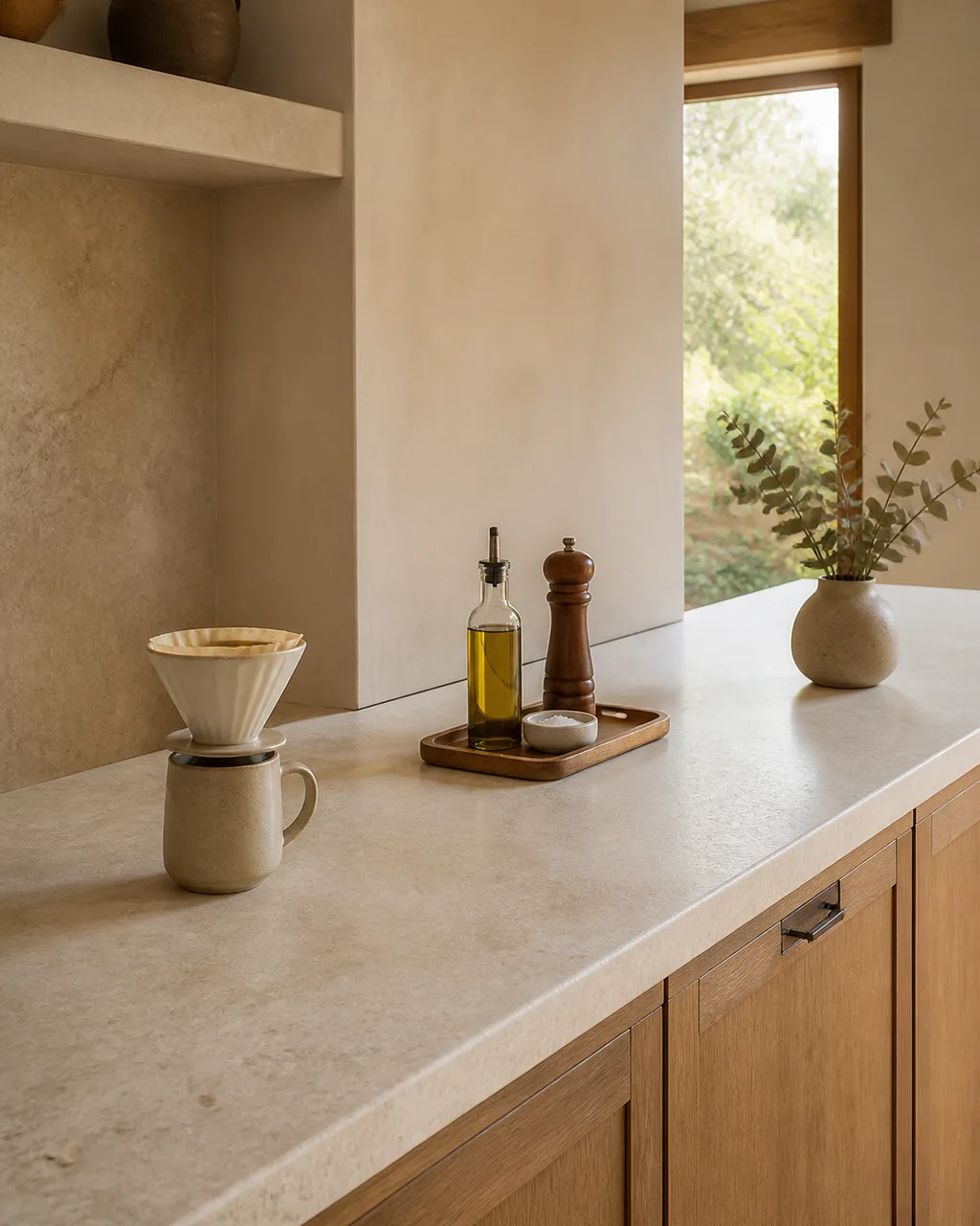
Coffee station, cooking tray, and one decorative moment. Everything else goes behind a door. Three zones prevent the "everything out" drift that turns a counter into a warehouse. The rule is not "keep it empty." The rule is "keep it to three." Empty counters look sterile. Three curated zones look lived-in and intentional.
- Assign each zone a footprint no wider than a dinner plate
- Leave at least twelve inches of clear counter between each zone
- The decorative moment can be a single vase, a small plant, or a framed card on a stand
- Appliances used daily (coffee maker, toaster) earn a zone; everything else stores away
- Audit weekly: anything that crept onto the counter that is not in a zone goes back in a cabinet
10. Add a Cutting Board or Wooden Serving Board as a Standing Accent
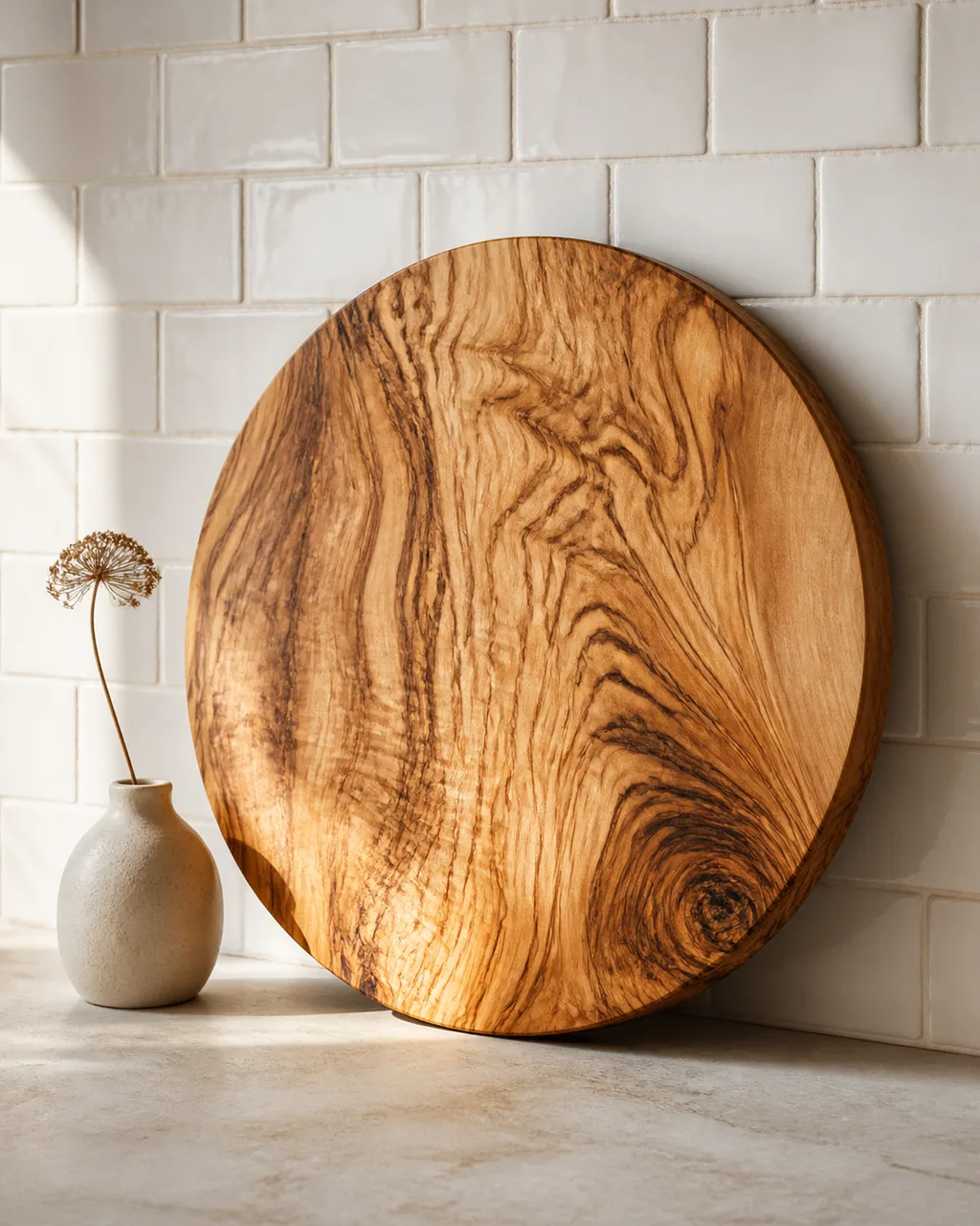
A large olive-wood board leaned against the backsplash doubles as decor and stays within reach for daily use. Round boards with visible grain read as sculptural objects. Rectangular boards with live edges read as artisan pieces. Both earn their counter space because they work and look good simultaneously.
- Choose a board with dramatic grain patterns: olive wood, acacia, or walnut
- Lean it at a slight angle so it casts a shadow on the backsplash behind it
- Keep one side for display and the other for actual cutting to preserve the show face
- A board taller than sixteen inches has enough presence to anchor a counter section
- Pair it with one small object beside it, a ceramic bud vase or a salt cellar, and leave the rest clear
14 kitchen aesthetic ideas at a glance
- 1Dominant Hardware FinishOne finish on every knob, pull, and faucet ties the whole kitchen together.
- 2Two-Color Open ShelfEdit down to two colors so the shelf reads as styled, not stored.
- 3Uniform Jar FamilyMatching canisters turn pantry staples into a visual accent line.
- 4Under-Cabinet Warm Glow2700K LED strips make the countertop feel warm and intentional.
- 5Art Above the SinkA small print or shelf fills dead wall space at your most-used station.
- 6Tea Towel Color AccentLinen in a bold tone is the only soft surface in a room full of hard ones.
- 7Curated Cooking TrayOil, salt, pepper, and spoon on a tray read as a still life, not a mess.
- 8Statement Pendant LightOne hero fixture above the island changes the room more than paint.
- 9Three-Zone CountertopCoffee, cooking, and one decorative moment. Everything else stores away.
- 10Standing Cutting BoardOlive-wood grain leaned against tile works as art and as a tool.
- 11Hardware Backplate SwapThe small plate behind each knob is often the most builder-grade surface in the room.
- 12Triple Material EchoThe same material appearing three times turns a purchase into a design decision.
- 13Above-Cabinet ScaleTwo or three oversized pieces on top of the cabinets, nothing small enough to collect dust unnoticed.
- 14Feature BacksplashVertical tile or a single slab carried up from the counter turns the cooking wall into a focal point.
11. Paint or Replace the Cabinet Hardware Backplate
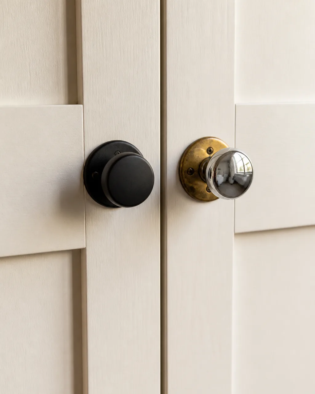
The small metal plate behind each knob is often builder-grade brass or chrome that clashes with new hardware. Swapping to a matching finish costs under two dollars per piece and visually cleans every cabinet face. Most people replace the knob and forget the backplate. The old backplate peeks out around the new knob like mismatched socks under a tailored suit.
- Measure the screw hole pattern on your existing backplates before ordering replacements
- Matte black or satin nickel backplates are widely available at big-box stores
- If your cabinets have no backplate, adding one gives each knob a finished, custom look
- Remove the old plate with a screwdriver, fill any exposed holes with putty, and mount the new one
- Tackle the whole kitchen in one session so the change registers as a system, not a patch
12. Introduce One Natural Material That Repeats Three Times
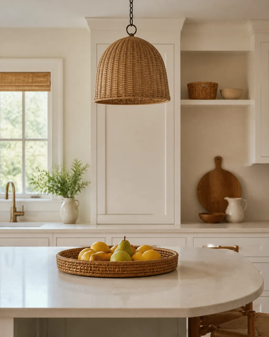
Woven rattan on the pendant, a rattan tray, and a rattan fruit basket. The triple echo makes one material feel like a design decision rather than a random purchase. One rattan object in a kitchen looks like a gift someone left behind. Three rattan objects in different scales look like someone chose rattan as part of the room's vocabulary.
- Pick a material with visible texture: rattan, woven seagrass, raw linen, terracotta
- Place each instance at a different height: ceiling, counter, and shelf
- Vary the scale so the repetition is rhythmic, not monotonous
- The three pieces do not need to match exactly; same material in different shapes works better
- Natural materials age well: they develop patina instead of looking worn
13. Style the Top of Upper Cabinets With Large-Scale Objects Only
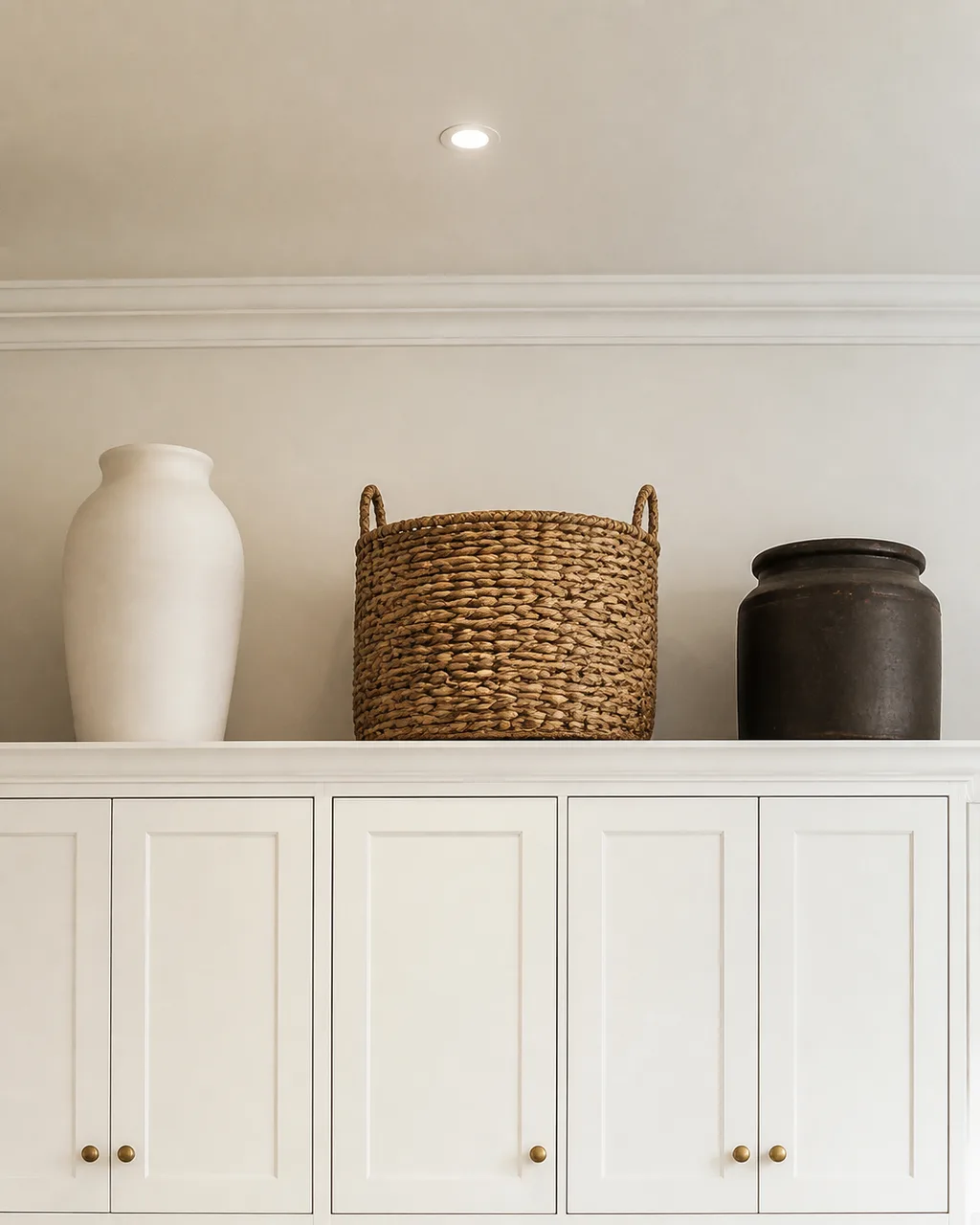
If there is a gap between cabinets and ceiling, place two or three oversized pieces and nothing small enough to collect dust unnoticed. Small objects up high are invisible from standing height and become a grease trap. Large objects cast shadows, create silhouettes, and read as intentional from across the room.
- Each piece should be at least twelve inches tall to register at cabinet-top height
- Space them with gaps as wide as the objects themselves so the arrangement breathes
- Stick to matte or textured finishes: glazed ceramics up high catch kitchen grease and glare
- A tall vase, a woven basket, and a stoneware crock is a reliable combination
- Wipe them down twice a year; dust and kitchen grease accumulate faster than you expect
14. Treat the Backsplash as a Feature Wall
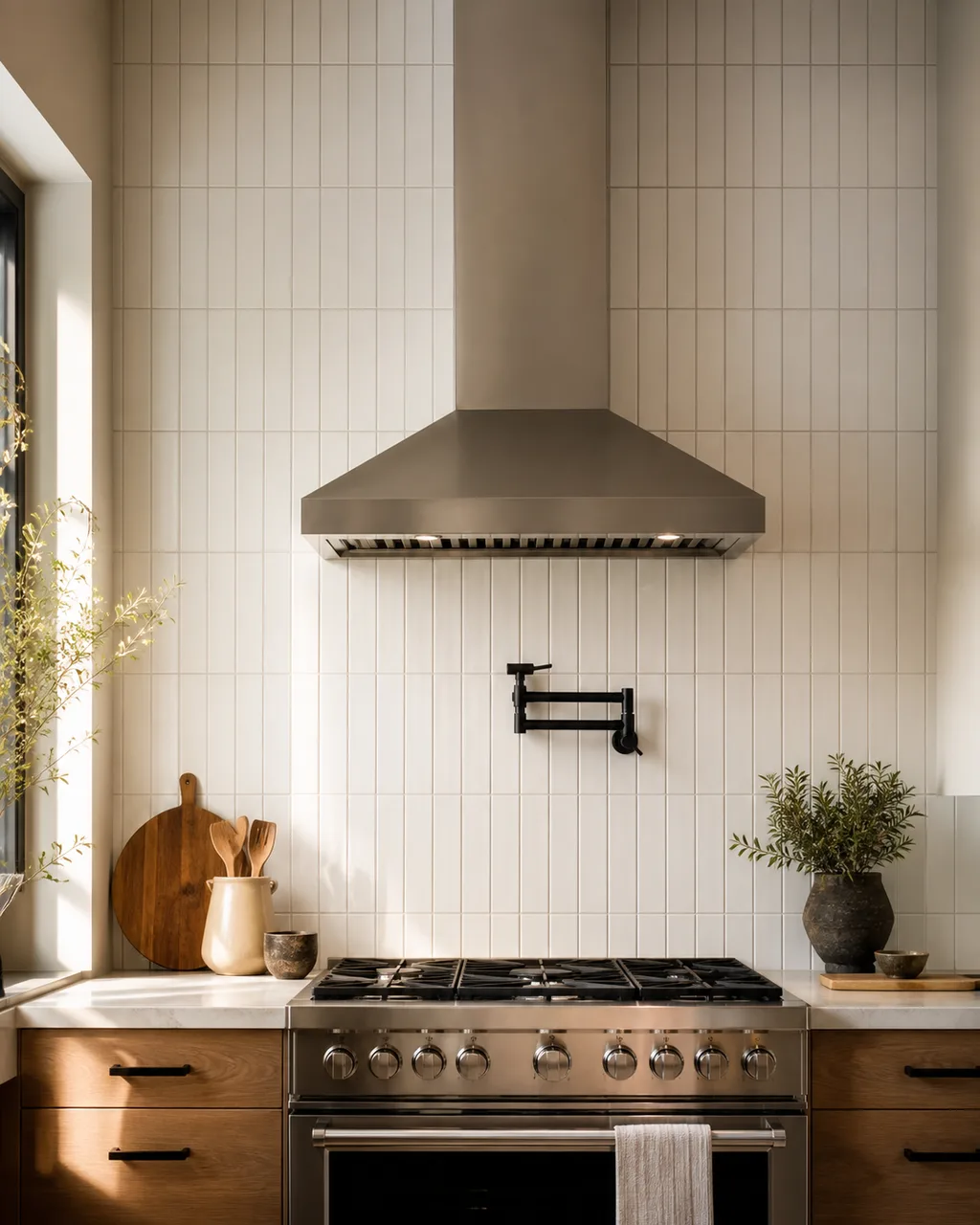
Subway tile laid vertically, a single slab of quartz carried up from the counter, or peel-and-stick geometric tile turns the cooking wall into the room's focal point without a renovation permit.
Horizontal subway tile in a standard running bond is the kitchen equivalent of beige paint. Changing the orientation to vertical stack bond using the same tile gives the wall height, formality, and a designer look at zero extra material cost.
- Vertical stack bond is the simplest layout change with the biggest visual impact
- Running the tile from counter to ceiling eliminates the awkward cutoff line most kitchens have
- Peel-and-stick tile panels let renters try this without landlord approval
- A pot-filler faucet or a single open shelf mounted on the feature wall amplifies the focal point
- Choose a grout color that matches the tile for a seamless slab effect, or a contrasting grout for grid texture
A kitchen with a consistent hardware finish, one curated tray by the stove, and a pendant that casts patterned shadows on the ceiling already looks like a different room. Start with the change you can finish before dinner tonight.
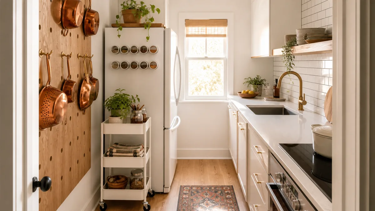
If your small kitchen feels too tight for open shelving or a standing board, every idea here scales down: a two-jar row, a single towel, one knob swap.
For broader kitchen design approaches, see our guide to kitchen ideas that covers layout, color, and cabinet strategy.