11 Living Room Bookshelf Styling Ideas That Look Collected, Not Cluttered
Your bookshelf tells the room what kind of person lives here. When every shelf is crammed spine-to-spine with no breathing room, it reads as storage.
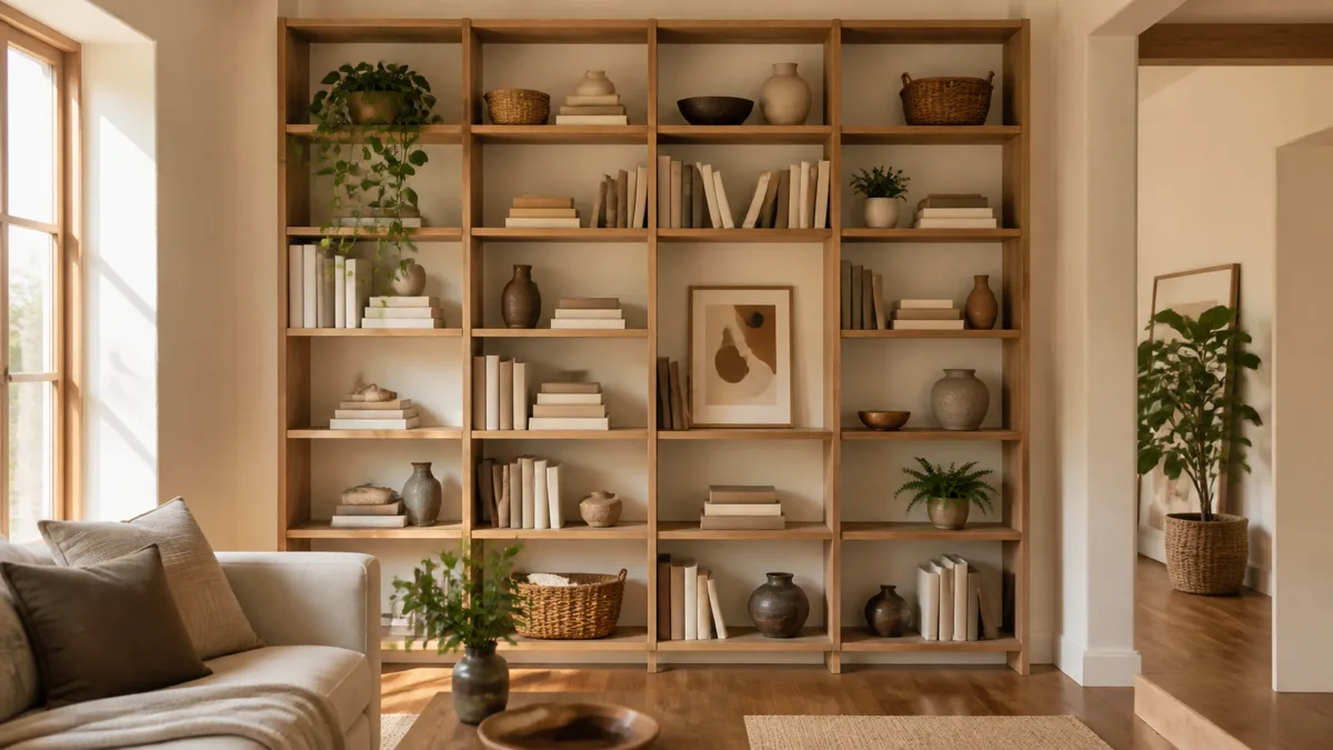
When each tier has a clear anchor piece, a deliberate gap, and a small cluster that catches light differently than the one above, the whole unit becomes a focal point you never had to hang on a wall.
These eleven ideas treat a bookshelf as a single designed composition. Ratio, rhythm, and negative space replace random stacking.
1. Anchor Each Shelf With One Oversized Object
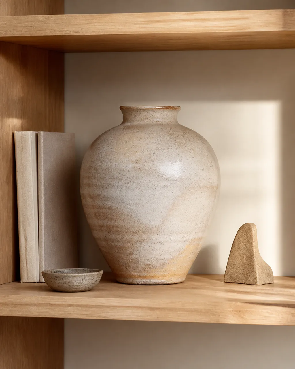
A single large vase, sculpture, or framed print per shelf prevents the scattered-trinkets look. The big piece claims visual territory and every smaller item orbits it. Without an anchor, each object competes for attention at the same scale and the shelf reads as a yard sale.
- Choose one object that fills at least a third of the shelf height
- Place it off-center, roughly one-third from either end
- Keep the remaining items shorter than the anchor so it stays dominant
- Rotate anchor pieces seasonally to refresh the look without restyling everything
- A tall ceramic jug or a stack of oversized art books both work as anchors
2. Stack Books Horizontally in Groups of Three to Five
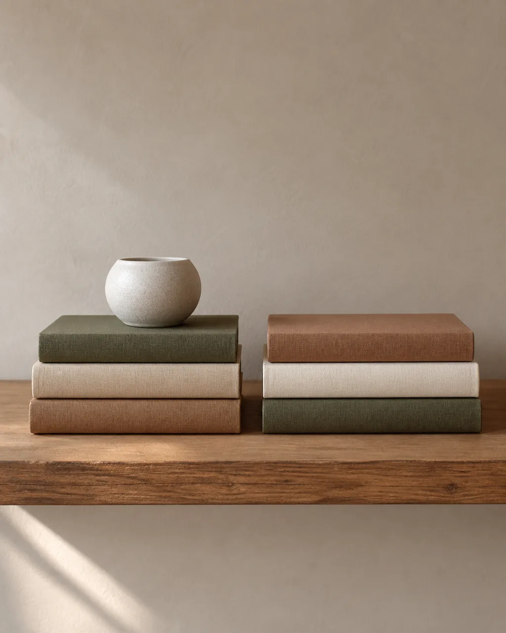
Horizontal stacks create pedestals for objects on top and break the rigid vertical rhythm of spines. Keep stacks low enough that the next shelf breathes. The stacked spine becomes a color block that anchors one section of the shelf while giving a candle or small pot a stage to sit on.
- Limit each stack to three to five books so it stays tidy
- Place a small object on top: a candle, a geode, a tiny pot
- Alternate horizontal stacks with upright book sections across the shelves
- Group books with similar spine colors together for a cleaner block effect
- Make sure the bottom book in each stack is the largest for visual stability
3. Leave One Shelf Mostly Empty
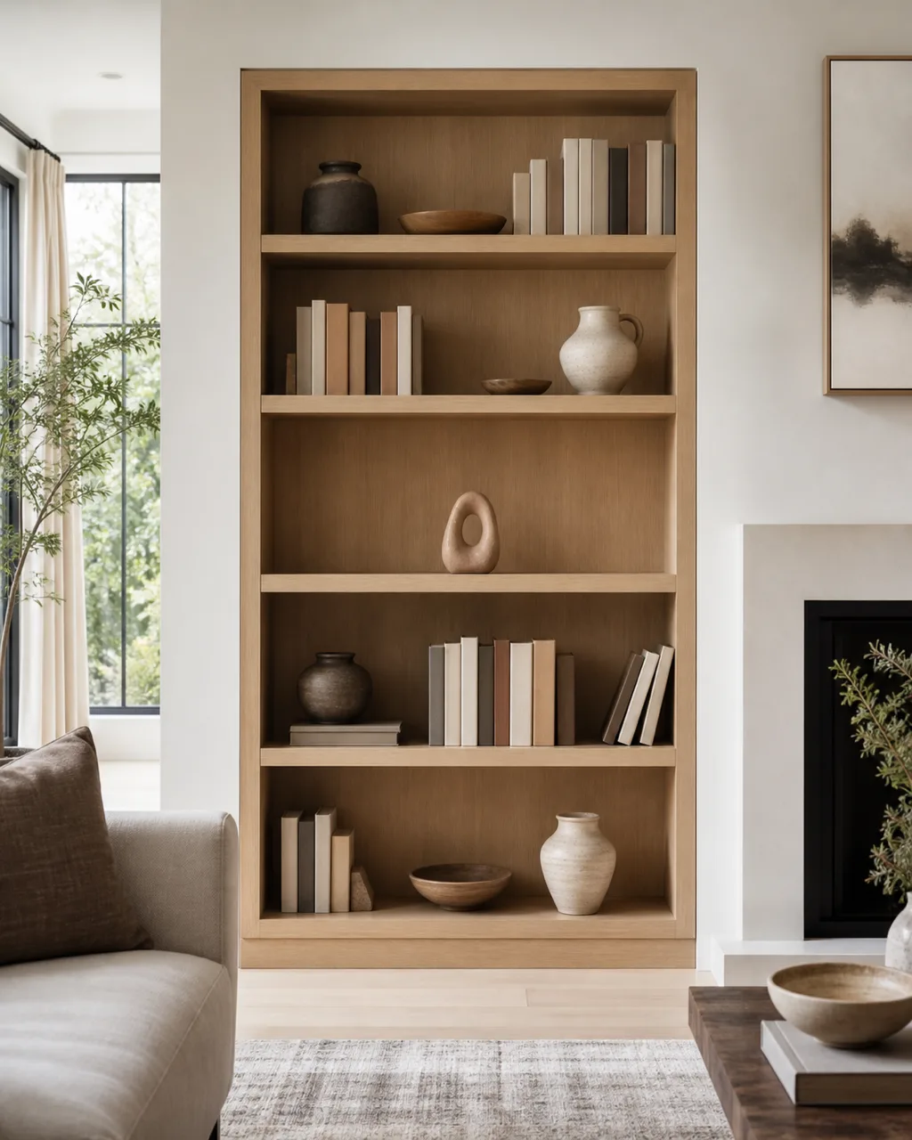
A shelf with just one small object or nothing at all gives the eye a rest. It makes the filled shelves feel intentional rather than packed. Negative space is the cheapest styling tool on your bookshelf, and it separates a collected look from a hoarding problem.
- Pick a shelf at eye level or just above for maximum visual impact
- One small sculptural object or a single trailing vine is enough
- Resist the urge to fill the gap: negative space is the point
- The empty shelf works as a visual comma between busier sections
- If the bookshelf has six or more tiers, you can leave two shelves sparse
4. Mix Spine-Out and Face-Out Book Orientations
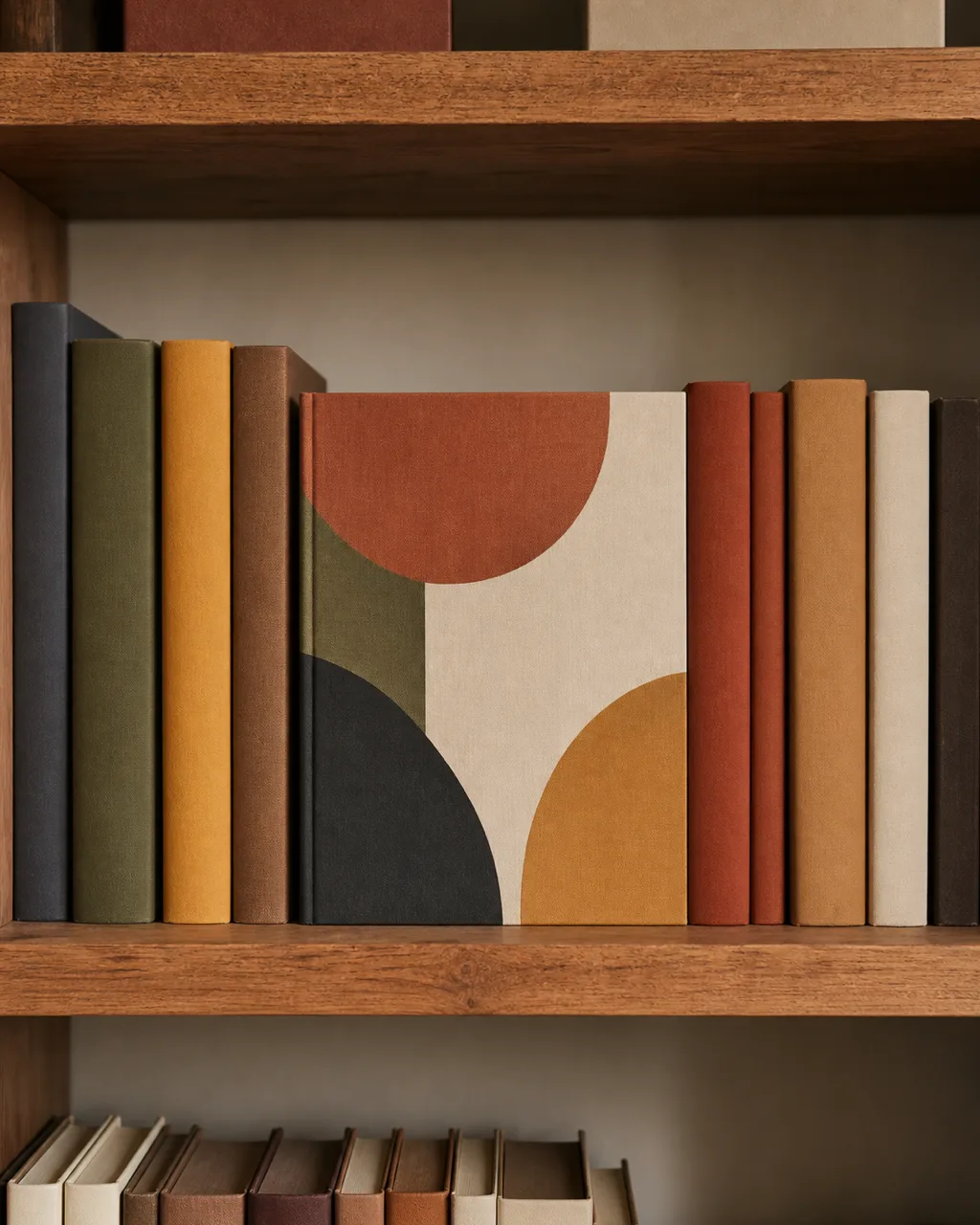
Turning a few covers forward adds color blocks and visual variety. The face-out book acts like a tiny piece of art on the shelf while the spine-out section provides a quiet backdrop. It breaks up the monotony of a solid row of spines without removing any books.
- Face-out books work best with bold graphic covers or photography collections
- Lean them against upright spines so they stay put without a stand
- One face-out section per two to three shelves keeps it from looking like a bookstore
- Use face-out placement to highlight seasonal reads or coffee-table favorites
- Sort remaining spines by color gradient for a quiet background rhythm
5. Add One Trailing Plant Per Bookshelf
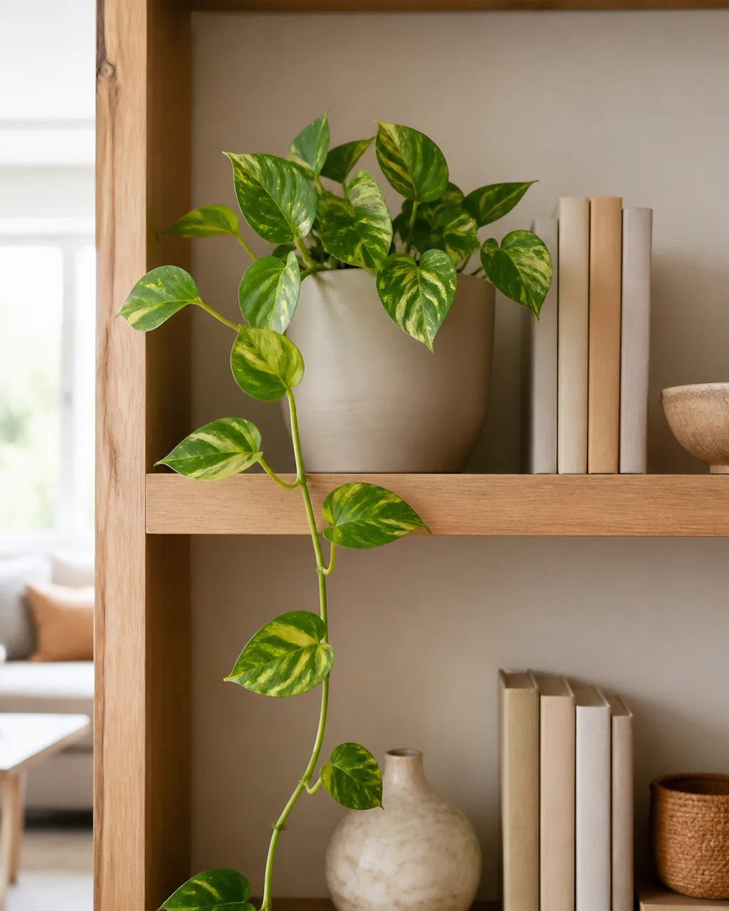
A pothos or string-of-pearls draped from an upper shelf softens hard edges and adds organic movement. The vine takes no shelf surface because it hangs off the front, and it introduces a texture that ceramic and wood cannot replicate. One plant per bookshelf is the limit; more turns the unit into a greenhouse.
- Place the pot on an upper shelf so the vine trails down naturally
- Choose a low-maintenance variety that tolerates indirect light
- A ceramic pot in a neutral tone blends with the shelf palette
- Trim the vine when it reaches the shelf below to keep the cascade controlled
- If your room gets minimal light, a high-quality faux trailing vine works without the maintenance
6. Use Matching Baskets or Boxes on the Bottom Shelf
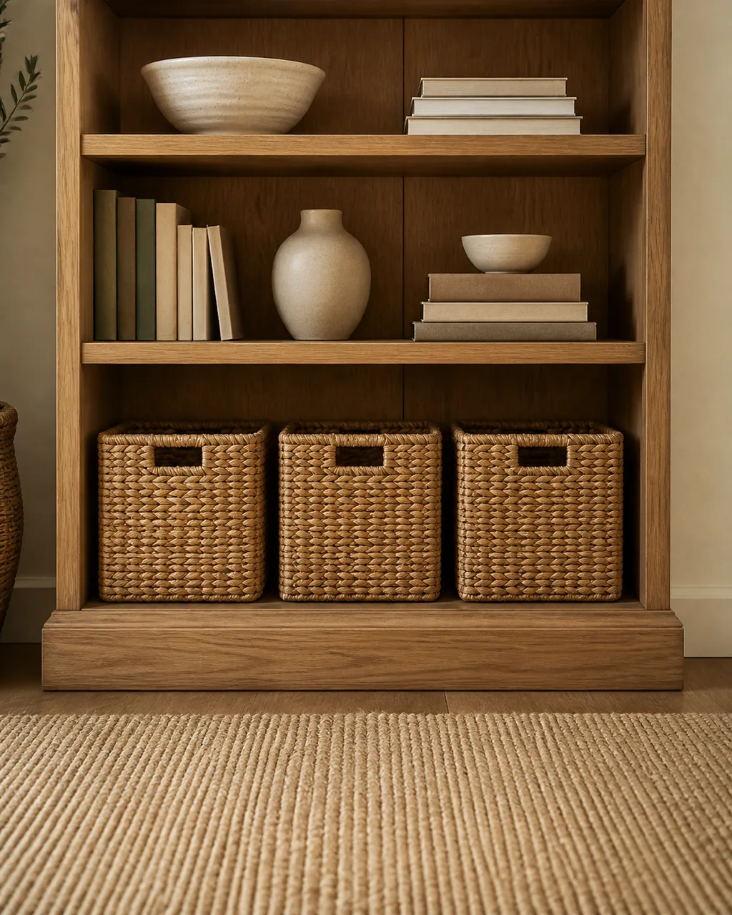
Uniform closed storage on the lowest tier hides cables, remotes, or board games and creates a grounded visual base. The bottom shelf catches the most visual weight because gravity pulls the eye down, so matching pieces calm it rather than letting a jumble of random items anchor the whole unit.
- Pick two or three baskets in the same material: woven seagrass, linen, or felt
- Size them to fit the shelf depth without sticking out past the front edge
- An unlabeled front looks quieter than labeled bins in a living room setting
- The bottom shelf holds practical clutter that the styled shelves above keep hidden
- This works on built-ins and freestanding units alike
7. Lean Framed Art Against the Back Wall of a Shelf
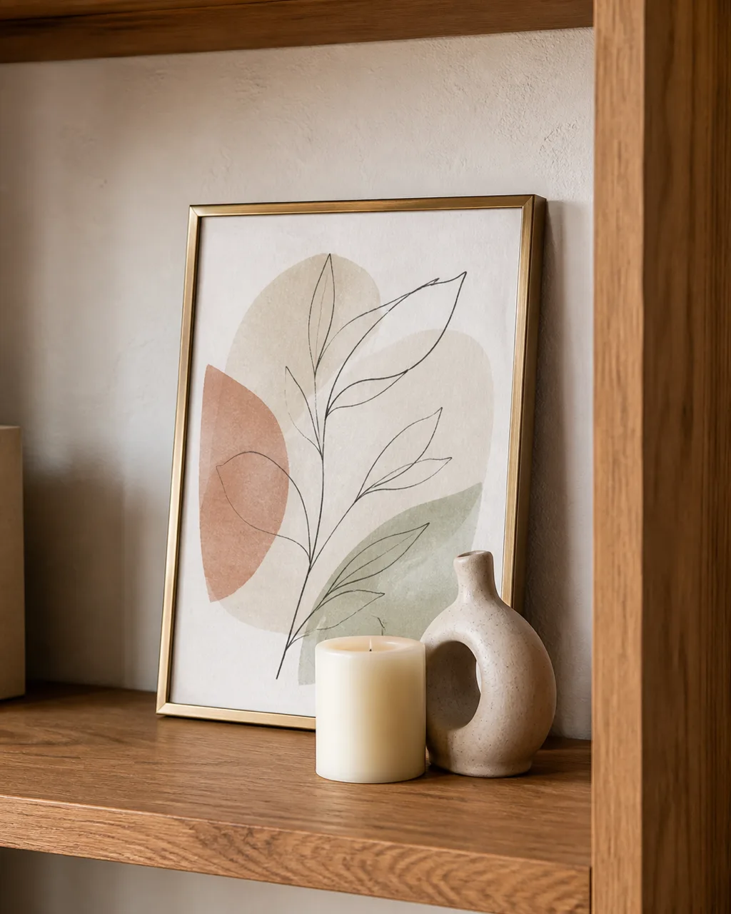
A small framed piece propped behind objects adds depth and a layered gallery feel without requiring wall mounting. The frame peeks out above the shorter objects in front, creating a backdrop that makes a flat shelf look like it has rooms inside it. For more ways to use art as a styling tool, see our guide to living room wall art ideas.
- Choose frames no taller than about two-thirds of the shelf height
- Prop the frame behind a short object to layer depth
- One frame per two to three shelves prevents the unit from becoming a gallery wall
- Thin brass or natural wood frames blend best without competing
- An abstract print or botanical sketch keeps the tone relaxed
8. Group Objects in Odd Numbers
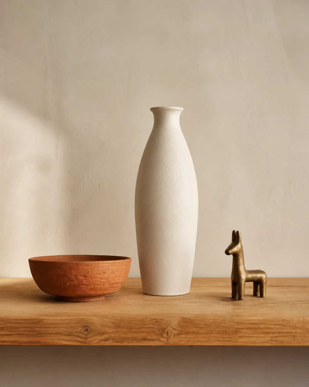
Clusters of three or five items read as composed rather than symmetrical. The odd count prevents the eye from splitting the group into mirror halves, so it scans the whole arrangement instead. Vary heights within each group so they form a small visual triangle that draws the eye upward.
- Three is the easiest: one tall, one medium, one small
- Stand each object at a slightly different depth from the back wall
- Keep each cluster within a span narrower than half the shelf width
- Vary textures within the group: one matte, one glossy, one organic
- Step back after arranging to see whether the triangle shape reads clearly
9. Limit Your Palette to Three Materials
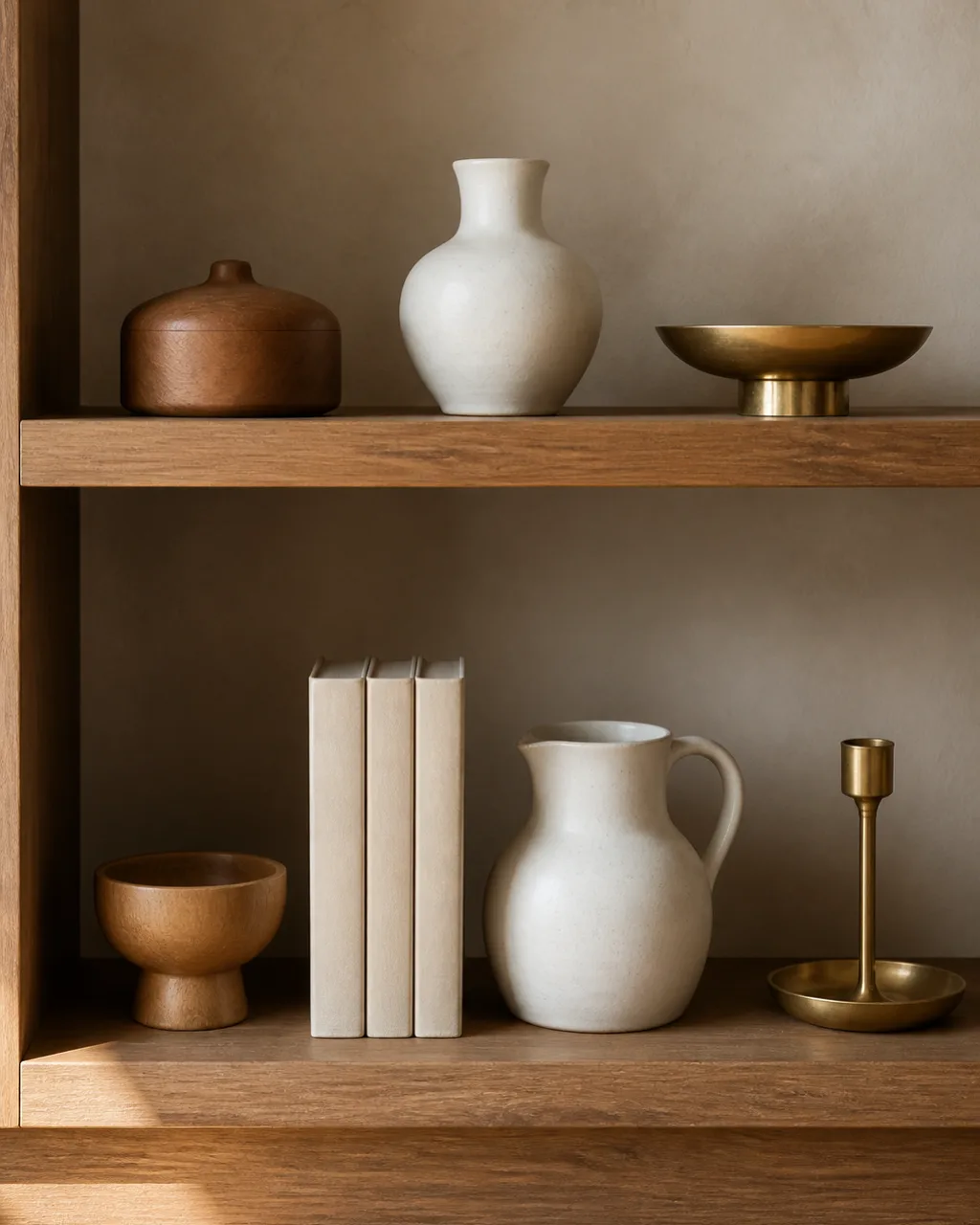
Wood plus ceramic plus brass, or wicker plus glass plus matte black: a three-material cap unifies randomness into a collection. Without it, each shelf looks like it belongs to a different room. The constraint forces you to remove pieces that do not fit, which is usually exactly what the bookshelf needed.
- Audit what you already have and sort objects by material
- Remove anything that introduces a fourth material category
- Spread each material across at least two shelves so it flows vertically
- Matte finishes photograph better and gather less visual noise than high gloss
- One metallic accent, brass or copper or iron, adds warmth without glare
11 bookshelf styling ideas at a glance
- 1Oversized Anchor ObjectOne large piece per shelf that claims visual territory and organizes everything around it.
- 2Horizontal Book StacksGroups of three to five books turned sideways as pedestals for small objects on top.
- 3One Mostly Empty ShelfNegative space that makes the filled shelves look intentional instead of packed.
- 4Mixed Book OrientationsFace-out covers add color blocks and break the monotony of spine rows.
- 5One Trailing PlantA vine draped from an upper shelf softens edges with organic movement.
- 6Matching Bottom BasketsUniform closed storage on the lowest tier hides clutter and grounds the unit.
- 7Leaning Framed ArtA small frame propped behind objects adds depth without wall mounting.
- 8Odd-Number GroupingClusters of three or five that form a visual triangle across the shelf.
- 9Three-Material PaletteWood, ceramic, and brass: a material cap that turns random items into a collection.
- 10Repeated Object RhythmThe same vase or book color on three shelves creates vertical flow.
- 11Front-to-Back LayeringA small object in front of a taller one creates depth lanes that read 3D.
10. Repeat One Object Type Across Multiple Shelves
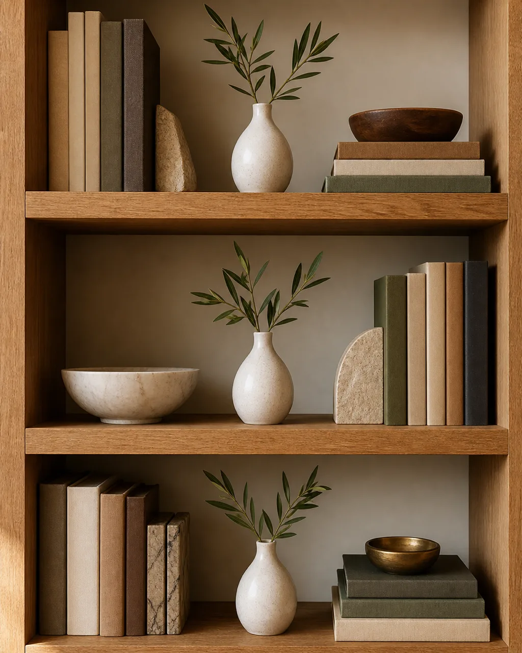
The same style vase or same color book on three different shelves creates vertical rhythm and ties the whole unit together. Without a repeating element, each shelf looks like its own island. The repetition threads a visual line from top to bottom so the eye travels the full height of the piece.
- Pick an object you already own in multiples: similar vases, matching frames, or books in one color
- Space them on every second or third shelf, not adjacent ones
- The repetition does not need to be identical: same shape in two sizes works
- This vertical thread makes the eye travel the full height of the bookshelf
- White ceramics or warm amber glass are easy repeat choices in any palette
11. Layer Small Objects in Front of Taller Ones
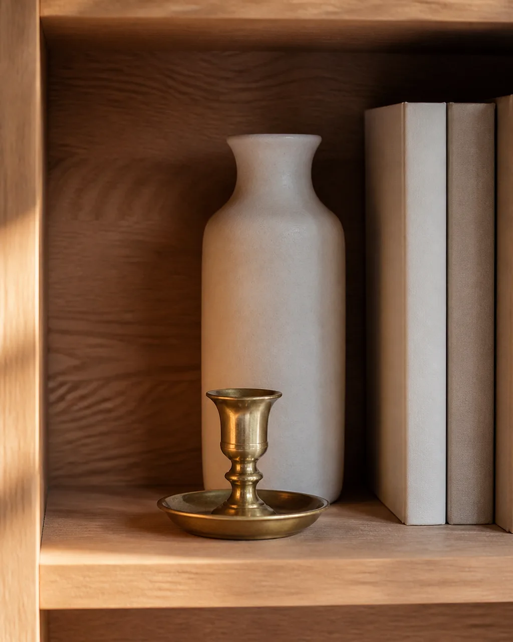
Place a candle or tiny figurine in front of a taller vase to create depth lanes. The shelf reads three-dimensional instead of flat. Most people line objects in a single row against the back wall, which wastes half the shelf depth and makes everything look like a police lineup.
- Keep the front object low: no taller than half the piece behind it
- Leave a finger-width gap between layers so both pieces are visible
- This works best with open-backed shelving where light comes through
- Vary which shelf gets layered: every other tier keeps it dynamic
- A small brass object in front of a matte ceramic vase is a classic pairing
A bookshelf styled with intention turns a piece of furniture into a portrait of how you live. Start with one shelf, the one at eye level, and work outward from there. Once you see how an anchor piece and a pocket of breathing room change the whole frame, the remaining shelves practically arrange themselves.
For more styling ideas on open surfaces, see our guide to living room shelf decor ideas that covers floating shelves and ledges. If your bookshelves sit near a console or media unit, living room console table decor ideas pairs well with the same material palette.