10 Living Room Wall Art Ideas That Make a Room Feel Finished
A blank wall above the sofa is the most visible surface in any living room, and most people leave it empty for months because nothing feels right. The problem is not a shortage of options. It is the opposite — too many choices with no anchor point.
These 10 ideas each give the wall a clear job — from commanding attention with one oversized piece to layering character with a thrifted collection. Every suggestion pairs the art type with the placement logic that makes it land.
Pick the one that matches what your room is missing. Drama wants the oversized canvas or the sculptural metal piece. Warmth wants the woven textile or the vintage cluster.
1. Oversized Single Canvas
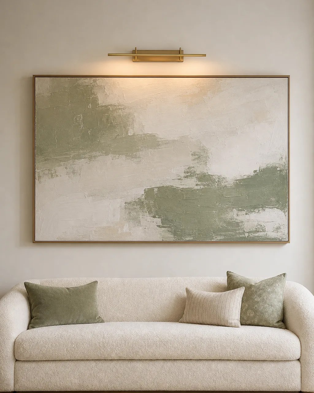
One large canvas above the sofa settles the entire room instantly. Everything else — pillows, the lamp, the rug — stops competing because the wall finally has a clear focal point. The key is going big enough that the piece reads as deliberate, not decorative filler floating on a blank wall.
- Pick a canvas with at least two colors already in the room so it reads as intentional, not imported
- Hang it so the center sits at 57 inches from the floor, roughly eye level when standing
- Float it six to eight inches above the sofa back so it connects to the furniture below
- Skip the frame if the canvas wraps around thick stretcher bars for a clean gallery edge
- Light it with a single brass picture light or an adjustable recessed can aimed from overhead
2. Gallery Wall Grid
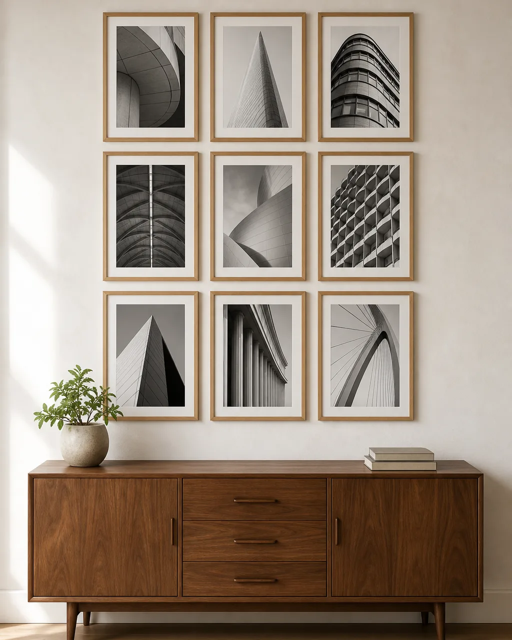
A gallery wall grid succeeds where scattered salon hangs fail because it reads as one large unit, not a dozen small decisions fighting each other. The discipline of identical frames and equal spacing turns individual prints into a single visual block that anchors the wall with the weight of one oversized piece.
- Use identical frames in the same finish and mat width so the grid holds together as a unit
- Space frames exactly two inches apart and tape kraft-paper templates to the wall before drilling
- Start with a three-by-three or four-by-three block that fits between the sofa back and the ceiling line
- Fill every frame with a single subject family — architectural photography, botanical studies, or abstract sketches
- Anchor the bottom row at 57 inches from the floor so the grid centers at natural eye level
3. Leaning Art on a Shelf Ledge
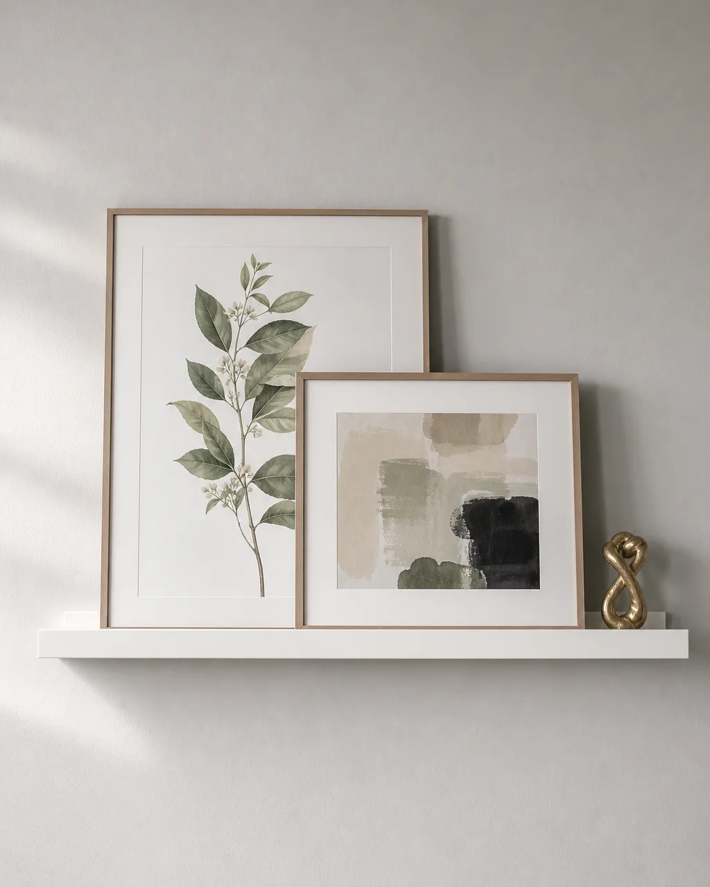
A picture ledge is for people who want art on the wall but do not want to commit to a permanent arrangement. Leaning prints layer naturally, swap with the seasons, and leave the wall intact when you move. The casualness reads as confident, not lazy, as long as the ledge itself is mounted cleanly.
- Mount the ledge so its top lip sits about 60 inches from the floor for comfortable standing viewing
- Layer two pieces per ledge section with the taller print behind and the shorter piece overlapping in front
- Mix a framed photo with an unframed canvas so the stack has depth rather than flat uniformity
- Paint the ledge the same color as the wall so it disappears and the art does the talking
- Lean one small sculptural object at the ledge end — a ceramic vase or a brass candlestick adds dimension
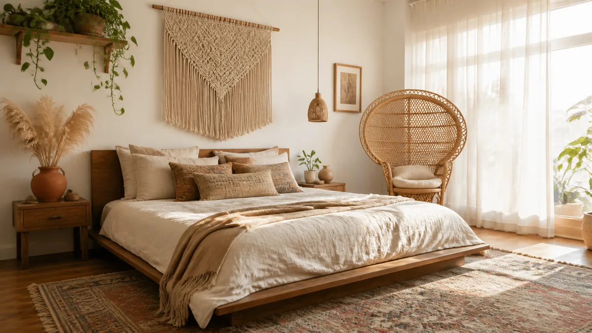
4. Woven Textile Wall Hanging
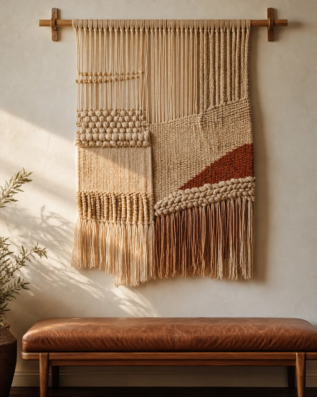
A woven hanging does something no flat print can — it adds physical dimension. The texture catches light differently throughout the day, the fringe moves with air currents, and the whole piece softens whatever wall it lands on. It works especially well above a bench or in a reading nook where you want the wall to feel approachable rather than polished.
- Look for a hanging with at least three distinct textures — smooth cotton, knotted jute, and looped wool
- Mount it on a natural wood dowel that extends two inches past each side of the weave
- Hang it where afternoon light hits at an angle to show the relief of each knot and cord
- Keep the hanging away from high-traffic walls where shoulders or bags will catch the fringe
- Pair it with a low-pile rug in a complementary fiber so the room feels layered, not random
5. Diptych or Triptych Set
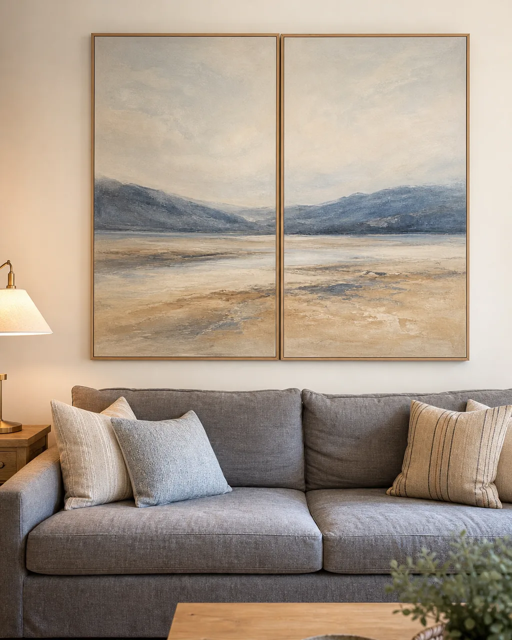
A diptych spans a wide wall better than any single piece because the gap between panels creates visual rhythm. The eye follows the image across both canvases, which makes the wall feel intentional rather than decorated. This is the right move when the sofa is long and a single canvas would look stranded in the middle.
- Leave a two-inch gap between panels so they read as a coordinated set, not two separate pictures
- Align the bottom edges on the same horizontal line using a laser level before drilling
- Choose a triptych where the image or color flows continuously across all panels
- Match the combined width of the set to roughly two-thirds the length of the sofa below
- Wire each panel to its own pair of hooks so one crooked frame does not pull the others off plumb
6. Sculptural Wall Art
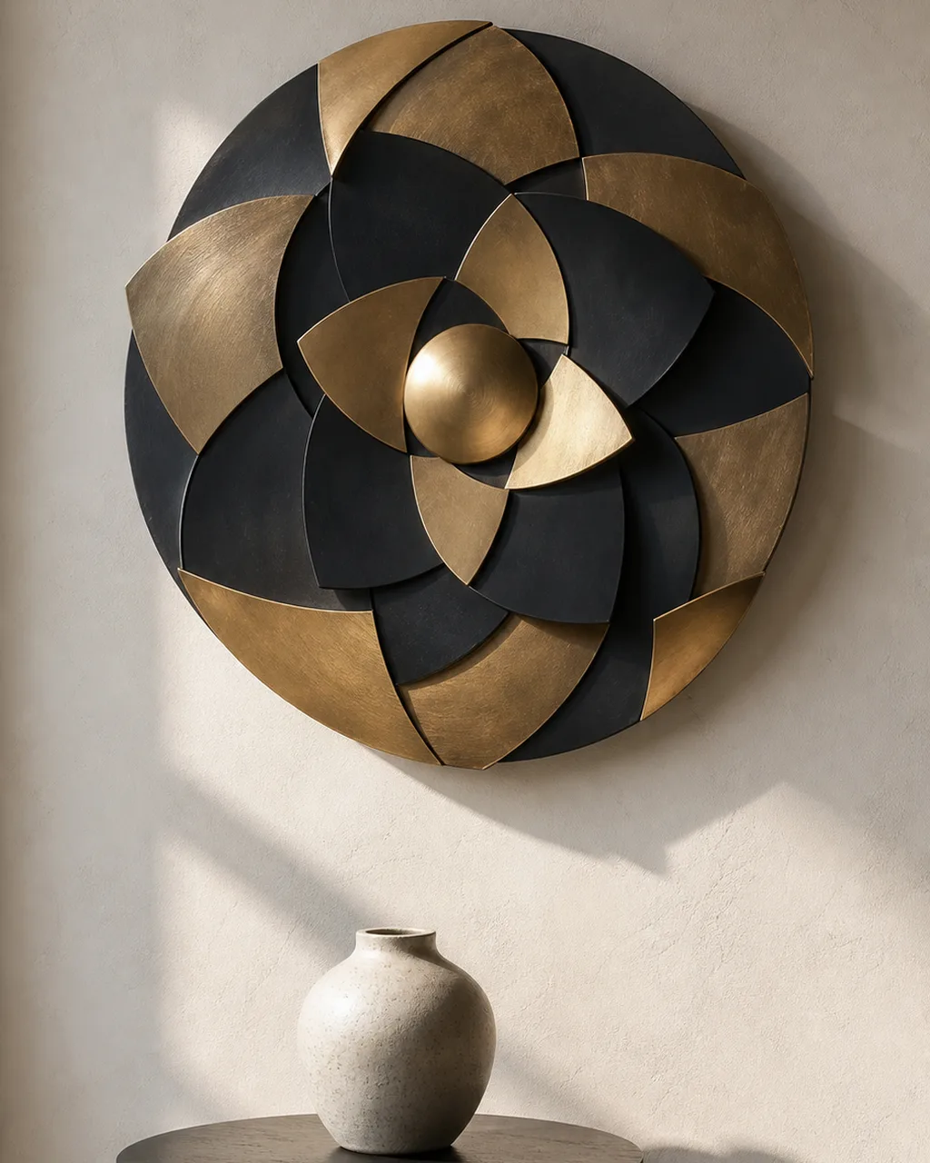
Sculptural wall art changes throughout the day without you touching it. The shadows shift as light moves, the depth catches attention from across the room, and the piece holds up visually from angles where a flat print disappears. It works best on a wall that gets raking light from a window — that is where the three-dimensional quality earns its keep.
- Pick a sculptural piece with enough depth to cast visible shadows from nearby window light
- Mount it on a wall that gets at least two hours of direct or raking light daily
- Use heavy-duty wall anchors rated for twice the piece's weight since 3D art levers outward from the wall
- Place it on a wall with no competing shelves or frames within 18 inches so it breathes
- Choose matte finishes over high gloss to avoid distracting reflections under overhead lighting
7. Black-and-White Photography Series
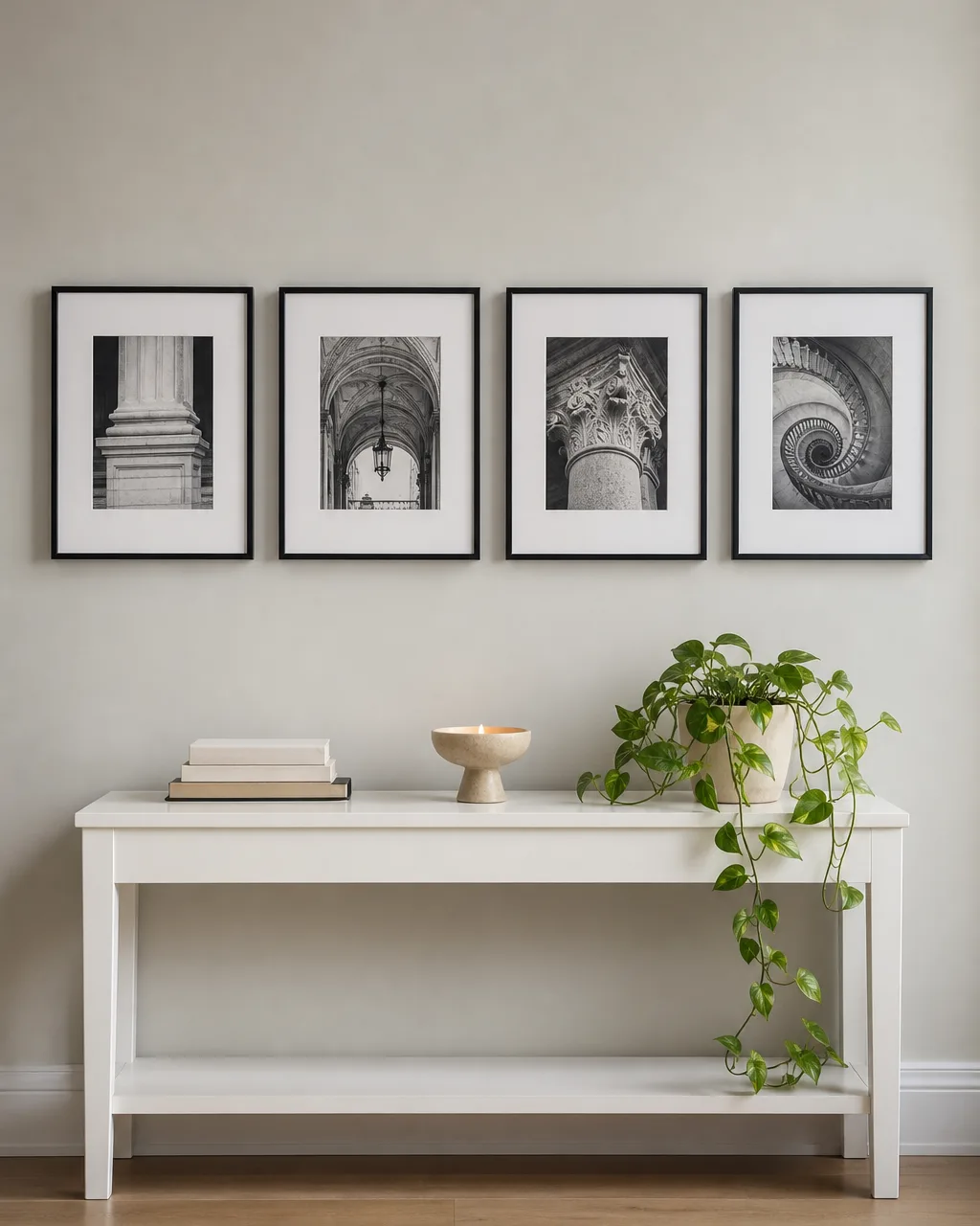
A row of black-and-white photographs is the safest path to a sophisticated living room when you are not sure what to put on the wall. Monochrome removes the risk of color clashing with existing decor, and the horizontal row creates a clean architectural line that makes the wall feel wider and more deliberate than a single piece could.
- Select three to five images with a common thread — cityscapes, nature close-ups, or architectural details
- Use thin one-inch black metal frames so the border does not overpower the photograph
- Hang them in a single horizontal row centered on the wall with three-inch spacing between frames
- Print on matte paper instead of glossy to reduce glare under standard living room overhead lighting
- Frame under UV-protective glass if the wall gets any direct sun to prevent the prints from fading
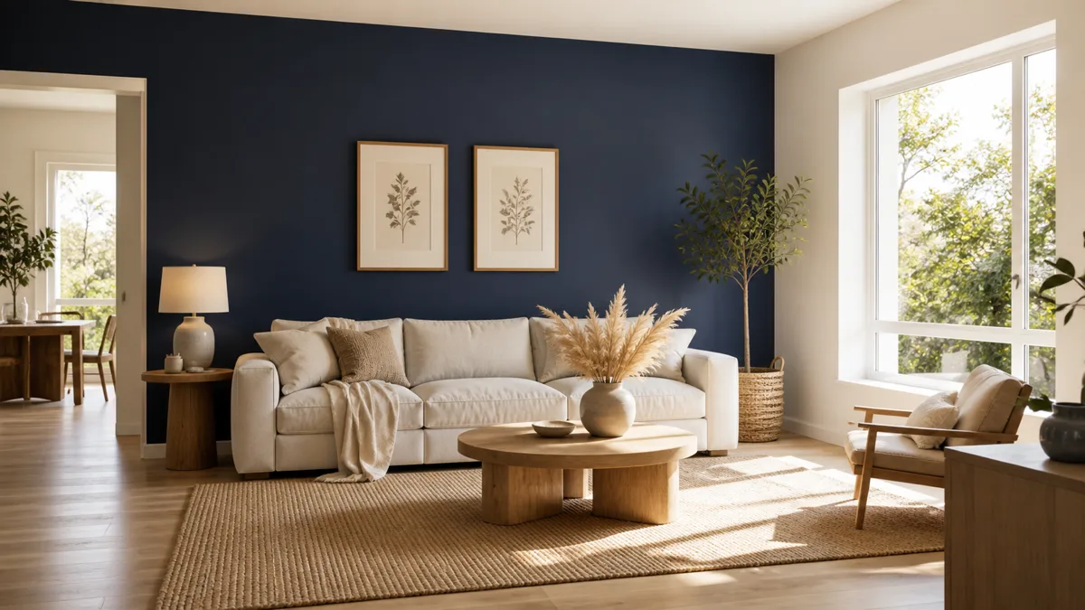
8. Botanical Pressed Art
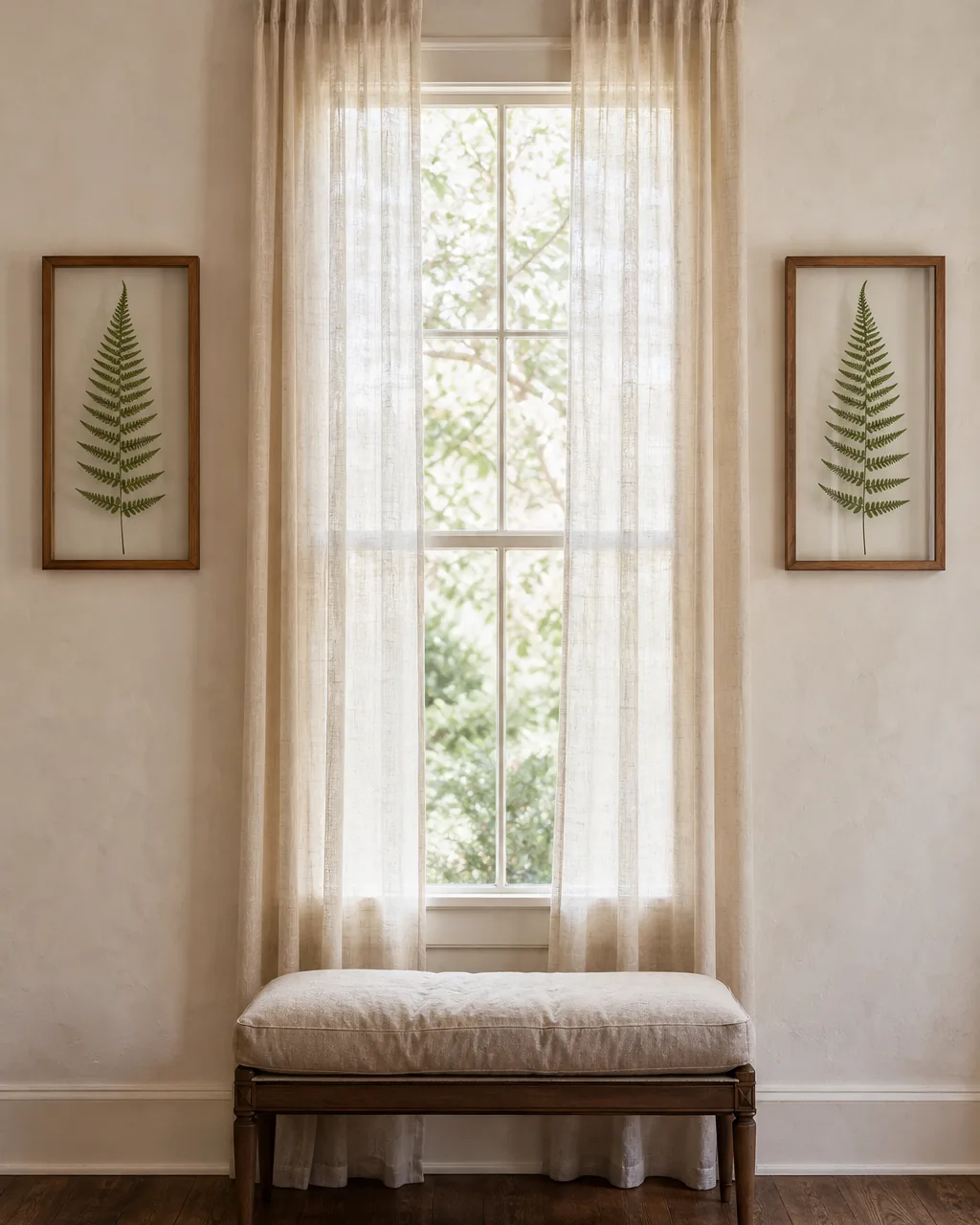
Pressed botanicals bring organic texture into the room without the upkeep of a living plant wall. The translucency of the specimens against glass lets light pass through and creates a quiet glow that changes with the time of day. This idea works best in pairs flanking a window, where it frames the view and adds symmetry without blocking natural light.
- Use float frames with clear glass on both sides so light passes through the pressed specimen
- Press thick-veined leaves like monstera or sword fern that hold their structure for years
- Hang them where indirect light illuminates the translucency without bleaching the leaf tissue
- Pair two identical frames at equal height on each side of a window for balanced symmetry
- Replace specimens every 18 to 24 months when the color fades from green to straw brown
9. Abstract Color-Block Art
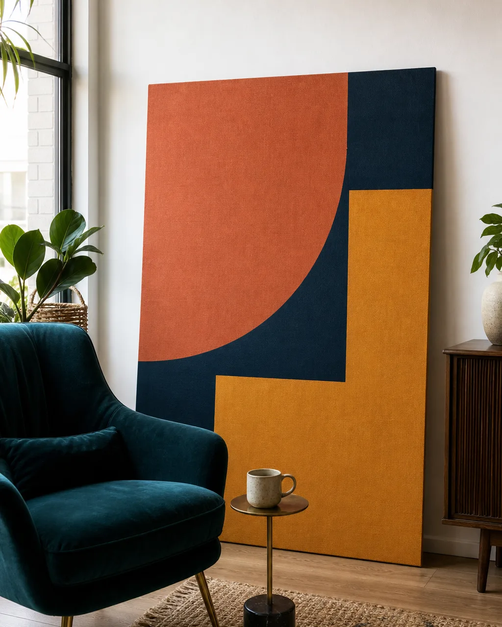
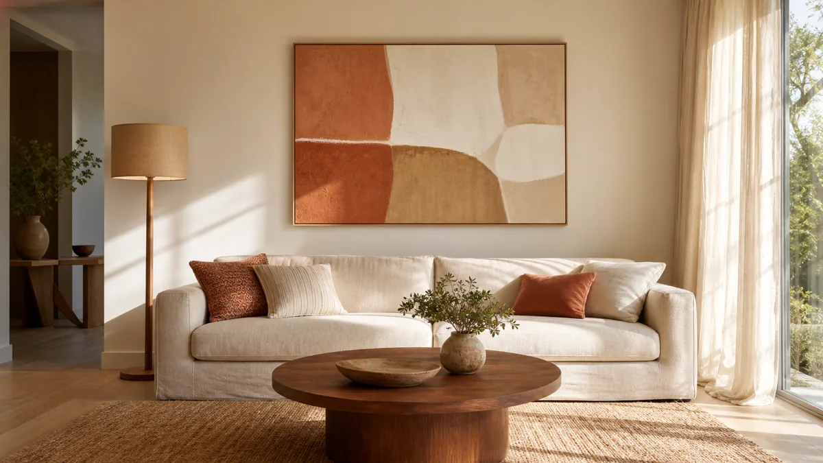
Abstract color-block art is the bridge piece for rooms where the accent colors exist but nothing ties them together. A painting that pulls the terracotta from the pillows, the navy from the rug, and the mustard from a vase turns scattered touches into a deliberate palette. It also handles minimalist spaces where one bold piece is all the decor the room needs.
- Pull two or three dominant accent hues from the room and find art that mirrors that exact palette
- Go large enough that the piece anchors the wall — at least 30 by 40 inches for a standard room
- Choose hard-edged geometry for a modern room or soft washes for a lived-in organic feel
- Lean a large unframed canvas on the floor against the wall for casual gallery energy
- Place it on the wall that gets the least natural light so the color reads richer, not washed out
10 living room wall art ideas at a glance
- 1Oversized Single CanvasOne large piece above the sofa that ends the blank-wall problem instantly.
- 2Gallery Wall GridIdentical frames in a tight grid that reads as one cohesive visual block.
- 3Leaning Art on a Shelf LedgeLayered prints you swap seasonally without new nail holes in the wall.
- 4Woven Textile HangingMacramé or fiber piece that adds physical dimension and softness.
- 5Diptych or Triptych SetCoordinated panels that span a wide wall with visual rhythm.
- 6Sculptural Wall Art3D metal, wood, or ceramic pieces that cast shadows and shift with light.
- 7B&W Photography SeriesMonochrome row that adds sophistication without color-clash risk.
- 8Botanical Pressed ArtFramed ferns between glass that glow with natural light.
- 9Abstract Color-Block ArtBold geometry that ties scattered accent colors into one palette.
- 10Vintage Thrifted CollectionMismatched frames that layer real character over time.
10. Vintage or Thrifted Art Collection
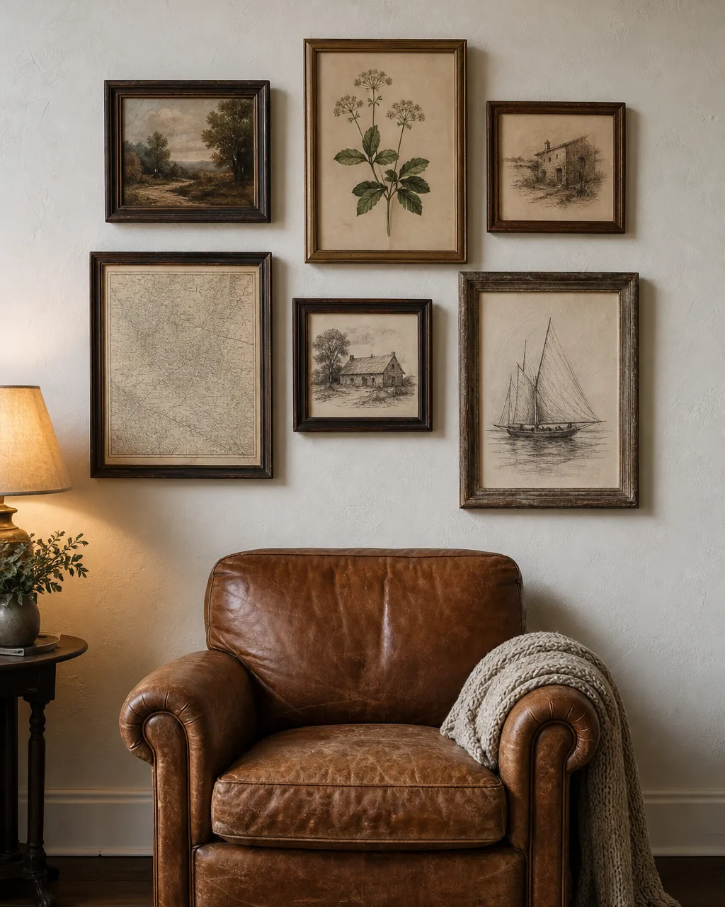
A vintage collection is the opposite of a catalog purchase, and that is exactly the point. Every piece arrived at a different time from a different place, and the mismatch tells a story that no coordinated set can replicate.
The character builds over months — each estate sale find or thrift store rescue adds another layer. It works in farmhouse rooms as naturally as in eclectic city apartments.
- Collect over time from thrift stores, estate sales, and flea markets rather than buying a curated batch
- Let frame finishes vary in wood tone and patina because that mismatch is the entire point
- Group the collection in a loose cluster with intentionally uneven spacing to avoid looking like a catalog page
- Anchor the cluster with one large piece and surround it with smaller ones that orbit around it
- Clean old frames with a dry microfiber cloth and reinforce any loose corners with wood glue before hanging
The wall behind your sofa has been doing nothing for long enough. Pick one of these ideas — whichever one matches the gap you noticed first while reading — and put something up this week.
Wall art does not need to be a forever decision. A shelf ledge lets you swap prints without patching holes. A leaning canvas moves with you to the next apartment. Even a gallery grid can come down and go up on a different wall in an afternoon.
The room will not feel finished until the walls say something. Start with one wall, one idea, and build from there.