18 Living Room Wall Decor Ideas Beyond the Basic Gallery Wall
Twenty-three lists of living room wall decor ideas, and they all show the same thing — a 3×3 grid of identical black frames on a white wall. You have pinned four of those gallery walls. Your sofa wall is still blank. The basic gallery wall is not actually the answer, and the longer you wait for it to feel right the more obvious that becomes.
The real wall-decor levers are scale, leaning, 3D layering, focal anchoring, and architectural texture. None of them need a frame grid. A few do not need a single nail. Here are 18 mechanisms that work on rental drywall — sorted by approach, with the lever named in plain language so it can be copied to your own blank wall this weekend.
Skim the list, jump to the lever that fits your wall. Eighteen mechanisms grouped from statement focal anchors to functional lighting — pick one this weekend, add the rest at no schedule.
- 1Oversized statement piece
- 2Lean art on console or floor
- 3Stacked floor lean (3 frames)
- 4Sculptural clock or object anchor
- 5Picture ledge of overlapping frames
- 6Asymmetric gallery around focal
- 73D object cluster (baskets, plates)
- 8TV-as-gallery-element wall
- 9Sculptural statement mirror
- 10Mirror cluster composition
- 11Oversized leaning floor mirror
- 12Picture rail or chair rail moulding
- 13Vertical wood batten accent wall
- 14Peel-and-stick wallpaper accent
- 15DIY frame moulding squares
- 16Kilim or rug as wall tapestry
- 17Woven basket 3D cluster
- 18Dried branch wall arrangement
- 19Picture light spotlighting art
- 20Bold graphic print over console
Hang one oversized statement piece where three small would have gone

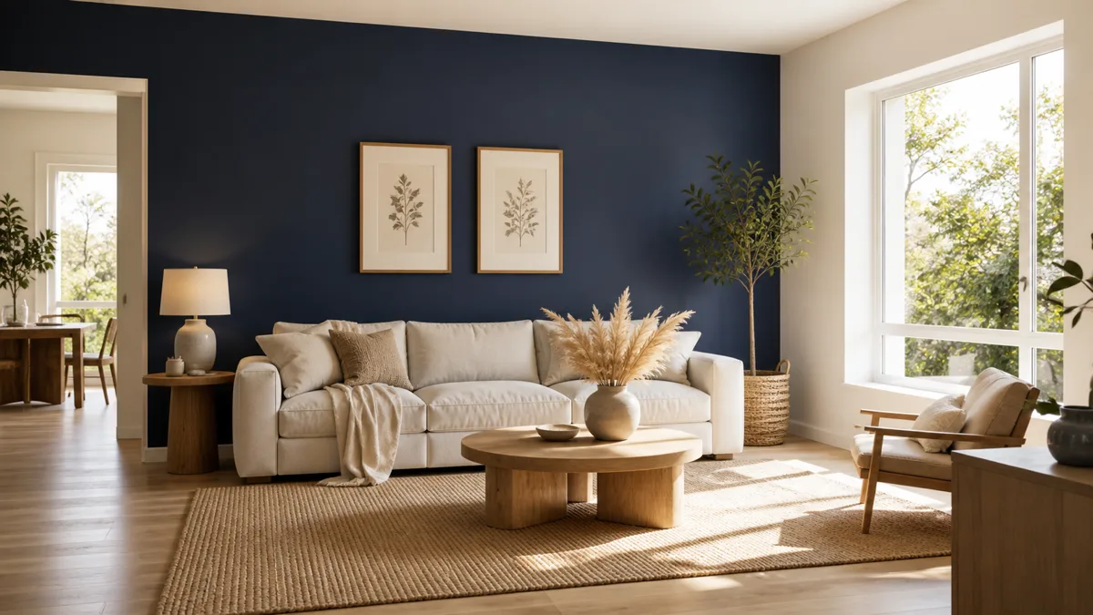
Scale is the lever, not subject matter. A canvas sized close to the width of the furniture below it reads as anchored. Three smaller pieces above the same sofa read as decoration that hasn’t committed.
The proportion to watch for: the art should occupy roughly two-thirds to three-quarters of the furniture width below it. A 48-inch piece above a 7-foot sofa is right. A 24-inch piece above the same sofa looks orphaned. Leave the wall on both sides of the canvas empty — the negative space does as much work as the art itself.
Lean large art on the floor or a console instead of hanging

The casual cousin of the statement canvas, and the only zero-damage option for a strict rental. Lean a large piece on a low console table or directly on the floor. The top tilts toward the room by a few degrees. Nothing on the wall behind it. The composition reads collected, not curated, and it can be rearranged in thirty seconds.
A stacked floor lean is the variation that costs nothing to try. Three frames of different sizes resting on the floor against a blank corner — biggest in back, mid-size in front of it, smallest at the front edge. The overlap is the design. It works in any corner that catches light, and the only requirement is that the wall behind it stays empty.
- Stack three frames of different sizes on the floor in a corner — biggest in back, overlapping smaller ones in front. No nails, no measuring, and rearranging it takes seconds.
Anchor the wall with a sculptural clock or single object instead of art

Not every wall needs art. A sculptural object — a large vintage clock, a wooden round disc, a sun-shape made of woven straw — works as a focal anchor in places where a framed print would feel default. Roman numerals on a 24-inch clock face read as collected, not catalog.
The rule is the same as for statement art: the object’s scale should hold its own against the furniture below it. A small clock above a wide console looks lost. Pick one object, hang it centered, and leave the wall around it bare. The single-object move forces the eye to rest, which is the entire point of decor as opposed to decoration.
Wall decor works one wall at a time, not as a roomwide theme. Pick the wall that has bothered you longest and match it to the approach that fits — statement scale, beyond-basic gallery, architectural texture, or soft 3D layering. The other walls will feel easier after the worst one is resolved.
Replace the grid with a picture ledge of overlapping frames

This is the upgrade to a basic gallery wall, and it costs less than measuring tape and hanging hardware. One long shelf — 4 to 6 feet wide, 3 to 4 inches deep, with a small front lip — mounted at art height. Lean five to seven framed prints along it. Let them overlap.
The mechanism the ledge unlocks is swapability. Bring home a new print at a thrift store, swap one out in fifteen seconds, no patching nail holes. Mix frame finishes and sizes intentionally — same-color same-size frames on a ledge read as a sample display; mixed sizes overlapping read as a real collection. The overlap is the design, not a problem to fix.
Build an asymmetric gallery around one focal centerpiece

Pick a focal piece — a round mirror, a wooden disc, an oversized clock — and let it carry the gravity of the wall. Cluster framed art around it asymmetrically. Heavier on one side. Frames flowing off-center. Heights and sizes varying on purpose. The composition reads organic because it follows a focal point instead of a grid line.
A grid gallery wall depends on every frame being the same color to hold together. An asymmetric gallery does not. Mixed finishes — thin black, warm walnut, brushed brass — actually help, because the eye reads the variety as collected over time. The focal piece does the unifying work that frame consistency would otherwise have to do.
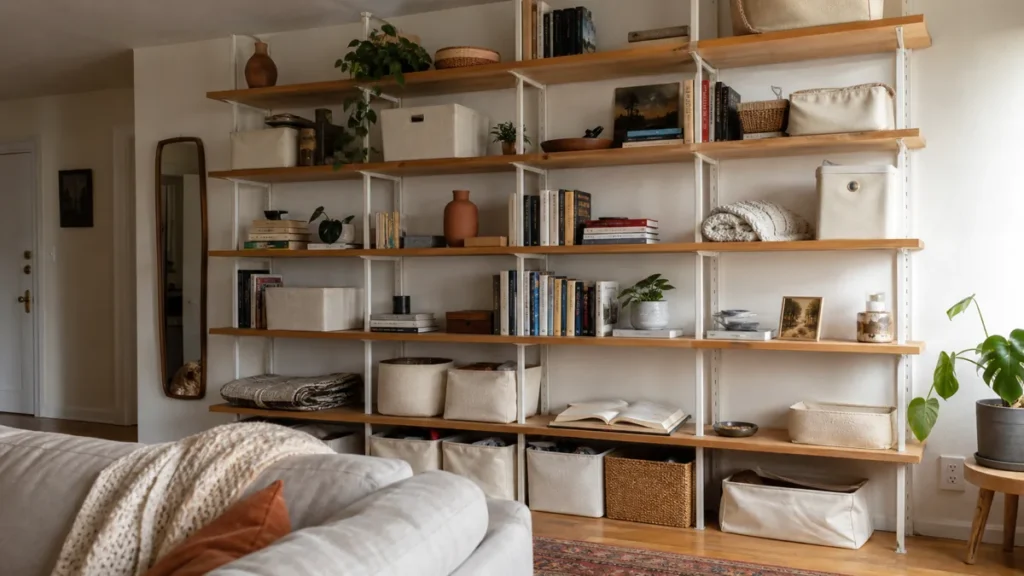
- Swap framed art entirely for 3D objects — woven baskets in mixed tones, hand-thrown ceramic plates, sculptural wooden discs. Cluster them on a single wall the same way frames would cluster, but the depth and texture do the work that color and pattern would have done. No glass, no nails through fragile mats.
Camouflage the TV with a gallery wall around it

The wall-mounted TV is the most common blank-wall problem in a living room, and the most common solution is wrong — trying to hide it. Stop trying. Treat the screen itself as the centerpiece of a gallery and cluster framed art on three sides of it.
When the TV is off, it reads as one dark rectangle in a composition. When it is on, the frames recede into peripheral vision. The spacing matters — keep the frames close to the TV, about four to six inches of wall visible between the screen edge and the nearest frame, so the eye reads the whole cluster as one piece. Mix frame sizes and finishes; matching frames would only make the TV more obvious.
Hang a sculptural statement mirror — shape, not size, is the lever

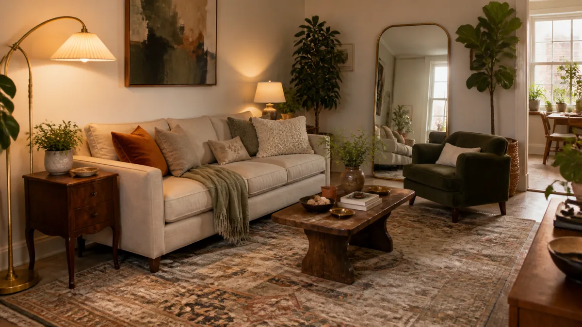
A flat rectangular mirror does the job. A sculptural mirror does the job and reads as the focal piece of the room. Arched. Sunburst. Wavy. Asymmetric organic. The silhouette itself carries weight that a basic rectangle never will.
The trap to avoid is the catalog-famous shape that everyone recognizes — the gold sunburst on every Pinterest board, the wavy mirror in every rental refresh. Look for a sculptural form that does not telegraph a specific store. Thrift stores carry a steady rotation of arched and organic-shape mirrors at a fraction of catalog prices, and antique sections often have ornate framed pieces that read more singular than anything new.
Most wall decor advice is a parts list. These four rules are what turns the parts list into a wall that reads finished rather than busy.
Cluster small mirrors as a composition, or lean one oversized floor mirror

Two opposite mirror moves that both work. The cluster turns five thrift-store mirrors into a sculptural composition — round next to hexagon next to oval, sizes varying, frame finishes mixed. Mounted as a flowing cluster on a single wall, the variety reads as a curated collection rather than mismatched leftovers.
The floor mirror is the rental-safe version. A 6-foot mirror with a thin matte-black frame leaned against the wall behind a chair or near a window doubles the apparent depth of the room without a single anchor in drywall. The lean has to be clear — the top tilted toward the room by a few inches — so the piece reads as casually placed instead of accidentally fallen.
- The floor lean is the better option in a rental with strict damage rules. A 5- to 6-foot mirror leaned upright against the wall behind a chair, near a window, or in any corner that catches afternoon light. Nothing mounted, no hanging hardware. The reflection does all the visual work.
Add a picture rail or chair rail for built-in architectural detail

A picture rail or chair rail is the cheapest architectural upgrade in any apartment, and it works because most renters never consider it. Picture rail moulding installed 12 to 18 inches below the ceiling adds the visible line that old buildings have and new builds don’t. Chair rail at 32 to 36 inches splits the wall horizontally without needing two paint colors.
The lever is the moulding profile, not paint contrast. Paint the rail the same cream as the wall behind it. The shadow line under the rail does the work. The cost is a length of basic trim at the hardware store and an afternoon of mitering and nailing — well under fifty dollars for a whole room, and removable with a putty knife and a coat of touch-up paint when it’s time to move.
Cover one wall with vertical wood slats or peel-and-stick wallpaper pattern

Wood batten walls have moved from designer-only territory to one-weekend DIY. The materials list is 1×2 lumber from the home center, stain or matte paint, and a brad nailer rented for ninety minutes. Space the battens 1 to 2 inches apart so the wall behind shows through the gaps. The vertical rhythm transforms a flat sheet of drywall into architectural texture in under four hours.
The pattern alternative does the same job with less commitment. Peel-and-stick wallpaper in a small-scale botanical or geometric repeat reads as installed wallpaper from across the room, peels off in one piece when the lease ends, and costs less than a textbook. Keep the pattern small-scale and earthy — large bold patterns date quickly, and small repeats read as texture rather than as a statement.
- Peel-and-stick wallpaper is the rental-safe version of the same lever. Small-scale botanical or geometric repeat on a single accent wall — earthy, muted, no jarring color — peels off cleanly at move-out, costs less than a wood batten install, and goes up in an afternoon.
Build DIY frame moulding squares for a wainscoting look on a budget

Faux wainscoting from cheap trim is one of those decor hacks that looks like it shouldn’t work and then does. Cut thin trim into rectangles, miter the corners, nail them to the lower half of a wall, and paint the whole thing — trim and wall — the same color. Three to four rectangles per wall section, spaced evenly. The trim casts a small shadow on the wall inside each rectangle, and the eye reads the entire lower half as architectural detail.
The build is straightforward. Trim runs ten to fifteen dollars per long piece at the home center. A miter box and a hand saw do the corner cuts; a brad nailer is faster but a hammer and finish nails work fine. The whole installation, including paint, takes a single weekend and adds the kind of old-house architectural cue that no amount of furniture can fake.
The 5-Lever Wall Decor Priority
- 1One oversized statementA canvas sized two-thirds to three-quarters the width of the furniture below it — sofa, console, bed. One piece. Wall on both sides empty. The cheapest visual upgrade above any sofa.
- 2Picture ledge over grid galleryOne long ledge, five to seven framed prints leaning and overlapping. Mixed sizes, mixed frame finishes. The overlap is the design; swap any frame in fifteen seconds.
- 3Sculptural mirror shapeSkip the flat rectangle. Pick an arched, asymmetric, wavy, or organic-shape mirror. The silhouette does the work. Thrift stores carry these at a fraction of catalog prices.
- 4Architectural texture accent wallWood batten slats with visible gaps, peel-and-stick wallpaper in a small repeat, or DIY moulding squares as faux wainscoting. One wall, one weekend, the texture becomes the decor.
- 5Kilim as wall tapestryA 4×6 vintage flat-weave hung from a wooden rod through a sleeve. Texture, pattern, and color in one piece. Thrift stores and estate sales surface real kilims for under sixty dollars.
styledhomenotes.com
Hang a vintage rug or kilim as a wall tapestry

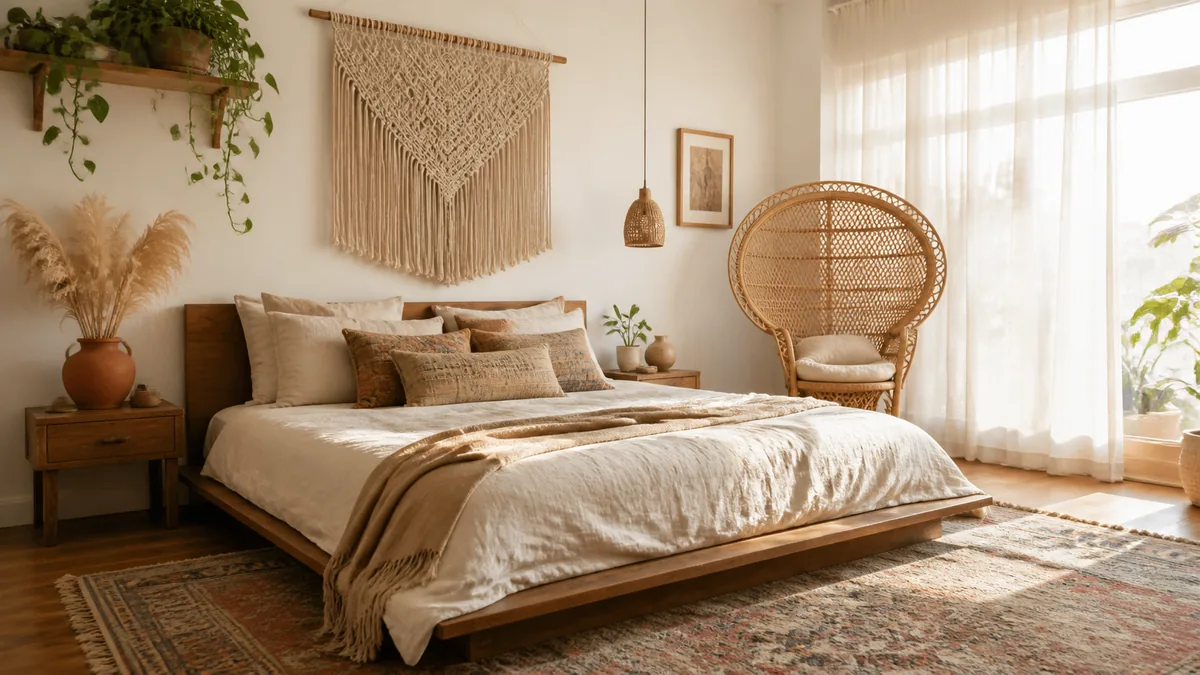
Textile on the wall reads richer than any printed canvas because the weave itself is the texture. A flat-weave kilim or vintage Persian rug — 4 by 6 feet, geometric pattern, fringe at top and bottom — mounted as a wall tapestry above a sofa carries color, pattern, and material in a single piece. Thrift stores and estate sales surface real kilims for under sixty dollars regularly.
The mounting method is a wooden rod through a sleeve sewn into the top of the rug, held by two small wall hooks. No frame, no glass, no stretcher. The textile drapes slightly unevenly — that real-fabric quality is the difference between this lever and a printed canvas trying to imitate it. For an eclectic styled room that uses the same textile-as-wall-art mechanic inside a full boho aesthetic, the boho living room playbook walks through the layering system.
Build a 3D cluster with woven baskets and dried branches

Depth on the wall does what framed flat art cannot. A cluster of woven baskets in mixed sizes and tones, hung directly on a single wall, projects four to six inches into the room. The shadows behind each basket do half the work — the textural variety and the depth carry the rest. Mix natural tan, warm walnut, and cream baskets in clearly different sizes; matched sets read as a display, varied tones read as collected.
A wall-mounted vessel filled with dried pampas, eucalyptus, or bare branches is the same mechanism with a different material. The botanical extends two to three feet off the wall plane, casting organic shadows on the cream behind it. The combination of low-cost dried botanicals and a thrift-store wall vase becomes one of the highest-impact 3D moves in this article.
- Dried branches in a wall-mounted vessel extend the wall composition into the room. Pampas, eucalyptus, bare branches — anything that holds shape without water. The projection off the wall is the lever; flat botanical prints would not register the same.
Add picture lights or plug-in wall sconces to spotlight existing art

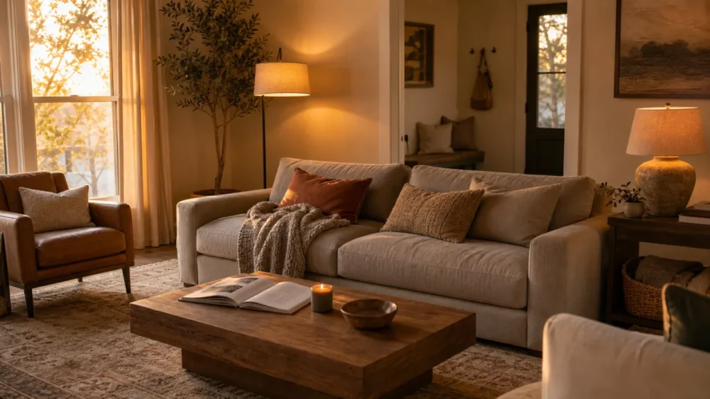
Lighting an existing piece of art turns it into the focal piece of the room at night. A small plug-in picture light mounted above the frame, set to a warm 2700K bulb, casts a soft amber wash across the top of the canvas. The art shifts from background decoration to lit centerpiece, and the rest of the room recedes into the kind of pooled-light atmosphere that magazines spend an evening staging.
The plug-in version skips the electrician. The cord runs down the wall to a standard outlet, taped or clipped along a thin line. For warmer mood overall — not just the picture light effect — the cozy living room playbook covers ambient lighting layering for the whole room.
Treat the wall behind a console with a single bold graphic print

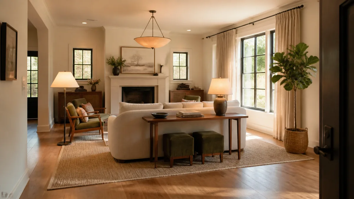
A console wall — behind a sofa, in an entry, against any feature wall — anchors with a single bold graphic print. Not a watercolor. Not a small abstract. A high-contrast botanical line drawing, a vintage map illustration, an oversized typography-free poster. The bolder the contrast, the more the print reads as a deliberate focal anchor for the console arrangement below.
The proportion is the same as the oversized statement canvas: roughly two-thirds to three-quarters of the console width below. Hang it centered. Style the console with three objects max — a small vase, a stack of two books, a bowl. The bold print does the heavy lifting; the console styling stays simple precisely because the print is already carrying the wall.