12 Living Room Console Table Decor Ideas That Look Curated Not Cluttered
A console table is rarely a furniture problem. It is a styling problem. The narrow surface invites a pile of mail, a charger, two candles, and one orphan plant inside a week.
Treat the console as a small composed scene, not a shelf. A few objects placed with intention beat a dozen objects scattered with none. The same rules that make a coffee table read calm work harder on a console, because the wall behind is part of the picture.
These twelve moves come from the same playbook as our broader coffee table styling ideas guide, but every one of them is about the console itself: the layering, the wall above, and the breathing room between the objects.
From a clear three-height vignette to a picture ledge that floats art off the wall, these twelve moves turn a narrow console into a curated surface that looks intentional, not cluttered. Jump to the fix you need first.
- 1Layer one tall anchor behind a mid object behind a short one
- 2Hang a round mirror to double the light above the console
- 3Style in odd-numbered groupings of three
- 4Use a long wooden tray to corral keys and mail
- 5Add a pair of matching table lamps for symmetry
- 6Vary the heights with books stacked under a vase
- 7Anchor one end with a sculptural bowl
- 8Slip two stools under the console for hidden seating
- 9Let one third of the top stay empty
- 10Mix natural texture with one metal accent
- 11Swap out one object each season for easy refresh
- 12Float art off the wall on a picture ledge behind the console
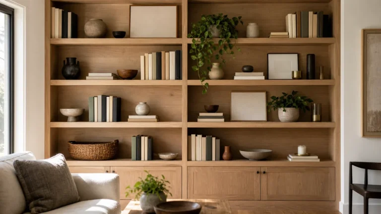
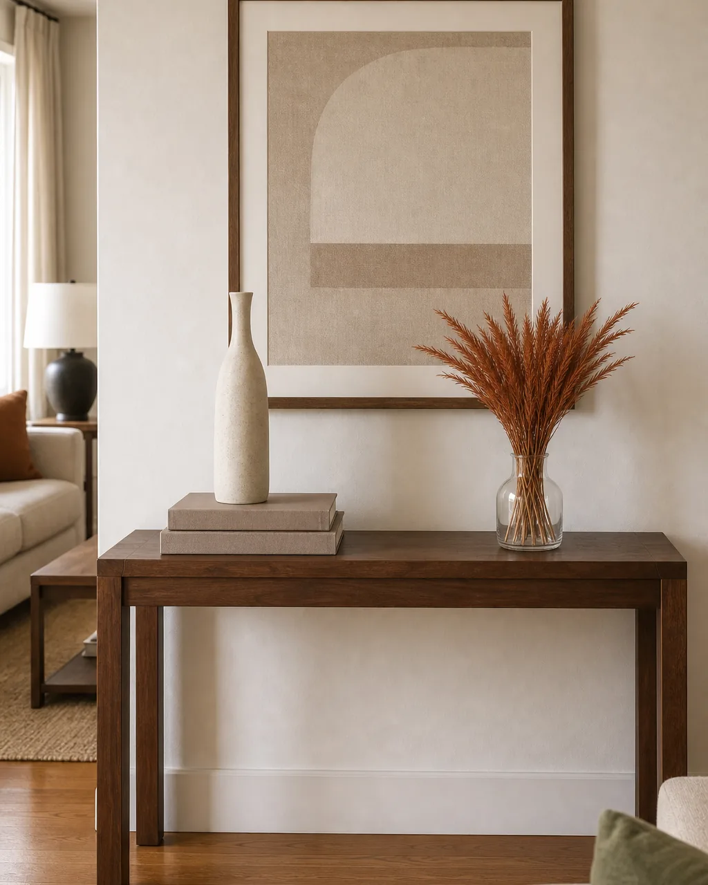
Layer One Tall Anchor Behind a Mid Object Behind a Short One
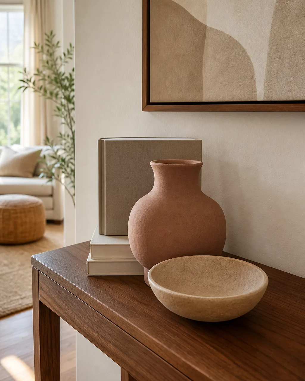
A console with everything at the same height reads as a row of objects. A console with three clear layers, tall behind mid behind short, reads as a styled vignette. The eye travels back to front instead of left to right, and the surface gains depth it did not have.
Choose three pieces that do not compete on the same axis. One tall vase or framed piece sets the back line, one medium ceramic or stacked books sits in the middle, and one low bowl or short candle holds the front. Each row clearly steps down.
- Set the back row first against the wall; a stack of books, a small frame, or a tall vase anchors the depth
- Place the middle row about an inch in front of the back row, not flush; the gap is what reads as layered
- Keep the front row low enough that the back row is still fully visible above it
- Avoid putting two objects in the same row at the same height; vary one slightly to break the line
- Step back four feet to check the silhouette; layering only works if the three heights still read from across the room
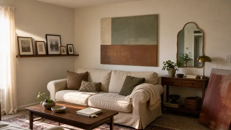
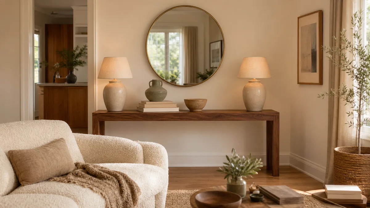
Hang a Round Mirror to Double the Light Above the Console
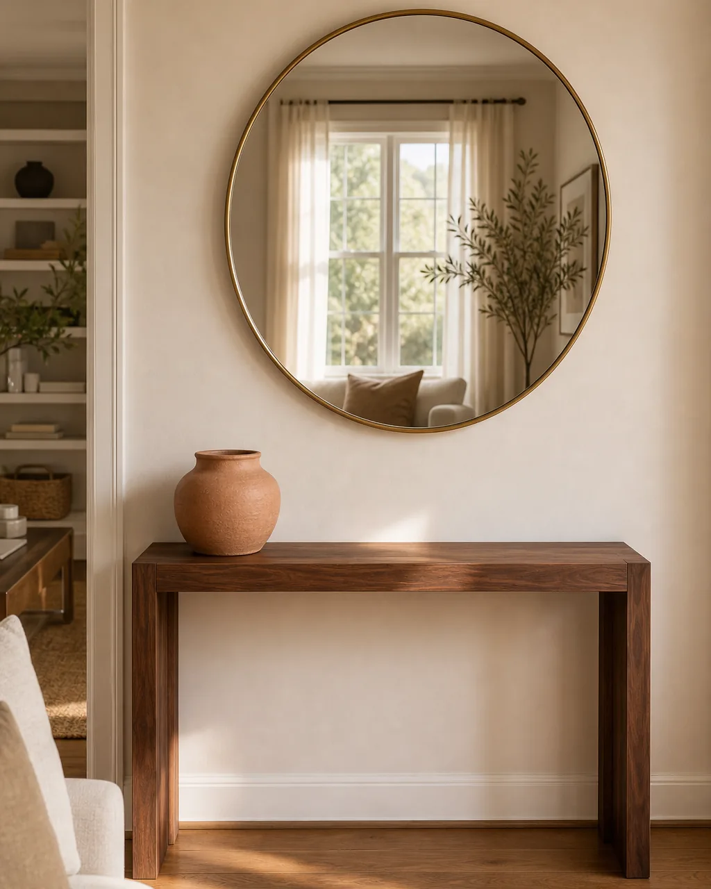
The wall above a console is the second half of the styling job. A round mirror over the console almost always wins, because it bounces whatever daylight hits it back into the room and makes the console feel like a working light source.
The shape matters. A round mirror softens the rectangle of the console below, which keeps the whole composition from reading too boxy. A rectangle mirror works too, but it doubles the lines instead of breaking them, so it is the harder choice in a small room.
- Hang the mirror so its center is roughly 60 inches off the floor, in line with eye height
- Size the mirror about two thirds the width of the console; smaller looks lost, wider looks heavy
- Position it directly opposite the brightest window in the room to get the full doubling effect
- Choose a brushed brass or matte black frame, not a fussy gilded one; the simpler frame disappears
- Keep the wall around the mirror empty; one round mirror is enough above a styled console
Style in Odd-Numbered Groupings of Three
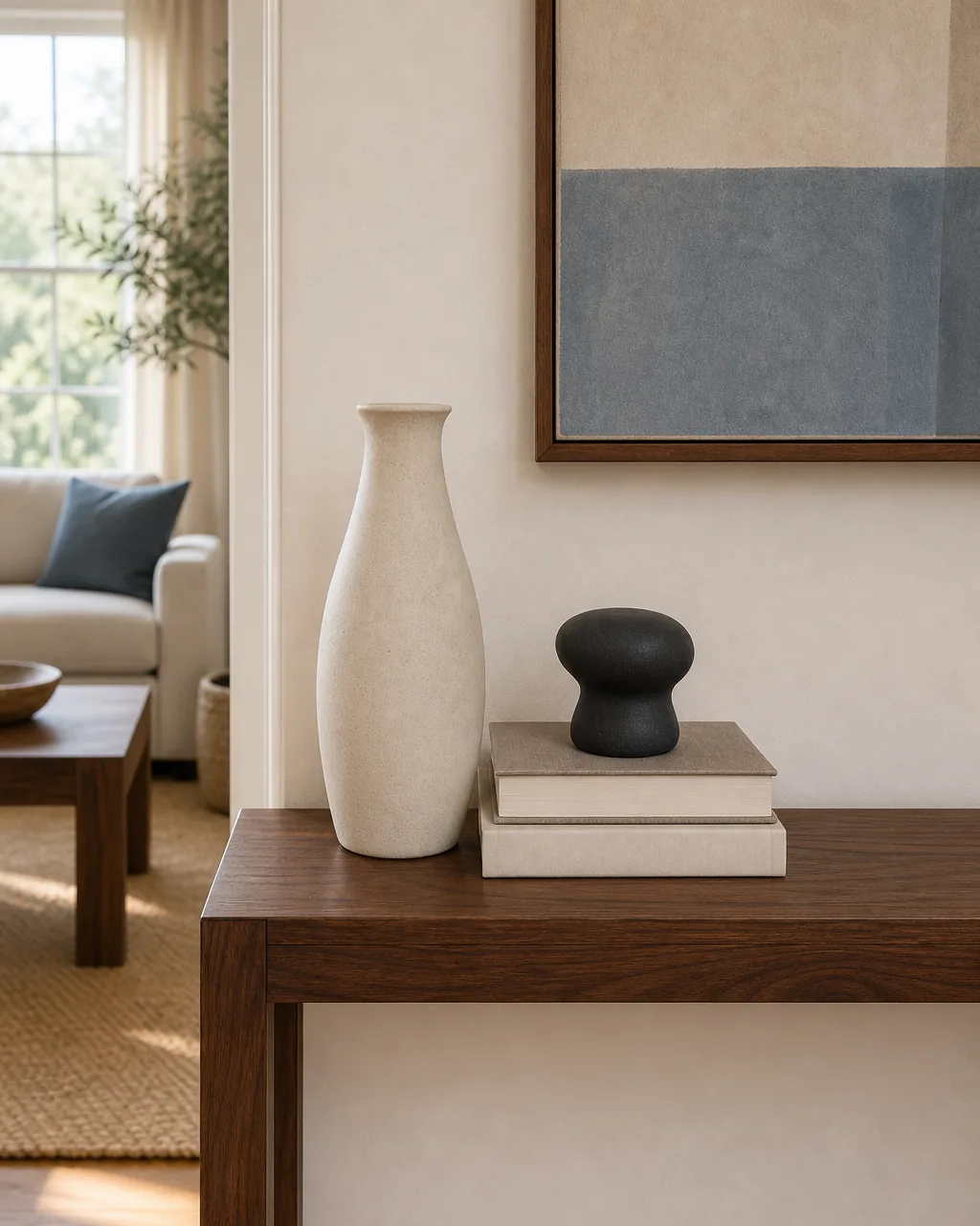
Two objects on a console always read as a pair, and a pair quietly suggests something is missing. Three objects read as a composition, finished. The same logic shows up in florists and stylists; odd numbers feel intentional, even numbers feel transitional.
The cluster matters more than the count. Three objects spread evenly across the console still feel like a row of three. Three objects pulled tight together, with the rest of the console deliberately empty, read as a vignette. Tight is what does the work.
- Group the three objects within a footprint smaller than one foot square; tight clusters beat spread ones
- Vary the heights inside the cluster so the trio still steps tall, mid, short
- Place the cluster off-center on the console, not dead middle; off-center feels considered
- Skip the temptation to add a fourth object to balance the empty side; emptiness is the balance
- Reach for five only on a very long console; three works on most apartment-scale pieces
You will not need all twelve at once. Pick the issue below that matches your console today, and start with those two or three ideas.
Use a Long Wooden Tray to Corral Keys and Mail
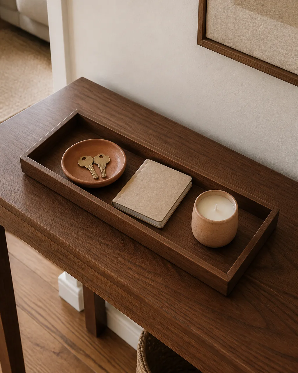
A console near the door takes a daily beating from keys, mail, sunglasses, and the random charger. Without a tray, all of it migrates across the surface and stays. With a tray, the same chaos becomes a contained zone that reads as styled when nothing is happening and as functional when life is.
The right tray reads as a decor object on its own. A long warm wood tray, ten to eighteen inches across, sits flat on the console and gives the everyday stuff a home. The styling rule becomes simple: if it lives in the tray, it belongs; if it drifts onto the bare console, it goes back.
- Size the tray about a third the length of the console so it never feels like a shelf
- Choose a warm wood or rattan tray that picks up the console finish rather than fighting it
- Keep one styled object inside the tray permanently, even when keys are not there, so it reads finished
- Refuse to let any non-tray item sit on the bare console long term; the tray is the boundary
- Skip mirrored or metal trays for a high-use entry zone; they show every fingerprint by Tuesday
Add a Pair of Matching Table Lamps for Symmetry
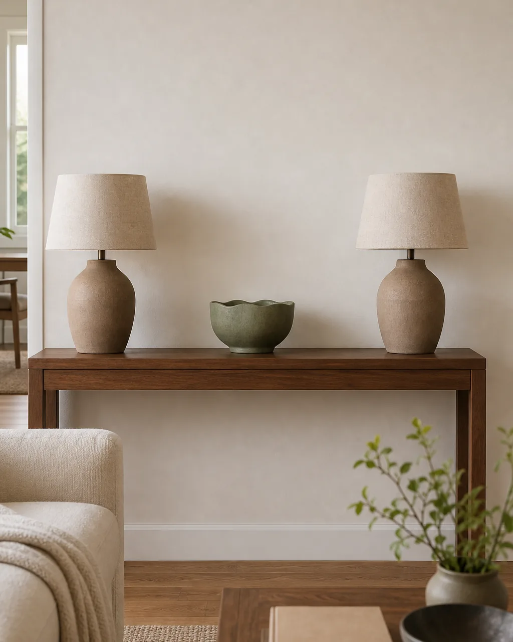
Symmetry is the shortcut that makes a console feel resolved. Two identical lamps at equal distance from the center give the eye a frame, and anything placed between them automatically reads as the focal point. The console stops looking decorated and starts looking composed.
The lamps do not have to be loud. Plain ceramic bases in a muted clay or warm white with natural linen shades disappear into the room until the light is on, and then they do the second job: warm pools of light at sofa height instead of one overhead bulb flattening the room. Sometimes the styling move is also the light fix.
- Buy a true matching pair, not similar lamps; near-matches read as a mistake from across the room
- Choose plain ceramic or matte metal bases without elaborate trim; calm bases age better than novelty ones
- Set both lamps the same distance from the center; measure with the tape, not the eye
- Use the same bulb wattage and warm color temperature in both; mismatched warmth ruins the symmetry
- Skip cord covers if the cords trail behind the console; a slim plug strip with a sub-six-inch cord is cleaner
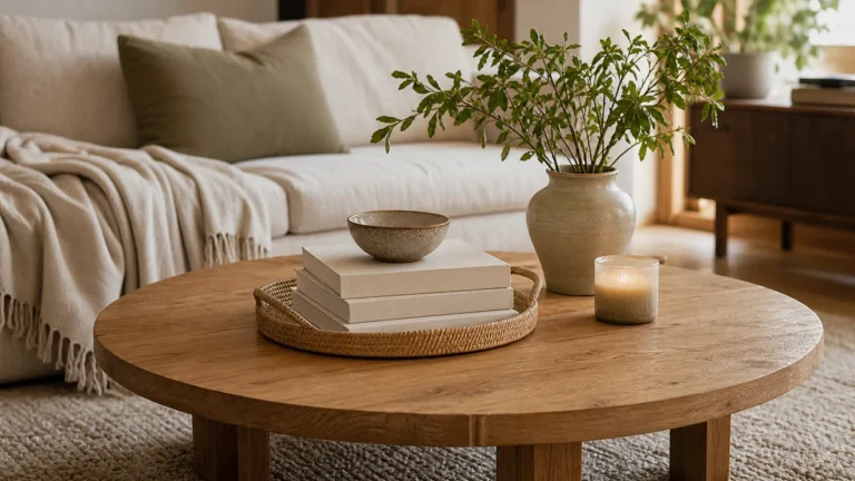
Vary the Heights With Books Stacked Under a Vase
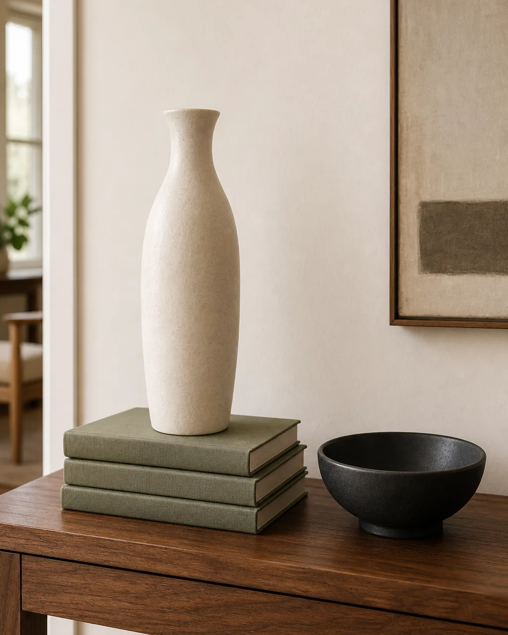
A vase placed directly on the console sits at one height. The same vase placed on a small stack of books sits two inches taller, and that two inches changes how the whole vignette reads. Books as a riser quietly add the height variation a console always needs without buying anything new.
The books also do double duty as styling pieces. A stack of two or three hardcovers with the spines turned to one direction holds the vase up and reads as part of the composition. The stack becomes a quiet pedestal, not a pile of reading.
- Stack two to three hardcovers flat, spines facing the same direction; mixed directions read like clutter
- Choose books with blank or muted cloth covers; busy jackets compete with whatever sits on top
- Place a single tall object on the stack, never two; the stack is a pedestal for one piece
- Pair the lifted vase with a low bowl or candle on the surface next to it for the height contrast
- Skip stacking books vertically as bookends on a styled console; vertical books belong on a shelf, not a vignette
A console looks composed or chaotic depending on a few habits. These four rules are what keep a styled surface from tipping over into a pile of loose objects.
Anchor One End With a Sculptural Bowl
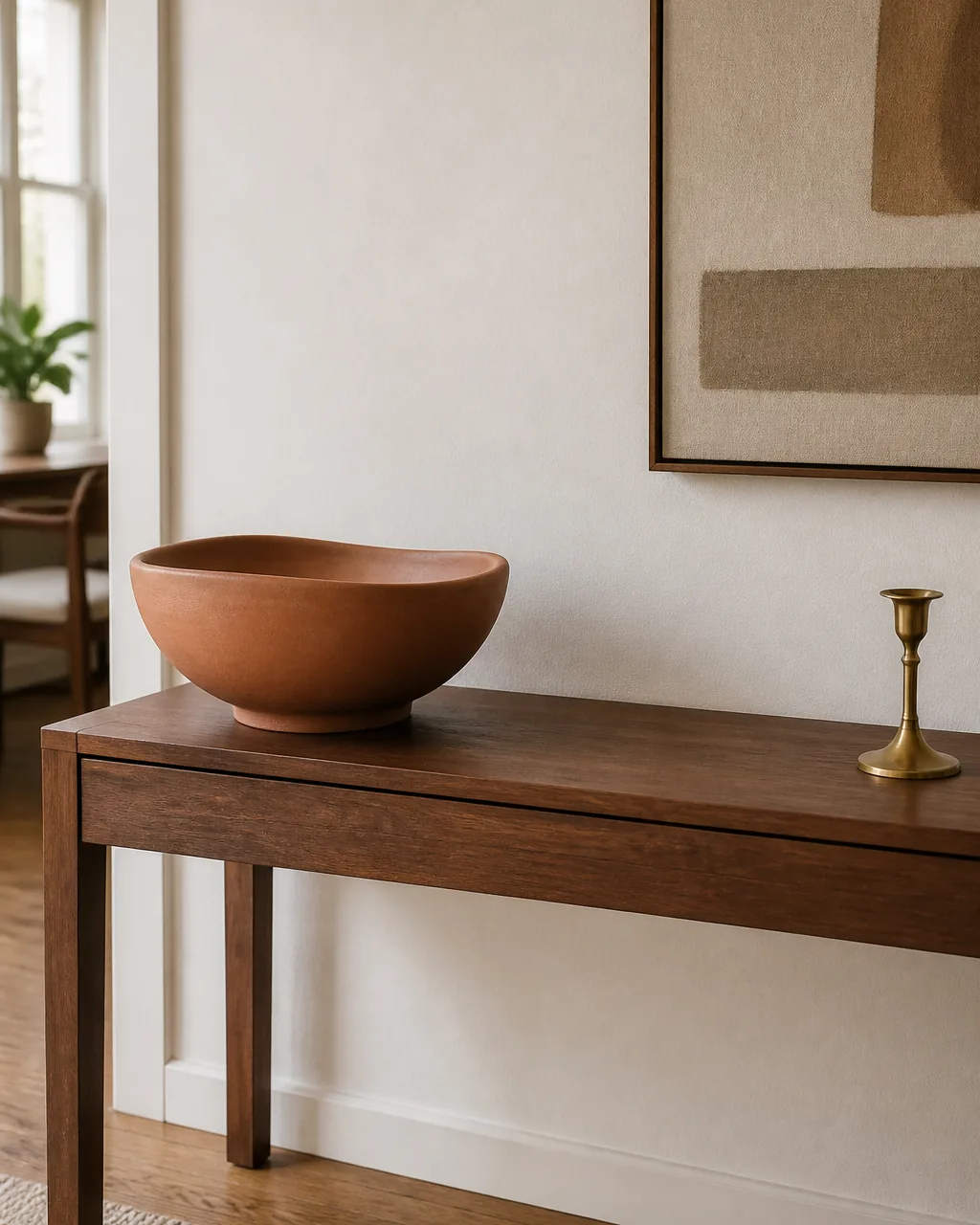
A console without an anchor object drifts visually. The eye lands somewhere different every time, and nothing feels like the starting point. One large sculptural piece at one end of the console gives the surface a reference, and every other object reads in relation to it.
The bowl works because it has visual weight without occupying much height. A low wide sculptural bowl in matte clay or stoneware reads as one strong shape, not a cluster, and it leaves the airspace above it open. Set it at one end of the console, not the middle, and the rest of the surface gets room to breathe.
- Choose a bowl that is visibly larger and heavier than every other object on the console
- Set it at one end, about six inches in from the edge, never dead center
- Leave the area directly above the bowl empty so its silhouette stays clean
- Pair it with one small accent at the opposite end for visual balance, not a second cluster
- Pick a matte finish in clay, plaster, or stone; high-gloss bowls compete with lamps for the same shine
Slip Two Stools Under the Console for Hidden Seating
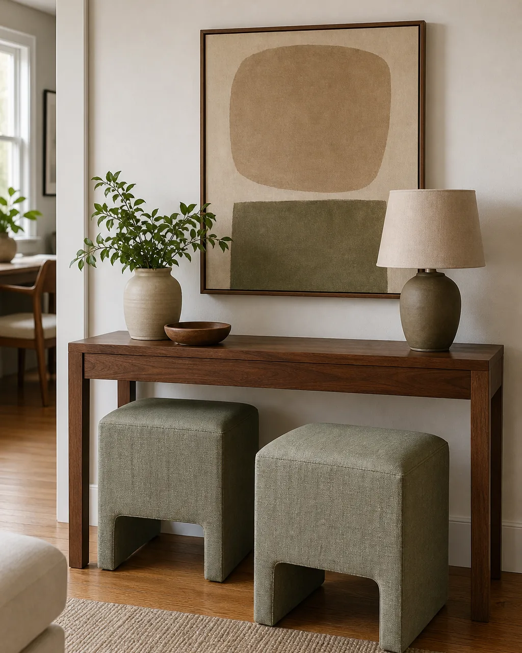
A console with two small stools tucked completely underneath does the same trick the coffee table styling playbook uses with nesting tables. The stools are invisible until someone needs them, and then they slide out as two extra seats with no rearranging.
The styling rule is that the stools must fully tuck. Any part sticking out reads as furniture left out of place, and the visual calm of the console disappears. Sized right, they look like part of the console silhouette, and the surface above stays free to be styled.
- Measure the console height minus an inch as the maximum stool height; the stools must clear cleanly
- Buy upholstered stools, not hard wood ones; people sit longer on a soft top
- Match the upholstery to one accent color already in the room so they belong even when pulled out
- Center the pair under the console, not flush to one side; the visual symmetry matters
- Resist storing baskets or boxes under the console once the stools are there; the gap belongs to the stools
Let One Third of the Top Stay Empty

A console with every inch of the surface covered reads as cluttered, even when each individual object is beautiful. A console with one third deliberately empty reads as composed. The empty area is what gives the eye a place to rest and what makes the styled side feel chosen.
The empty third does not have to be at the same end every time. Style on the left, leave the right open. Style symmetrically across the middle, leave both ends open. The principle is breathing room as part of the composition, not the space left after the objects ran out.
- Mark off mentally where the styled area ends; one third of the console length stays untouched
- Resist the urge to set down a single decorative object in the empty third; the emptiness is the object
- Move the daily landing zone to a tray, not the bare console top, so the empty area stays empty
- Re-style only when needed; once the empty third is the rule, the console stays calm without weekly fussing
- Step back to verify the empty area reads as intentional, not as a gap waiting to be filled
12 console moves for one curated living room surface
- 1Layer one tall anchor behind a mid object behind a short oneThree clear layers, tall behind mid behind short, read as a styled vignette and give the surface depth.
- 2Hang a round mirror to double the light above the consoleA round mirror bounces daylight back into the room and softens the rectangle of the console below.
- 3Style in odd-numbered groupings of threeThree objects pulled tight and placed off-center read as a finished composition, not a transitional pair.
- 4Use a long wooden tray to corral keys and mailA warm wood tray contains the daily chaos, reading styled when empty and functional when life happens.
- 5Add a pair of matching table lamps for symmetryTwo identical lamps at equal distance frame the center and add warm light at sofa height.
- 6Vary the heights with books stacked under a vaseA small stack of hardcovers lifts a vase two inches and doubles as a quiet pedestal in the vignette.
- 7Anchor one end with a sculptural bowlOne large low bowl in matte clay carries visual weight at one end and leaves the airspace above it open.
- 8Slip two stools under the console for hidden seatingStools that fully tuck stay invisible until someone needs two extra seats with no rearranging.
- 9Let one third of the top stay emptyDeliberate empty space reads as composed and gives the eye a place to rest beside the styled side.
- 10Mix natural texture with one metal accentMostly natural materials plus one warm metal piece catches light and breaks the matte uniformity.
- 11Swap out one object each season for easy refreshThree evergreen pieces plus one seasonal swap is the whole refresh, no full redecorating needed.
- 12Float art off the wall on a picture ledge behind the consoleA ledge lets canvases lean and overlap, adding depth and tying the wall and surface into one scene.
styledhomenotes.com
Mix Natural Texture With One Metal Accent
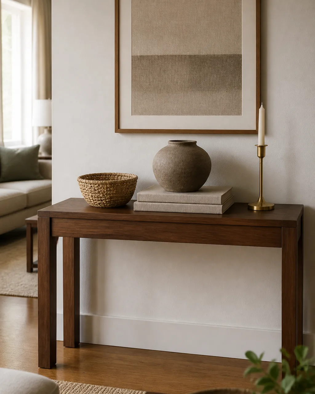
A console styled with all soft natural materials risks looking flat. A console styled with all metal looks cold. The sweet spot is mostly natural, with one piece of warm metal as the accent that catches light and breaks the matte uniformity.
The metal piece pulls double duty. It adds a reflective surface that bounces lamp light around the surface in the evening, and it gives the eye one bright point to land on against the matte clay, wood, and linen around it. One metal accent is enough; two metals start to compete with each other.
- Pick exactly one metal piece, not three; a single candlestick, vase, or sculptural object does the job
- Choose brushed brass or matte black over polished chrome; warm metals match warm wood tones
- Place the metal accent off-center, not in the middle of the natural pieces; it is the spark, not the anchor
- Skip pairing metal with mirror on the same console; the mirror already provides the reflective element
- Refresh the metal piece every few seasons; tarnished brass dulls the whole point of the accent
Swap Out One Object Each Season for Easy Refresh
A fully redecorated console is exhausting four times a year. A console with three evergreen objects plus one seasonal piece is not. One swap is the entire seasonal refresh, and the rest of the styling stays put.
The seasonal piece carries the calendar. Dried wheat stems in fall, branches in winter, fresh tulips in spring, lemons in a bowl in summer. Each one signals the season without the rest of the room having to follow. The eye picks up on the change because three of four pieces stayed the same; the new one stands out.
- Pre-decide which one slot is the seasonal slot before any swap; usually the right or far end of the console
- Keep three to four evergreen pieces that always stay; lamps, mirror, and the heavier bowl rarely leave
- Use a low vase or vessel as the seasonal container so the contents change but the base stays consistent
- Schedule the swap on the same weekend each season so it becomes a habit, not a project
- Resist swapping more than two objects at a time; the whole point is calm and easy
Float Art Off the Wall on a Picture Ledge Behind the Console
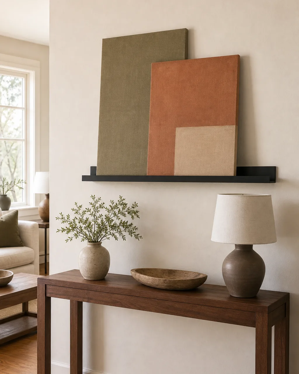
Art hung flat on a wall behind a console fixes the composition forever. A picture ledge changes that. The ledge gives a place for one or two canvases or framed prints to lean against the wall, slightly overlapping, and the whole vignette becomes editable in five minutes.
The visual move is the float. The art sits forward of the wall, not flush, which adds an inch of depth above the console and ties the wall and the surface into one layered scene. Pair the picture ledge with the right styling on the console below, and the whole wall area starts working together.
- Choose a slim ledge in matte black or warm wood, two thirds the width of the console
- Mount the ledge so the canvases sit at eye height when standing, about 60 inches off the floor
- Lean two pieces with a slight overlap; one piece looks lonely on a long ledge, three feels crowded
- Pick unframed canvases or simple wood frames; ornate frames fight the picture ledge clean line
- Refresh the art twice a year by swapping one canvas; the ledge makes the whole rotation a one-minute job
A console table is not really a furniture project, it is a styling habit. Choose a few objects that stay, leave one third of the top empty, lift one piece on a stack of books, and swap one object each season, and the same console reads calm Monday morning and curated Saturday afternoon.