15 Dollar Store Home Decor Ideas You Will Actually Want to Display

Most dollar-store decor reads as dollar-store the second you walk into the room. The reason is rarely the item — it is brand packaging still on it, the wrong scale, the wrong neighbor on the shelf, or three items where one would do. Fifteen specific items at Dollar Tree, Dollarama, or Five Below that read intentional. Each with mechanism, shopping cue, and one honest trade-off.

If you want the broader budget framework before the dollar-store specifics, the 20 budget home decor ideas under $20 each pillar is the upstream foundation — price-ceiling levers across the whole home, source-agnostic. This article is the Saturday-shopping-list spinoff.

Jump to the dollar-store idea
15 dollar-store moves that read intentional

The reader is in a real US apartment that has been priced out of “real” home decor. Each idea is a specific deployment lever — buy in repetition, swap branded packaging, deploy materially-coherent groups. Pick the four that match your apartment’s biggest visual problem and stack from there.

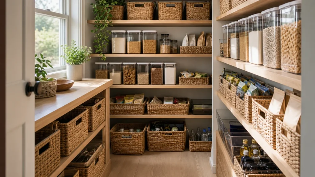
Decant Pantry Staples Into Clear Glass Jars

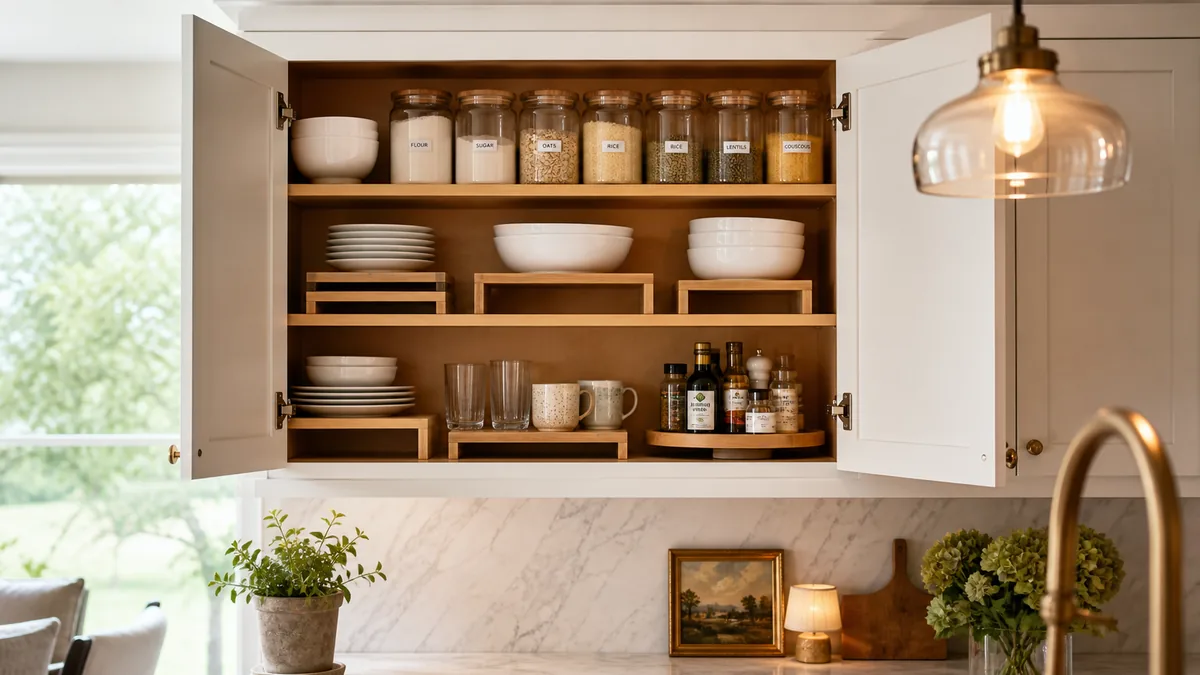
Six matching wide-mouth glass jars with wood lids in a single row on a dark walnut floating shelf with matte black L-brackets, holding decanted yellow pasta, white rice, lentils, oats, coffee beans, and brown grains, white counter below, soft direct daylight from the right, cream painted wall behind

A pantry shelf with six matching glass jars and the contents visible reads editorial. The same shelf with cereal boxes and rice bags reads as storage. The mechanism is brand-packaging removal — the eye reads brand labels as visual noise and reads identical containers as a designed system, even though the items inside are exactly the same.

The image shows six jars on one shelf, all the same wide-mouth shape, all with simple wood lids, all aligned in a single row. The natural color variation between rice, lentils, coffee beans, and oats does the visual work. No labels needed, no chalk-writing fad — the contents themselves are the styling.

  • Target the 30-oz wide-mouth glass jars in the canning aisle. Skip the small spice jars — too small to hold real bulk and they read as a spice rack, not a pantry system.
  • Buy six to eight at once. Visual repetition is the lever. Three matching jars plus four random containers cancels the effect entirely.
  • Decant pasta, rice, oats, lentils, coffee beans, sugar, flour. Pick the staples you actually use weekly — anything decanted but unused goes stale.
  • Skip the chalk-label craze. Hand-written chalk labels read as 2017 Pinterest. No labels at all, or small kraft tags tucked behind the jar, reads more current.
  • Trade-off. Half-decanting is worse than not decanting at all. Three jars next to a half-open cereal box reads cluttered. Commit to all eight or skip.

Group Three Plain Stoneware Bowls as a Coffee Table Sculpture

Three matching cream stoneware bowls in a slight cluster on a dark walnut coffee table, the edge of a cream sofa visible on the left, a small framed botanical print on the wall behind, light wood floor, soft side daylight

Three identical bowls grouped on a coffee table read as a small sculptural arrangement. One bowl alone reads as forgotten. Four or more bowls reads as a yard sale. The number is doing the work, and three is the magic count where the eye registers each bowl as intentional.

The image shows three cream stoneware bowls in a slight overlap, no contents visible, on a dark walnut coffee table. The contrast between the warm cream of the bowls and the dark wood of the table is what gives the grouping editorial weight. The bowls are not holding anything — they are the object.

  • Target plain cream or matte black small stoneware-look bowls, 4 to 6 inches in diameter. Skip patterned or glazed colors — they fight each other and read busy.
  • Buy three of the exact same bowl. Same color, same shape, same size. Variation reads as garage sale; identity reads as gallery.
  • Group with slight overlap, not perfect alignment. Two bowls touching plus one slightly behind reads relaxed. A perfectly straight line reads like a place setting.
  • Leave at least two bowls empty. One bowl can hold a single object — a smooth stone, a balled-up linen napkin — but two of the three stay empty.
  • Skip the bowls-as-snack-storage move. Bowls full of chips or candy ruin the sculptural read. The point is that they are decor, not function.
  • Trade-off. A coffee table smaller than 30 inches wide cannot hold three bowls plus a book or a tray. On a tiny table, drop to one larger bowl and skip the grouping.

Mason Jar Bathroom Apothecary Set

Four matching tall clear mason jars in a row on a white bathroom counter, holding from left to right cotton swabs, cotton pads, makeup brushes handles up, and coarse bath salts, the edge of a round black-framed mirror visible upper left, a cream hand towel hanging on a metal ring upper right

A bathroom counter with four identical mason jars holding daily items reads coherent. The same items in their original packaging — the cotton swab box, the cotton pad bag, the brush tin — read as a chaotic counter. The single-material rule does most of the lift. Pick glass for the whole counter and let the contents inside vary.

The image shows four matching tall mason jars, contents visible. Cotton swabs in the first jar read styled because the white tips create a soft uniform texture. Cotton pads stacked in the second look like a spa. Makeup brushes in the third read intentional only because the jar around them matches the others. The fourth holds coarse bath salts and adds the warm color note.

  • Target plain quart-size mason jars. No embossed branding visible on the glass — the smooth-sided versions are cleaner.
  • Buy four to five jars. Three is fine but four creates a stronger row across a standard 30-inch bathroom counter.
  • Use for cotton swabs, cotton pads, makeup brushes, bath salts, hair ties. Pick items used daily so refilling is part of the routine.
  • Skip the metal screw band when possible. Glass-only silhouette reads cleaner. If you keep the band, the wood-lid version reads warmer than metal.
  • Display in a row at the back of the counter. The front 6 inches stay clear for actual sink use.
  • Trade-off. Mixing mason jars with plastic containers breaks the single-material rule. Either all glass on the counter, or none. Half-glass-half-plastic is the worst version.
Pick the apartment problem that matches yours — the rest of the 15 dollar-store ideas slot in around the four levers you start with
What’s your apartment’s biggest visual problem?

Not every apartment needs all fifteen ideas. The article is built so each idea is a stand-alone deployment lever — pick the four that target your apartment’s specific weakness and skip the rest. The four quadrants below are the most common starting points.

Empty / dorm-vibes, needs warmthIf your apartment reads as empty and dorm-like — bare walls, cold lighting, no soft texture — your four highest-leverage dollar-store moves are garland, candles, a cutting board, and faux greenery. Start at Idea 15 Faux Garland to soften a hard shelf edge. Then Idea 8 Pillar Candles on a wood tray for warmth. Then Idea 5 Wood Cutting Board as wall display for texture. Finally Idea 6 Faux Eucalyptus in a single vase for living vertical interest.
Cluttered / brand-packaging chaosIf your counters and shelves are covered in branded pantry boxes, Dollar Tree stickers, and visible chaos under the sink, the issue is packaging noise. Start at Idea 1 Decant Clear Glass Jars to hide every branded label in the pantry. Then Idea 11 Apothecary Jars for the bathroom counter and cleaning supplies. Then Idea 9 Woven Baskets to mask the bulky cleaning items. Finally Idea 3 Mason Jar Apothecary for the bathroom textile and cotton-round storage.
Thrift sofa / mismatched textilesIf you have a thrift-store couch or hand-me-down chairs with mismatched throw pillows and clashing textiles, the issue is the textile palette is competing. Start at Idea 14 Pillow Covers to swap every clashing pillow cover for a single tonal family (oatmeal + cream + dusty sage). Then Idea 7 Linen Napkins draped as table runner or chair throw for woven texture. Then Idea 8 Pillar Candles on a tray to add warm-tone anchor that the textiles can lean against.
Cheap-looking pottery / vasesIf your existing pottery and vases read as cheap or dated — shiny plastic, awkward colors, off-brand finishes — you can transform them without buying replacements. Start at Idea 13 Spray-Paint Pottery with one matte editorial color (terracotta / sage / oat) across 3 mismatched vases for instant cohesion. Then Idea 6 Faux Eucalyptus in the largest vase to add living vertical line. Finally Idea 2 Stoneware Bowls grouped 3-up on the coffee table as sculptural anchor.

Layer Three Thin Black Frames on a Picture Ledge

A single walnut picture ledge mounted on a cream painted wall, holding three thin black frames in slight overlap with varying sizes — a small botanical line drawing on the left, a medium abstract geometric print in the center, a small dark abstract on the right, light wood floor below, the corner of a cream chair lower left

A ledge with three layered frames creates depth from a flat wall. Each frame partly overlaps the next, varying sizes, varying art styles, but all framed in the same thin black. The repetition of the frame color holds the grouping together while the overlap creates the visual depth that a flat gallery hang misses.

The image shows three frames on one walnut ledge, all thin black, all slightly different sizes, leaning at a relaxed angle. The art inside varies — line drawing, abstract geometry, dark abstract — but the frames are identical. That is the lever doing the work.

For the full wall-decor playbook beyond the picture-ledge specifics, the 18 living room wall decor ideas that work on a blank wall guide covers gallery walls, oversized art, and shelf styling at greater depth.

  • Target thin black plastic frames with magnetic glass fronts. The 4×6, 5×7, and 8×10 sizes are the most common at dollar stores — buy one of each size.
  • One walnut ledge mounted at eye height. Dollar stores often carry a basic shelf; a $5 craft-store ledge works if the dollar version is out.
  • Arrange in slight overlap. The smallest frame in front of the medium, the largest at the back. Not perfectly aligned — leaning a few degrees reads relaxed.
  • Free print sources beat Pinterest stock. Unsplash, Public Domain Review, and Smithsonian Open Access have line drawings with no watermarks. Print on matte paper.
  • Skip the “live laugh love” engraved frames. Generic typographic art kills the gallery read. Stick to abstract or botanical line work.
  • Rotate the prints in 30 seconds. The ledge is a swap zone — change the art seasonally without making new nail holes.
  • Trade-off. A wall under 36 inches wide cannot hold three layered frames. On a narrow wall, drop to two frames or use idea 10’s frameless acrylic approach instead.

Wood Cutting Board as Kitchen Wall Display

A single small rectangular wood cutting board hung from a single black hook on a cream painted kitchen wall, white subway tile starting to the right, white counter below, soft daylight from a window on the right

A cutting board on the wall instead of in a drawer reads as styled kitchen, not utilitarian one. The warm wood against the painted wall is the entire mechanism — texture against a flat color creates editorial weight that no amount of styled counter clutter can match. The board does not even need to be expensive. A $3 plain rectangle from the dollar store works as long as the surface is clean.

The image shows a small wood cutting board on a single black hook, plain rectangular shape, no carving or text, hung at counter-level eye height. The cream wall behind and the white subway tile to the side give the wood the contrast it needs to register as a deliberate display.

  • Target the small to medium plain wood cutting board. 8 to 12 inches long, plain rectangle, no carved handle and no text engraving.
  • Mount on the kitchen wall with a single hook. A $1 black metal hook from the hardware aisle reads cleaner than a decorative ornate one.
  • Use a separate board for actual cutting. The display board stays clean — knife scars and tomato stains read garage, not gallery.
  • Skip the chalkboard-painted versions. Painted boards with “Today’s Menu” scribbled across them read 2014 farmhouse.
  • The free version: use the cutting board you already own. Hang the one in your drawer instead of buying a new one. Spend the $3 on something else.
  • Trade-off. An actively-used cutting board with visible knife scars cannot become a display board midway through its life. Pick a fresh one for the wall or skip the idea.

Faux Eucalyptus Stems in a Single Ceramic Vase

A single matte cream ceramic vase with a rounded shoulder shape holding five to seven faux eucalyptus stems with green oval leaves, placed on a dark walnut surface, the edge of a gray sofa visible on the left, cream painted wall behind, soft side daylight

One large vase plus a handful of eucalyptus stems reads as a designed arrangement. The same number of stems split into three small vases reads cluttered. The vertical organic mass is doing the work — the eye registers one tall shape as intentional and reads multiple short shapes as visual noise.

The image shows a single matte cream ceramic vase with five to seven eucalyptus stems arranged with one or two shorter and several taller. No other plant material competes. The walnut surface beneath gives the cream of the vase the contrast it needs to read as the focal point.

  • Target faux eucalyptus stems specifically. Skip faux roses, tulips, or florals — eucalyptus is the only faux green that reads premium at dollar-store prices.
  • Buy five to eight stems. Three is too sparse. More than eight overcrowds the vase and the natural sway reverses into a rigid bouquet.
  • Pair with a matte cream or matte black ceramic vase. $1 to $3 at Dollar Tree, or use the spray-paint move from idea 13. Skip glossy or printed vases.
  • Arrange asymmetrically. One or two stems short, two or three stems tall. A perfectly even fan reads as funeral arrangement.
  • Skip bright-color faux florals. Silk roses in any color, plastic sunflowers, fake hydrangeas — all read fake. Eucalyptus is the safe lane.
  • Trade-off. Faux stems collect dust. A vase that sits untouched for two months reads neglected, not styled. Wipe the leaves every few weeks with a dry cloth.

Cream Linen-Look Napkins as Everyday Textile Anchor

A stack of five folded cream linen-look napkins on a white counter next to a dark walnut salad bowl, light cream wall behind, soft daylight from the left window

A stack of identical cream napkins next to a wood bowl reads as a designed kitchen scene. A drawer with four colors of dish towels and three napkin patterns reads as a yard sale, even when only the one on the counter is visible. The textile-family rule is the lever — one neutral color across every kitchen textile reads designed, period.

The image shows five matching napkins stacked, a single soft cream color, next to a deep walnut bowl. The textile and the wood are the only two materials in frame. That is the editorial cue — limited material count and one tonal family across everything visible.

  • Target plain cream, oatmeal, or soft sage cotton or linen-look napkins. The kitchen-towel aisle usually has them at $1.25 each.
  • Buy six to twelve of the same napkin. Same color, same texture. Stock up enough that a stained one can be retired without breaking the set.
  • Use as napkins, dish towels, and one folded under the cutting board from idea 5. The same textile travels across the kitchen and the consistency is the lever.
  • Skip the printed-pattern dish towels. Any pattern — checks, stripes, prints — fragments the textile family. One color, one texture, full stop.
  • Trade-off. Cream stains. Coffee, tomato, and olive oil leave marks. Plan to replace every 12 to 18 months, or go oatmeal or muted sage for zero-replacement.
What separates a dollar-store decor refresh that reads intentional from one that screams “I bought everything at Dollar Tree”
A 4-rule system for deploying dollar-store finds editorially

Most dollar-store decor advice fails because it treats the store as a shopping list instead of a deployment system. These four rules cover what consistently makes a $50 dollar-store run read intentional — buy in repetition, kill branded packaging, hold material consistency, bound the vignette — and what to skip even when an item looks good on the shelf.

Buy in repetition — 3+ of the same item beats 1 of eachThe visual lift comes from tonal and material repetition, not from variety. Three matching stoneware bowls grouped on a coffee table reads as intentional sculpture. One stoneware bowl + one ceramic vase + one wire basket on the same surface reads as a random pile. Three mason jars in a row, three pillar candles on a tray, three matching frames stacked on a ledge — resist the “one of each kind” instinct and commit to the multiples.
Remove all branded packaging before deployingDecant pantry staples into clear glass jars. Peel off every Dollar Tree price sticker (a hair dryer + Goo Gone removes adhesive residue). Hide branded soap pump labels behind a small linen strip or transfer the soap into an apothecary jar. Branded packaging is the single biggest “dollar store look” tell — the same items with the packaging removed read 80% more expensive.
Material consistency > varietyPick one material family per vignette and hold it: all glass (clear jars + clear vase + clear candle holder) OR all woven (baskets + linen napkin + jute coaster) OR all wood (cutting board + wood tray + wood frame). Mixed materials in a small vignette read busy and disorganized. One material family per surface reads designed and editorial.
Five deployed correctly > fifteen scattered with no planA wood tray with 3 stoneware bowls + 2 pillar candles in one corner of one surface outperforms fifteen dollar-store items spread across five surfaces. Bound your vignette before you deploy — one tray, one shelf, one wall, one coffee table corner — and put everything in that bounded zone. Five items in a vignette reads intentional. Fifteen items scattered reads frantic.

Three Unscented Pillar Candles on a Wood Tray

Three cream pillar candles in varying heights — short, medium, and tall — placed on an oval dark walnut tray on a dark walnut coffee table, the corner of a cream sofa with a throw visible on the left, soft side daylight

Three candles inside a tray edge read as a styled vignette. The same three candles spread across the coffee table read as scattered objects. The tray is doing the work — bounded space reads calm, freeform reads cluttered, even when the contents are identical.

The image shows three cream pillar candles on an oval walnut tray on a dark walnut coffee table. The candles are varying heights — short, medium, tall — and grouped close together near one end of the tray. The remaining tray space stays empty, which is part of the look. A crowded tray cancels the effect.

  • Target plain unscented cream or off-white pillar candles in 3, 6, and 9 inch heights. Avoid scented and holiday-themed versions — both date the vignette.
  • Buy one of each height. The varied heights are what makes the grouping read as designed instead of a place setting.
  • Place on a small wood tray. Slate or a flat ceramic plate works if no tray. Anything that defines a clear edge does the job.
  • Group the candles toward one end of the tray. Leaving open space on the other end reads more relaxed than centered alignment.
  • Skip lighting them often. These are decor. Burning wax pools and visible wicks pull the read from styled to lived-in fast.
  • Trade-off. Five candles or three candles without a tray both lose the lever. The boundary is non-negotiable. Skip if no tray surface is available.

Woven Baskets for Bathroom Visible Storage

Two woven seagrass baskets on a single dark walnut floating shelf above a white toilet — a taller cylindrical basket on the left holding stacked toilet paper rolls, a lower rectangular basket on the right holding rolled cream towels, cream painted wall, soft daylight from a window on the left

Two woven baskets on the shelf above the toilet do two design jobs at once — they hide the chaos of toilet paper and towels, and they add natural fiber texture against the cream wall. Plastic bins do neither. The natural fiber is the lever; varying the basket sizes is the second lever.

The image shows a single walnut shelf above a white toilet holding a taller cylindrical seagrass basket with toilet paper rolls visible from the open top and a lower rectangular basket with cream rolled towels. Two basket shapes, one shelf, one tonal family of natural fiber. The wall behind stays plain.

  • Target seagrass, water hyacinth, or rope-woven baskets. The plastic-woven look-alikes read as cheap because the texture is wrong — they shine slightly under light.
  • Buy two or three in varying sizes for one shelf. A taller cylinder plus a lower rectangle reads designed. Three identical baskets reads like a hotel storage cart.
  • Use for toilet paper rolls, rolled hand towels, hair tools, first aid supplies. The open top is part of the look — skip lidded versions if possible.
  • Display on an open shelf or under the sink. The shelf-above-toilet placement is the strongest visual lever because it uses dead vertical space.
  • Skip the plastic basketweave imitations. Natural fiber reads warm; plastic reads bargain.
  • Trade-off. All baskets matched to the exact same size reads hotel, not styled. Vary the proportions — one wide, one tall, one short — for the home read.

Plain Acrylic Frames for Free Botanical Prints

Three clear acrylic floating frames in a horizontal row on a cream painted wall, each with a simple black-ink botanical line drawing — a single branch on the left, a small leafy branch in the center, a fern on the right, small magnetic corner pieces visible, soft daylight from upper right

Three frameless acrylic frames with simple line-drawing botanicals read as $40-per-piece modern wall art. The real cost is closer to $4 per piece. The mechanism is what the frame is missing — no decorative border, no thick wood, no ornate matting. The art floats inside two clear sheets of acrylic and reads modern by subtraction.

The image shows three acrylic frames in a row, all the same size, each holding a different botanical line drawing in black ink on white paper. The wall behind stays plain. The frames themselves disappear visually — what reads is the art and the spacing.

  • Target plain acrylic frames with magnetic corner pieces. Two sheets of acrylic, no plastic surround. The 5×7 or 8×10 sizes work best.
  • Buy three of the same size. Identical frames with varying art reads gallery. Mixed sizes reads chaotic on a narrow wall.
  • Free print sources beat paid stock. Unsplash for botanical line drawings, Public Domain Review for vintage botanicals, Smithsonian Open Access for out-of-copyright art.
  • Print on matte paper, not glossy. Glossy photo paper kills the gallery read by adding shine. Matte regular paper or matte cardstock is correct.
  • Hang in a horizontal row at eye height. Equal spacing between frames, top edges aligned. Asymmetry breaks the gallery read at this scale.
  • Skip thick decorative borders. Any thick wood frame or ornate matting cancels the frameless lever. The whole point is the frame disappearing.
  • Trade-off. Acrylic frames scratch easily. Hang them where they will not get bumped — a wall above a sofa or above a console works; a narrow hallway does not.

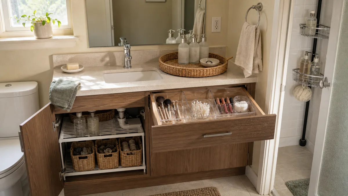
Glass Apothecary Jars in the Bathroom for Cotton Swabs and Pads

Three small clear glass apothecary jars with wood lids on a white bathroom counter, holding from left to right cotton swabs, cotton pads, and more cotton swabs, the edge of a round black-framed mirror visible upper left, a cream hand towel on a metal ring upper right

A bathroom counter with three identical glass apothecary jars holding daily items reads styled. The same items in a Costco bulk bag and a CVS plastic tub read cluttered. The mechanism is identical to idea 3 — single material, bulk visible, brand packaging gone — at a smaller, counter-friendly scale. Apothecary jars are the pick for tight counters where mason jars take too much depth.

The image shows three small wood-lidded apothecary jars in a row, contents visible through clear glass. The white tips of the cotton swabs and the soft white discs of the cotton pads create a uniform visual texture that reads spa, not pharmacy. The wood lids tie back to the walnut tones used elsewhere in the apartment.

  • Target small glass apothecary jars with wood or matte black lids. 4 to 6 inches tall, plain clear glass, no embossed branding.
  • Buy three to four jars. Three reads as designed; four works if the counter is wide enough to hold them without crowding the sink area.
  • Use for cotton swabs, cotton pads, Q-tips, bath salts, hair ties. Bulk daily items only — anything used monthly belongs in the cabinet.
  • Line up at the back of the counter. Front 6 inches stay clear for actual sink use.
  • Skip the plastic apothecary look-alikes. Plastic reads cheap; glass reads styled. The material is the entire lever.
  • Trade-off. Leaving the original Costco-size cotton swab box next to the jars defeats the whole effect. The bulk packaging has to go to the closet, period.
Save this for later

15 Dollar Store Home Decor Ideas You Will Actually Want to Display

  1. 1Decant — clear glass jars across the pantryBuy 6-8 matching clear glass jars and decant rice, pasta, flour, sugar, coffee, oats — every branded label disappears. The repetition is the lift. Skip mixed jar sizes and shapes in one shelf row.
  2. 2Stoneware bowls — 3 grouped on the coffee tableThree matching cream or oat stoneware bowls grouped on a wood tray reads as intentional sculpture. One bowl alone reads like a leftover. Resist the “one of each color” instinct — commit to the three matching.
  3. 3Mason jars — bathroom apothecary lineupThree or four mason jars in a row on the bathroom counter, holding cotton rounds, Q-tips, hair ties, bobby pins. Skip the labeled chalk-pen-on-jar look — clear glass + visible contents reads cleaner than scripted labels.
  4. 4Picture ledge — layered frames in matching finishA floating picture ledge with 4-5 matching black or oak frames overlapping at slight angles reads gallery-curated for under $25. The layered ledge is the dollar-store version of the layered living room wall decor arrangement — same visual lever, lower cost.
  5. 5Wood cutting board — wall-displayed as sculptureA $5 dollar-store wood cutting board hung on a kitchen wall reads as warm-tone texture, not as utility. Pick the largest matte-finish board and hang vertically. Skip the rope-handle versions — the bare wood reads more editorial.
  6. 6Faux eucalyptus — single stem in a tall vaseOne realistic faux eucalyptus stem in a tall ceramic vase reads as one designed gesture. Skip the dollar-store mixed bouquet with fake daisies and pink filler — eucalyptus alone is the only faux foliage that reads passable.
  7. 7Linen napkins — textile anchor on the tableFour matching cream / oat / sage cotton-linen napkins folded in a stack on the dining table or draped as a runner adds woven texture that thrift-couch apartments lack. Skip the printed-pattern napkins — solid color is the lever.
  8. 8Pillar candles — 3 on a wood tray vignetteThree matching cream pillar candles at varied heights (4, 6, 8 inches) on a wood serving tray reads as a designed vignette in 30 seconds. The tray is the bounded vignette — everything outside the tray is excluded.
  9. 9Woven baskets — bathroom hidden storageTwo matching woven seagrass or jute baskets under the bathroom sink or on the toilet tank for overflow toiletries, hair tools, towels. The basket is the closed visual — visible chaos becomes hidden chaos for $6.
  10. 10Acrylic frames — printable art at gallery scaleTwo or three matching clear acrylic frames holding free printable art from Pinterest reads as a curated mini-gallery. Print on heavy matte cardstock for the most expensive feel. Skip the dollar-store gold-trim plastic frames.
  11. 11Apothecary jars — clear containers for cleaning suppliesLarge clear glass apothecary jars holding under-sink cleaning sponges, dish brushes, or laundry pods. The visible contents reads as designed when the container is bounded and the materials inside match (all wood-handle brushes, not mixed plastic).
  12. 12Wood serving board — entry tray for keys and mailA $4 dollar-store wood serving or paddle board repurposed as the entry table tray for keys, mail, sunglasses. The wood material reads as intentional warm-tone anchor in the entryway, not as a kitchen item.
  13. 13Spray-paint pottery — one editorial matte colorThree mismatched dollar-store vases spray-painted the same matte terracotta or sage or oat color in one session reads as a designed set. The trick is one matte color across all three — gloss finish or mixed colors kills the effect.
  14. 14Pillow covers — tonal family across all couchesThree or four dollar-store pillow covers in the same tonal family (oatmeal + cream + dusty sage + warm gray) swapped over existing pillow inserts. Skip mixing bold patterns with solids — the tonal family is the lever.
  15. 15Faux garland — shelf softener along the edgeOne faux eucalyptus or olive garland draped along the edge of a kitchen shelf, mantle, or bookshelf softens the hard horizontal line. Skip the bright green plastic ivy garlands — the muted-tone eucalyptus garland is the only kind that reads passable.

styledhomenotes.com

Wood Serving Board as Entry Drop Tray

A small rectangular wood serving board on a dark walnut entry console, holding a set of house keys, a folded white envelope, and a small ceramic dish with coins, a black-framed art piece partly visible on the wall above, a black wall hook on the right, light wood floor below

A wood board on the entry console turns daily drop items into a contained landing zone. Keys, mail, sunglasses, and spare change inside the board edge read as a styled function. The same items scattered across the open console read as clutter. The boundary is doing the work again — same as the tray in idea 8 and the bowl grouping in idea 2.

The image shows a small rectangular wood board on a walnut console holding house keys, a folded envelope, and a small ceramic dish with coins. The art on the wall above and the black wall hook on the right give the drop zone a styled context without adding more counter mass.

  • Target a small wood serving board. 8 to 10 inches long, plain rectangle, no carved handle and no engraved text.
  • Place on the entry console. A small console table, hallway bench, or even the top of a low bookshelf near the door all work.
  • Use for keys, the day’s mail, sunglasses, and one small ceramic dish for spare change. Anything else goes into a closed drawer.
  • Skip the live-edge and chalk-painted versions. Plain rectangle reads timeless; live-edge wood reads 2018 mountain Airbnb.
  • Skip “this is home” engraved boards. Typographic boards date themselves fast and break the styled-but-functional read.
  • Trade-off. A board smaller than 8 inches reads like a coaster instead of a drop zone. If the console is narrow, lean toward 10 inches and skip the small ceramic dish.

Spray-Paint Cheap Pottery to a Single Editorial Color

A small matte black ceramic bottle with a tapered neck and a slightly taller matte sage green planter holding a small green pothos, both on a dark walnut console, a partly visible black-framed art piece on the cream painted wall behind, soft side daylight

A dollar-store ceramic vessel in its original glossy cream or kitsch color reads as a dollar-store ceramic vessel. The same vessel sprayed matte black or muted sage reads as a piece from a small ceramics studio. Twenty minutes of spray-paint pulls the read from $2 craft-store to $40 boutique, and the color choice is the entire reason it works.

The image shows two vessels — a small matte black bottle with a tapered neck and a taller matte sage planter with a small pothos. Both started as plain dollar-store ceramics. The matte finish is critical; the same shapes in glossy finish would still read cheap.

  • Target plain dollar-store ceramic vases, planters, and small bowls. Cream or off-white pieces are easiest to paint over.
  • Pick one color and commit. Matte black (Rust-Oleum Painter’s Touch Flat Black 1976) or muted sage (Krylon Fusion All-In-One Sage). Use it for every piece.
  • Spray outdoors or in a well-ventilated garage. Two thin coats with 30 minutes between. Thick single coats run and ruin the matte read.
  • Matte finish only. Gloss spray paint over a dollar-store ceramic still reads cheap because the original gloss shows underneath any texture.
  • Cheap version: paint one piece. A single matte black vase on a console as the focal point still does the work. You do not need to paint a set on day one.
  • Trade-off. A piece with a glossy gold rim or metallic detail will still show under matte spray paint. Pick vessels that are matte to start, or sand the glossy detail first.

Three Cream Throw Pillow Covers (Slip Existing Pillows)

Three cream throw pillow covers in varying textures on a cream sofa corner — a waffle-weave cover at the back, a cross-hatch grid weave in the middle, a smooth flat linen-look cover at the front, soft daylight from upper left

Three pillow covers in the same tonal family but different textures pull a thrift sofa together in one afternoon. The lever is two-part — the tonal family (cream-on-cream) reads as a designed set, and texture variation (waffle, grid, smooth) keeps the cream from going flat. Covers instead of new pillows cut cost by about 80 percent, and the inserts can be lumpy without anyone seeing them.

The image shows three pillow covers stacked on a cream sofa corner — the back pillow has a waffle weave texture, the middle has a grid pattern, the front is a smooth flat linen-look. All three are the same cream tone. The texture difference is what gives the grouping depth.

  • Target plain cream, oatmeal, or muted sage pillow covers. 18×18 or 20×20 inches are the most common sofa pillow sizes.
  • Buy three covers in different textures. One waffle weave, one flat smooth linen-look, one slubby or grid weave. Same color, three textures.
  • Slip over existing pillow inserts. Save the cost of new pillows. The inserts can be old and lumpy — the cover hides everything.
  • Skip printed, sequined, or tasseled versions. Pattern fights the tonal-anchor lever. Same with metallic threads and decorative trims.
  • Skip mixing color families. Cream plus navy plus terracotta is four colors, not a tonal family. The mechanism only works when every cover is in the same color zone.
  • Trade-off. Cream stains. Coffee, red wine, oily hands all leave marks. Plan to wash covers monthly and replace every 18 to 24 months.

Faux Greenery Garland on an Open Shelf or Mantle

A faux eucalyptus garland draped along the front edge of a dark walnut floating shelf, with a small black-framed botanical print, a cream stoneware bowl, and a single cream pillar candle styled behind the garland, cream painted wall above, soft daylight from the right

A garland draped along the front edge of an open shelf softens the hard horizontal line of the shelf and creates a continuous organic sweep that vertical objects can sit behind. Without the garland, the shelf reads as flat storage with three styled items on it. With the garland, the shelf reads as a designed vignette where the green line is the unifying element.

The image shows a faux eucalyptus garland along the front of a walnut shelf with a small black-framed print, a cream stoneware bowl, and a single cream pillar candle styled behind. The garland is the connecting line; the three objects behind are the punctuation.

  • Target a 6-foot faux eucalyptus garland. Sold in seasonal aisles year-round at most dollar stores — eucalyptus is the year-round safe choice.
  • Drape along the front edge of an open shelf, mantle, or floating shelf. The horizontal sweep is the lever; vertical placement does not work.
  • Style two or three small objects behind. A framed print, a small bowl, a candle — keep the count low so the garland stays the focal element.
  • Skip multi-color holiday garlands. Pumpkin orange or red berry garlands date the entire vignette. Eucalyptus reads year-round.
  • Fluff the stems before draping. A garland straight out of the package reads flat and fake. A few minutes of stem-spreading doubles the realism.
  • Trade-off. A too-dense garland that covers the shelf surface defeats the styling behind. A sweep is the goal, not a curtain. If the garland feels heavy, prune a few stems.

Fifteen items. You will not buy all fifteen on one Dollar Tree run, and you probably should not try. The deployment matters more than the count — five items deployed correctly look more intentional than fifteen items scattered with no plan.

An empty-looking apartment that reads dorm-vibes leans hardest on the warm-texture levers — ideas 5 (cutting board on the wall), 6 (eucalyptus in a single vase), 8 (candles on the tray), and 15 (garland along a shelf). Those four add warm material weight without filling more square inches.

A cluttered apartment where every surface fights brand packaging fixes its biggest issue with ideas 1 (decanted pantry jars), 3 (mason jar bathroom set), 9 (woven baskets for visible storage), and 11 (apothecary jars on the bathroom counter). Same items as before, contained and consistent.

A thrift sofa with mismatched textiles pulls together with ideas 7 (cream napkins as everyday textile anchor), 8 (candles on the tray for the coffee table), and 14 (three cream pillow covers in varied textures). The tonal-family rule does the visual lift across the whole living room in one afternoon.

A counter with cheap-looking pottery and a too-bright vase shelf transforms with ideas 2 (three matching bowls), 6 (eucalyptus in a single vase), and 13 (spray-paint the cheap pottery to one matte color). Twenty minutes of paint pulls the entire piece collection up two price tiers.

About the author
Nora Ellis

Nora Ellis edits Styled Home Notes, where she shares practical decorating, organization, and small-space ideas for creating a more styled and functional home. Every article is reviewed for clarity, usefulness, image sourcing, and Pinterest-to-page alignment before publication. Visit the Nora Ellis author page.

Similar Posts